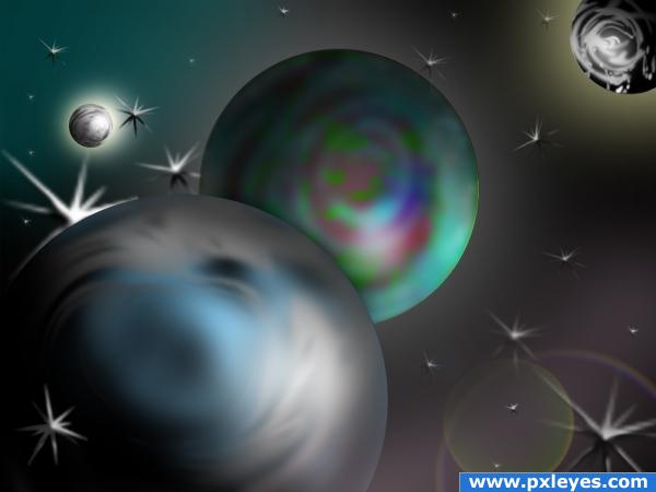
only used standard brushes from ps, blur, smudge, no source, ps only
(5 years and 3860 days ago)
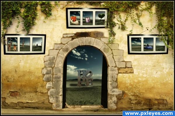
A little collage of my main emotions right now :)
These are: solitude, grief, love and hope.
I wanted to arrange them in a way so you can see, that they all belong together.
That's why greif, love and solitude are arranged in a kind of triangle.
I used always the same background, cause it shall reperesent me in this case. I'm always the same, I just have different emotions.
And in case you don't recognize the emotions:
On the left side is solitude, what should express the feeling of being alone. That's why the boy is walking away from the girl.
On the right side is grief. I intentionally placed only the girl there and nothing else, cause when you feel grief, you are always alone, notwithstanding how many people may be around you.
And in the middle is the love. I don't think, that I need to explain this one ;)
These three build the traingle. I placed the love intentionally above the two others, cause most of the times the love is just stronger and gives you strength.
The ivy comes from above (the direction of the love), what shall say, that love makes things alive.
But if the love is too weak, there is always hope. Even when you don't believe, that there could be hope.
It's always there, you just have to open your mind for it...
The text, that is engraved in the wall, shall represent the gathering of this emotions.
Yes, I guess, that's it.
Thanks for reading that long description and I hope, that you understood at least a little, what I was trying to say ;)
Oh and I know, that the frame looks bend. But the original frame is bend actually and I didn't wanted to change that, cause in my opinion it adds a special feeling to it :)
-----
Other sources used:
Girl1 - Thanks to Gabriela Camerotti
http://www.flickr.com/photos/face_it/1152018541/in/set-72157594190140111/
Tree - Thanks to Marina Cast.
http://www.flickr.com/photos/marinacast/2019000223/
Woman - Thanks to Gabriela Camerotti
http://www.flickr.com/photos/face_it/900673849/
Girl2 - Thanks to nyki_m
http://www.flickr.com/photos/nyki_m/2696575988/
Tree - Thanks to PXLeyes and mqtrf
http://www.pxleyes.com/images/contests/tree%20stumps/fullsize/sourceimage.jpg
CC-License for hope
http://creativecommons.org/licenses/by-sa/2.0/
CC-License for the hand
http://creativecommons.org/licenses/by-nc-sa/2.0/
night_fate has been notified (5 years and 3869 days ago)
lots of work here... yowza!!! only disappointment is this really needs to be printed GIANT to really appreciate it... good work at putting your heart into it
HIGH RES IS SUPER.. forgot to mention that
Thanks  And yes, I know... I tried to make the things bigger/more readable, but it looked terrible... So I decided to keep them as they are and hope, that the people take the time to have a look at the high res
Alot of thought went into this entry.... nicely done!
It looks great! Good luck!
Great blending on the wall, excellent message...good luck! 

great entry. well done author. lots of thought, good use of sources and a fantastic presentation of your emtions.
nice blending!!
lovely entry, high res is a must see 
great image and i knew it was u
  U have a very unique style
 and yeah HIGH RESOLUTION IS A MUST
really nice image and story 
Too much reading. I love the photos of stuff on the wall. I love the carvings in the stones. You used the tree from another contest. META-cool.
Thank you all very much for your nice comments 
Apart from what's said above, I like the color combination (warm against cold, just in the right proportions). Good image, well constructed. Tiny nitpick is that I dont understand the choice for the font for your text, but that's very personal. Nice result for sure! Good luck!
Congratulations for 1st
congratulations for winning again! And thanks for comment on my win
congrats, .. ach was sag ich, ..glückwunsch 
Congrats, really lovely work 
congrats! 
Congrats! - Awesome work
congrats friend
congrats
Congrats!
Congrats!
Fabulous work,u can feel soul here.I like it very very much.....
Howdie stranger!
If you want to rate this picture or participate in this contest, just:
LOGIN HERE or REGISTER FOR FREE
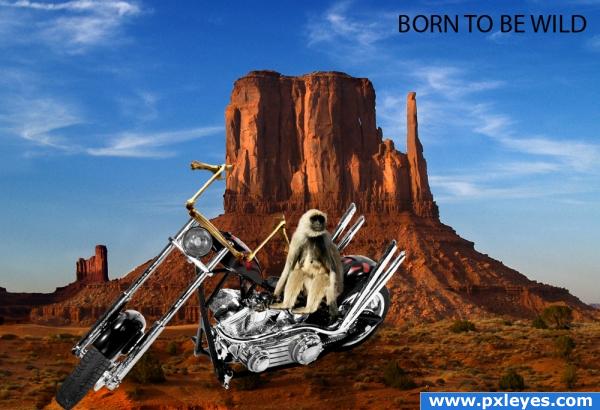
Sources from CG Textures and sxc.hu - did a bit of a change on the bike and added some bones in for handles (5 years and 3881 days ago)
The change you made on the bike looks great, but i think the monkey could use better masking around the fur, it looks like quite a harsh selection. Maybe also try masking his right leg (screen left) so it looks like he's actually sitting on the chair. And who knows, maybe give it a background if you want! Good luck!
i like this image!
Howdie stranger!
If you want to rate this picture or participate in this contest, just:
LOGIN HERE or REGISTER FOR FREE
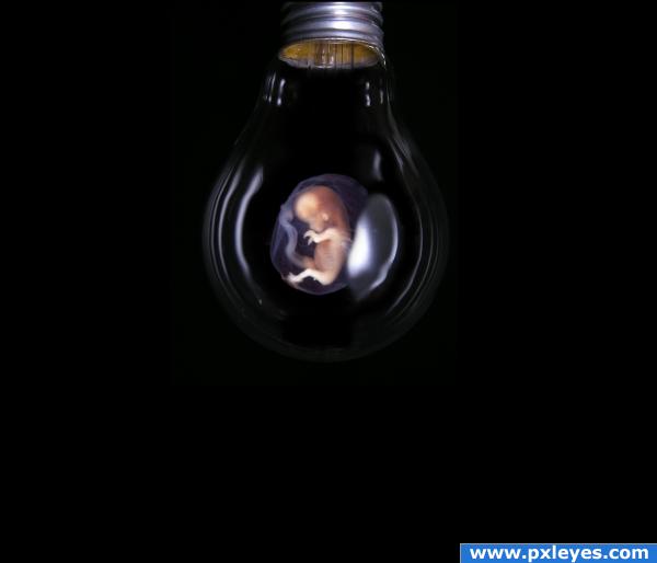
Will the idea become reality? (5 years and 3889 days ago)
Nice idea!
Very nice!
hahaha love it!
Nice, but why so much black around it? Good luck!
to wazowski: i wanted to add the feeling that the baby is lonley and alone. hope it worked. 
Ah, that's all ok  (I already had a clue). Thing is, on my screen I see 2 different backgrounds. One is real black and another one from -I guess- the bulb source. Up to you if you want to keep it like that. Good luck!
looks like you have a better monitor...  mine is old as matusalem... lol i'll fix it... thx
Howdie stranger!
If you want to rate this picture or participate in this contest, just:
LOGIN HERE or REGISTER FOR FREE
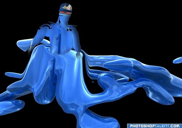
Credit to Selficide-Stock!
http://selficide-stock.deviantart.com/
Thank you! (5 years and 3944 days ago)
yes i see here many terminators!  good luck!
very nifty.. good luck
Better than nothing! 
interesting idea good luck!
You know that scene in Terminator 2 where the T1000 get's up from the floor and all the metal slips together? You already have the right material for it, but for me it's not convincing yet that this robot is actually coming from that blue blob. You used some liquify for the blob stuff, I'd do the same for the terminator itself. Let the 2 images really smoothly get fall into each other, like you barely see 2 images anymore. Also, use the volume of the blue stuff, connect it better with the robot's body. Worth the try! Good luck!
damn this is gonn be a close contest  nice work
nice 
Howdie stranger!
If you want to rate this picture or participate in this contest, just:
LOGIN HERE or REGISTER FOR FREE
serelium /platinum effect.good job
The lense flare in the bottom corner is very nice, but I feel like anyone could just take an orb and splash some colors on it, nice work and good luck.
I like it, but it looks like the light is coming from different directions...
Howdie stranger!
If you want to rate this picture or participate in this contest, just:
LOGIN HERE or REGISTER FOR FREE