(5 years and 3140 days ago)

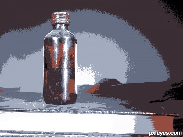
I like this technique.. enjoyed it.. I've used 8 colors. (5 years and 3183 days ago)
nice!
A little bland, perhaps. Increasing the saturation might give the bottle more impact.
Congrats!
Thanks 
Howdie stranger!
If you want to rate this picture or participate in this contest, just:
LOGIN HERE or REGISTER FOR FREE
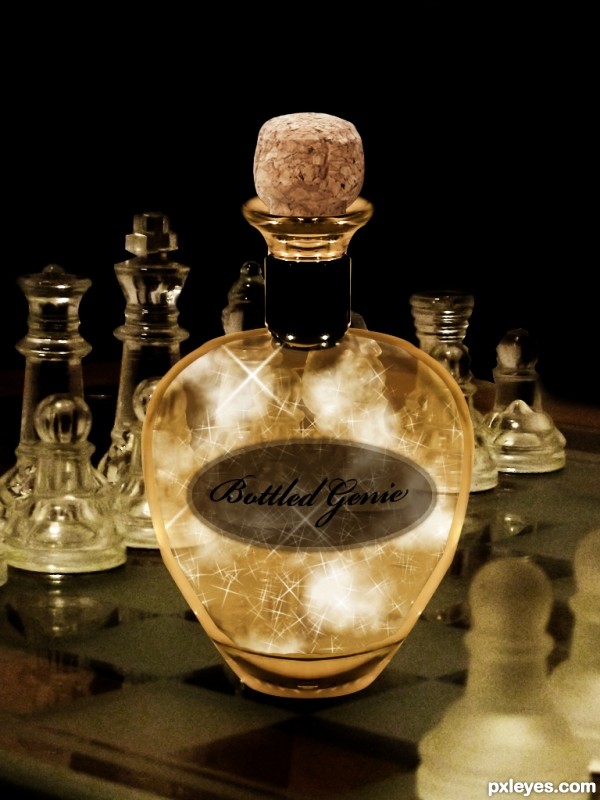
Very original concept, but there needs to be a slight bit of reflection on the chess board from the bottle, to match the reflection of the chess pieces.
Also, the top of the bottle looks very flat, with no curvature or depth. You need to have the "shoulders" of the bottle show light refraction like the cork at the top.
We should see some cork through the bottle neck. Not that you had to, but I'm wondering why you didn't use the glass stopper from the source pic. GL author.
here i agree with MossyB and CMYK46 author
overall nice work
What a beauty! Classy like bottle!
Howdie stranger!
If you want to rate this picture or participate in this contest, just:
LOGIN HERE or REGISTER FOR FREE