(5 years and 3290 days ago)
- 1: Background
- 2: Rocks

Only source image and PS.
Edit: modified (5 years and 3537 days ago)
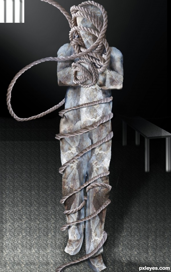
The building of the man and the upper parts of the rope are very nice -- the bindings as you move down are a bit repetitive and the ends as they bend are bit over liquefied in appearance
The table and floor are at a really weird perspective. He is sliding down the floor, and the table is more floating, with the back legs higher than the front, but at a lesser angle than the floor...
Howdie stranger!
If you want to rate this picture or participate in this contest, just:
LOGIN HERE or REGISTER FOR FREE
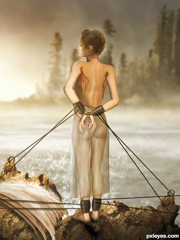
The anatomy is somewhat wonky. Her left leg is noticeably thicker than the right, as if she has a swelling problem. The left knee joint is also lower (which may be causing the swelling...)
suggestions:

1) make the waist thinner
2) let down her hair as if blown by the sea breeze
3) the thin gown should be "blown" by wind, not straight down
4) blood should be improved
nice idea, matching her facial expression
The concept is utterly breathtaking.
But it does look somewhat unfinished. Or at least unrefined. Ropes do not attach properly to anchors, they just point in the general direction. I'm not as concerned with a fluttering skirt because the wisps of hair around her face are also relaxed and not breeze-blown. However, MossyB made some excellent suggestions about the body. I will add two additional things that stand out to me: the right arm appears attached to her back, since the right side/ upper rib area extends too far; an armpit should be there and arm angled differently. The second thing is the right scar / wound - because these are not random injuries, but are where two symmetrical items (the wings) were removed, the scar/wound on the right would more closely match the left wound.
I wish you had more time to adjust!! Would love to see an edited version. :\ Good luck, author!
UPDATE: I just realized you used a 3-D concept for the body (that teaches me to look at the SBS before commenting!) The critique of the body is still valid. Just goes to show that not all 3-D renderings realistically and accurately depict anatomy with success.
Congratulations
congrats!!
WOW! very creative and superb work!
congrats
Thanks for Your comments and votes.
Howdie stranger!
If you want to rate this picture or participate in this contest, just:
LOGIN HERE or REGISTER FOR FREE