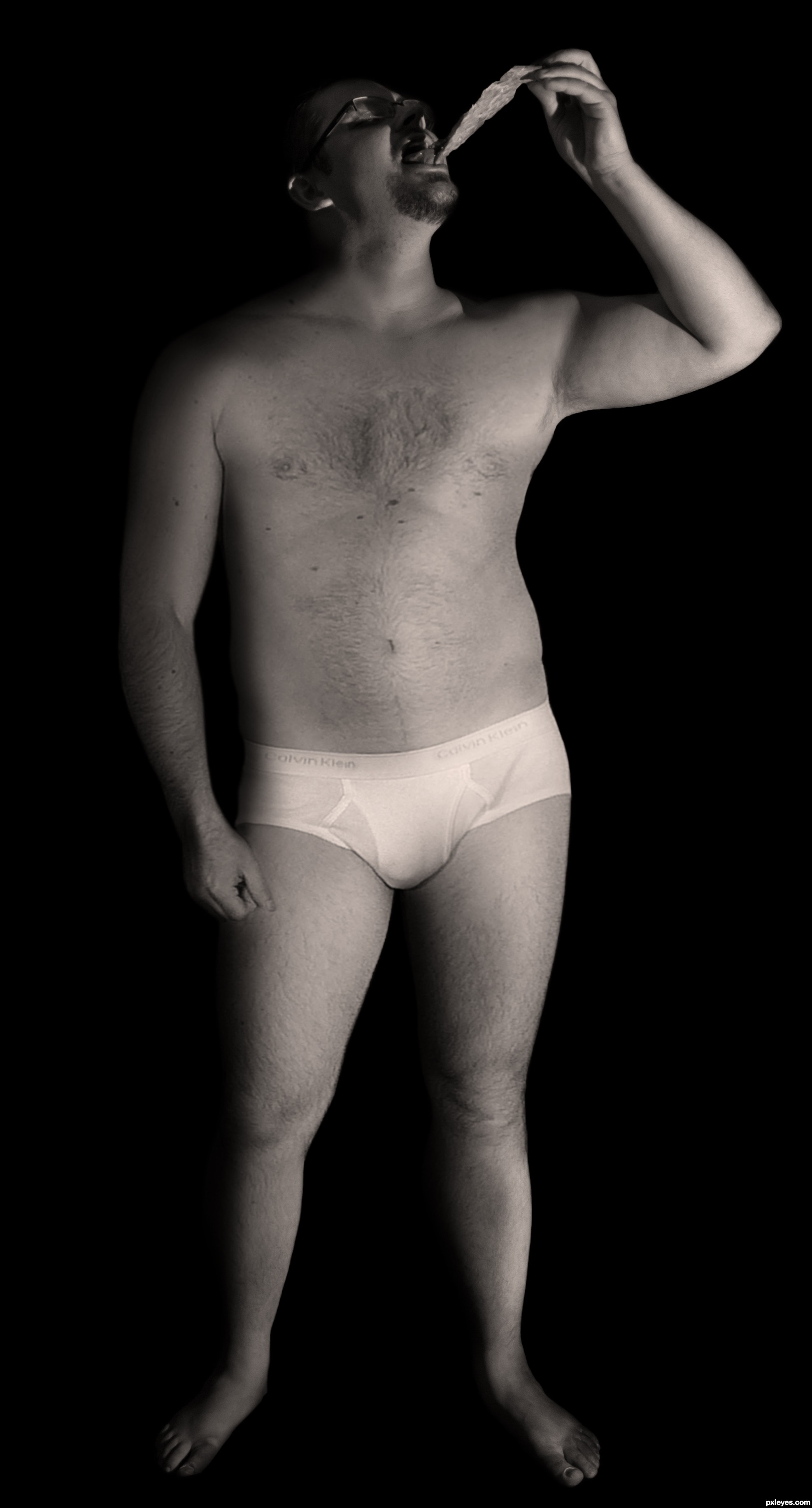
Decided that Steve shouldn't hide behind a pizza box, we'll let everyone see that macho body.
Thanks to SenshiStock from DeviantArt. (5 years and 3162 days ago)
1 Source:
(5 years and 3288 days ago)
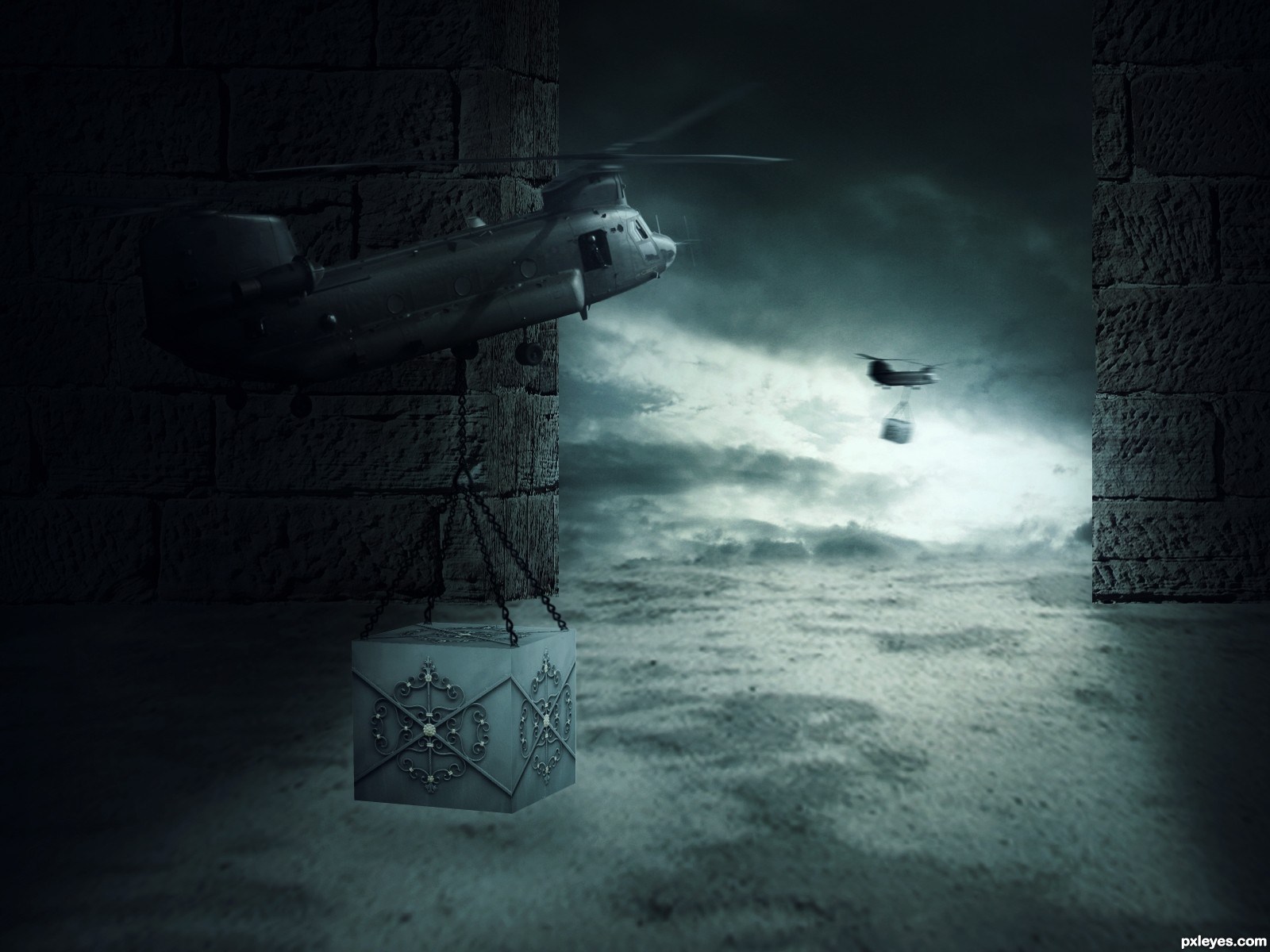
Way too heavy on the vignette effect - it's so dark around the edges that you lose a lot of the effect you are going for. It is also so dark that the lighting of the box makes no sense.
oooooo I really wanna know what's in the box!!! great mystery piece
Thanks man.
It is a bit dark, but I really like the feel of this image. Real nice job using the source image in this way.
Very Mysterious! As Drivenlush said, "I really want to know what's in the box?" Great execution author!
congrats!
Congratulations 
Congrats for 3rd
Thanks you mates.
Congrats!
Congrats!
Congrats
Howdie stranger!
If you want to rate this picture or participate in this contest, just:
LOGIN HERE or REGISTER FOR FREE
MASKING WITH OTHER POST BOX (5 years and 3394 days ago)
A background and a postman or somebody with a letter would give more sense to this design.
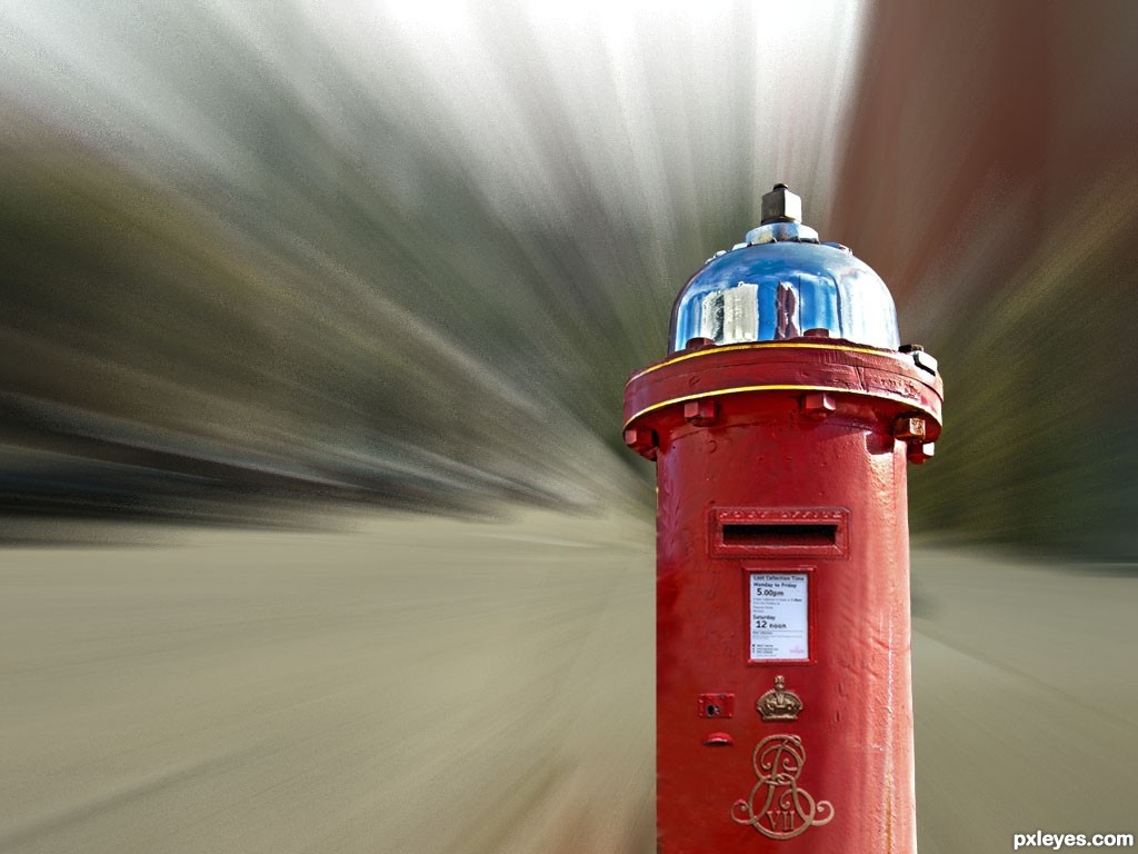
the idea is gud ....!!
to focus on particular object while moving in high velocity.
Howdie stranger!
If you want to rate this picture or participate in this contest, just:
LOGIN HERE or REGISTER FOR FREE
Done with Gimp and PS.
Thanks to:
- .shock and Guillermo Gimenez @ Photoxpress;
- Intrinsic @ Pxleyes for the tutorial. (5 years and 3406 days ago)
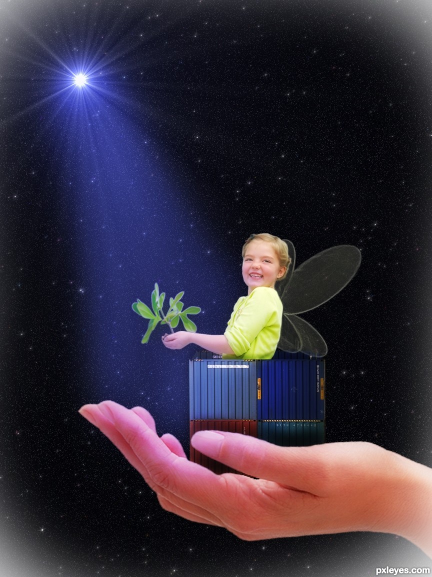
I think the box should be brighter as it gets lost among the brightness of the girl and the hand. Overall, to be blunt, I wish there were something to keep this from being kind of trite and boring. Some sort of magical swirl coming out of her hands (or a much bigger plant?) might be more interesting, for example.
I'm thinking of your suggestions; I also think it's something missing here... thanks.
Howdie stranger!
If you want to rate this picture or participate in this contest, just:
LOGIN HERE or REGISTER FOR FREE
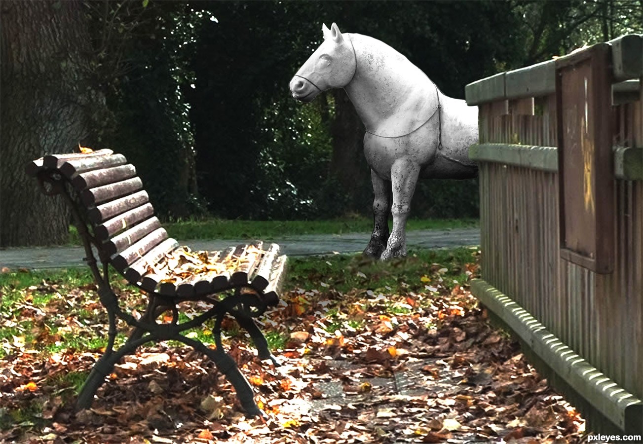
source and own photo (5 years and 3427 days ago)
Horse is a little too sharp in comparison to the rest of the image, and you may want to take the cut a little closer as there seems to be edges.. best of luck
As horse is under tree shadows, I think you can darken it a little more the highlighted parts.
thanks for the help, but I actually started with the horse directly on the trail and I didn't like the darkness, so I moved him to the edge of the fence (which has light on top) his back has a continuation of that light and casts his own shadow, that's the way I see it, (I moved the horse purposely out from under the trees so he would have a light (he looks rather dull without light)
thanks for the help
Love it...simple but very effective...well done author
Howdie stranger!
If you want to rate this picture or participate in this contest, just:
LOGIN HERE or REGISTER FOR FREE
Photography and photoshop contests
We are a community of people with
a passion for photography, graphics and art in general.
Every day new photoshop
and photography contests are posted to compete in. We also have one weekly drawing contest
and one weekly 3D contest!
Participation is 100% free!
Just
register and get
started!
Good luck!
© 2015 Pxleyes.com. All rights reserved.


Body by Jets, baby! :P Great chop, author!
LOL...'tighty-whities'....too funny, nice idea author
great work on the blend
Someone had to do him in his "boudoir" shot. Glad you liked it Steve. James, down our neck of the woods they are called "budgy smugglers".
good blending author
Congrats again!! 2nd and 3rd place, nicely done!
Nice Congrats
Howdie stranger!
If you want to rate this picture or participate in this contest, just:
LOGIN HERE or REGISTER FOR FREE