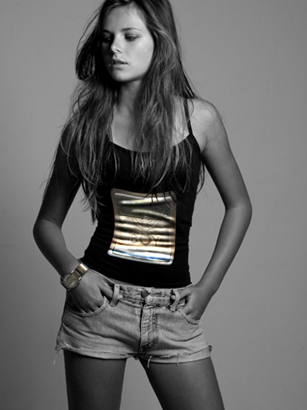
T-shirt matching watch.
For t-shirt print:
- watch logo detail
- warp tool to distort
- dodge and burn tool to make wrinkles following t-shirt's ones
- the detail was kept in color on purpose. :D (5 years and 3698 days ago)
- 1: source1
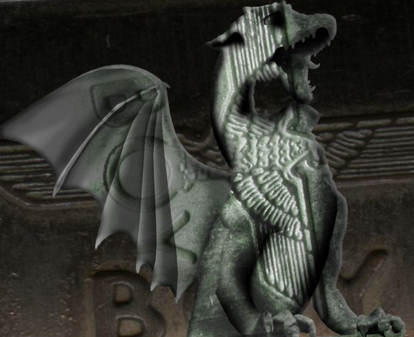
Using simple techniques, i have created moy BoyLondon Dragon Statue. Hope You like! (5 years and 3700 days ago)
Idea is nice but final product is to flat.Try using a bit more warp tool and give more roundness to the edges...and add your source image.
Feels a bit masked... IMO
Howdie stranger!
If you want to rate this picture or participate in this contest, just:
LOGIN HERE or REGISTER FOR FREE
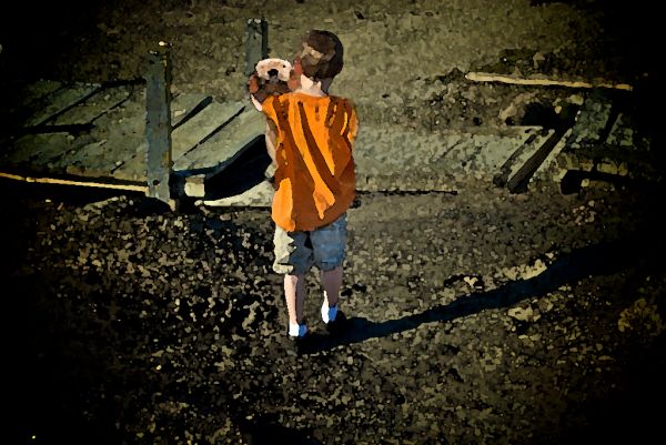
(5 years and 3715 days ago)
Good idea, but too filter heavy...
A bit filter heavy.. it would be a nice image if you just relied on colour blending instead of filters.
This is sooo cute.. I love puppies 
Great idea! maybe better if you crop the image, so the focus is on the boy and his dog. For some reason filter work are not well received here, if you want to change that. Still like the feel of the image!
That is a good idea, why'd ya add a filter to it??
Good one,....Nice try....
It's hard to tell you even used the source from this image. It's kind of a minimal use.
Howdie stranger!
If you want to rate this picture or participate in this contest, just:
LOGIN HERE or REGISTER FOR FREE
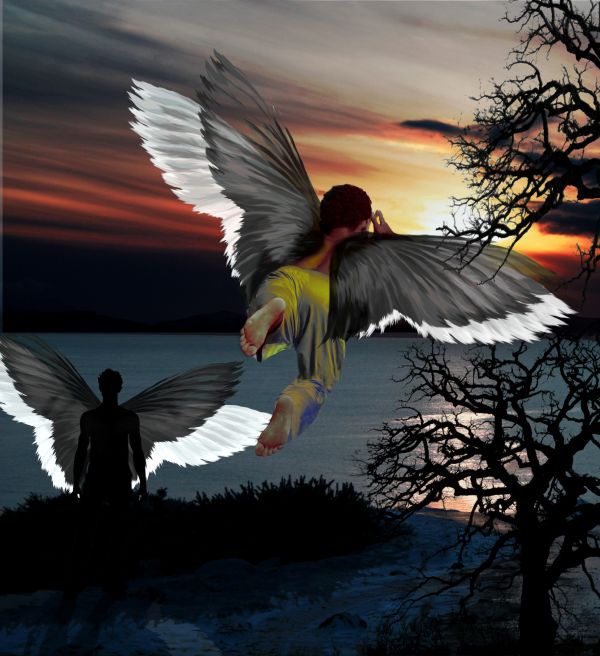
A lot of images with the same idea it seems.. but as I finished this one already, gonna submit it anyways - took a lot of work.
I cleaned the tree picture and removed the girl from the sunset image. Made several pairs of wings with slight adjustment with rotation/perspective tools. Made an invert for white wings. Made the black wings a bit transparent with masking.
Made a new foot/leg and pants for the flying boy with pattern tool and coloured the pants with gradient map tool.
Used duplicate layers to alter sunset image colours and enchanced them by hand (more red, etc..)
Finally added a bit unrealistic but fun shadow/halo wing effect for the silhouette man.
* update **
Added a shadow for the bushes also, as Langstrum suggested. (5 years and 3721 days ago)
nice try, but I think the higher tree branch should be behind the wing or you can delete that one. Moreover, the bush also needs the shadow as the man standing in front. The opacity of the tree is quite low, so it's not stick to the scenery. GL
Thanks Langstrum. I added the shadow for the bushes, but there are 2 different trees for the picture, one in front and one further away, behind the boy. So I'm gonna left that one, thou I see you can think it's the same tree.
The perspective of the tree becomes a little bit of hinderance to the wings as the guy flying looks behind from the perspective whereas the branches of the tree are behind the wings in the picture.....Otherwise nice work....
The wing is coliding with the tree....lose the tree! overall, good chop!
I'd still like to point out, in my mind and eyes there are two trees, and the boy's wings are in the middle.. the lower section tree is also further away from the boy.. so no collision - yet . .?
Congrats! 
Howdie stranger!
If you want to rate this picture or participate in this contest, just:
LOGIN HERE or REGISTER FOR FREE
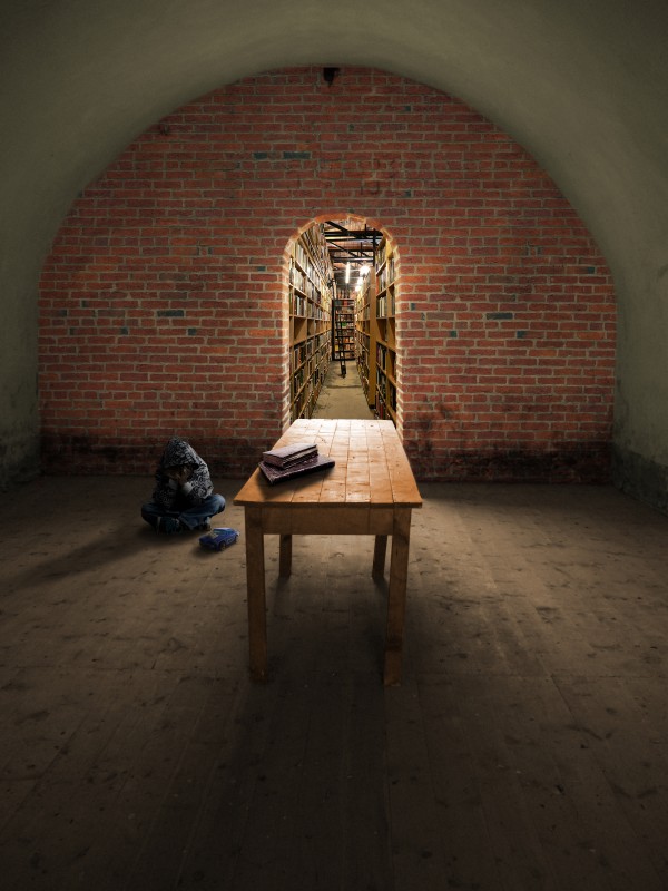
To explain the title, I picture this boy withdrawn in the dark room from some unknown sad event. That's just the situation I imagine from the scene.
I just tried to focus on believability and atmosphere. The brick wall photo is mine.Thanks for the other source photos from homero nuñez chapa (toy car), Lydiat (bookstore), Pamporoff (old Books), and Vincent Crivello (boy) (5 years and 3755 days ago)
Why what? It's a nicely done image, but I don't get the relevance of the title. The shadows of the boy & toy should rotate about 5 degrees counterclockwise.
very nice blend of sources, and excellent shadows. Great job!
I would adjust the shadows on the kid and car. Only noticable in high res but they kind of seem like the are floating. The books are a better match as far as correct shadow. I was confused by the title too. Perhaps you could include that in your description. 
EDIT: It appears like you made the shadow adjustment.  I didn't mention before but you did go a good job on the perception and felt I must give you props.
So far my favorite in this contest. The use of a vanishing point is outstanding. Few things are more satisfying than finding a nice quiet place to read, play with a car, or just be alone. I really like the feel of this peice.
very nice g.l
Very good work 
the doorway is off center
Thanks for the contructive comments. Yes I did adjust the shadows per CMYK46 about 2.5 degrees & tried to clarify the title. I also adjusted the shadow under the car(thanks jawshoewhaw) and trimmed the edges of the shadow because it had a bit of a curve to it. RickLaMesa, The source window was off center too. I just put the door where the window was, lol.
looks real nice...gl
nice blending of sources author... well done... 
Nice work.
Personally I think it quite good, nice image and well done
I like this, great work
Howdie stranger!
If you want to rate this picture or participate in this contest, just:
LOGIN HERE or REGISTER FOR FREE
Nice use of source, you really made it look as a shinyprint. I like it!
Would probably make more sense to use a male model...Probably get lower rating though :P . Nice result
I have to disagree with Barnacle, a girlmodel with this print is genius! It´s confusing, yes - but youthful, cool fashion.
Nice work...T shit looks great...good luck author
Nice...
You are wrong Sunzet. Would you buy a t-shirt or watch being advertised by a girl ? assuming that you are a guy. So, obviously it would make more sense, thats all I said and I was right. It's not good to disagree with someone who is right lol
But in fashion many things are ok - like a boyish style, for example... Maybe it'd be wierd a boy using some stuff for girls, but the opposite is very common!
And... who has never seen an ad where men present female perfums or women present male underwear??? So, don't fight for it! ;D
I´m a girl and I would looove to have that shirt! ...Author - If you ever get to print it - tell me...and send one to Barnacle as well
Thank u, Sunzet!
I'd have to agree with you Sunzet, I've seen cologne and high fashion magazine ads with the similar direction. Metro-sexual or something like that. Author, very nice blend and a very simple but original entry. GL!
You are all wrong, obviously, again. This is a mans watch. Girls wouldn't want to wear it, ok maybe a few but generally, no!. Guys wouldn't wanna wear it because of the femanine advertisement. It's not a good idea, thats all i'm saying. It would make more sense on a man. You know i am right.
Sure you can bang on about the t-shirt - it's kinda sexy on her. Kinda like the missus wearing my shirt or something. But a watch ? nope. It aint cute, sexy and certainly not genis. :P
Hey, people, this is NOT a discussion place! And preferences are OUT of discussion... Each one has his opinion; I am a woman, and I've already used a watch like that kind. Women use soldier style boots. Women use male perfums. It's a question of preference! That's all.
I thank everybody who supports this work, and who doesn't too!
No, it´s not a discussionplace , so we´ll leave that. As great as I think this work is done, I though noticed you might wanna turn the clock"dial"
 around, so when she looks at it, it won´t be upsidedown.
Good point, sunzet, I've not noticed that... But let's consider that this pic is an ad: the watch would be upside down to people who see the model. Am I wrong? Hugs!
Well, using that pic in an ad, it would probably be combined with a text and maybe also the watch as kind of like the "Macho Boy"-entry, and then it should be faced rightway for her. But forsay its a very very famous brand that need no more explaining, then it should be as it is, most people wouldn´t get the upsidedowner... On the otherhand they might, as me, not really notice the watch at first beacuse of the cool shirt. That makes it a brilliant ad btw...they could sell the watch as well as the shirt.
maybe wouldve been better if the shirt was b&w or the person was in colors... I think
Howdie stranger!
If you want to rate this picture or participate in this contest, just:
LOGIN HERE or REGISTER FOR FREE