(5 years and 2823 days ago)

(5 years and 2874 days ago)
epic...great job. subtle and really well executed.
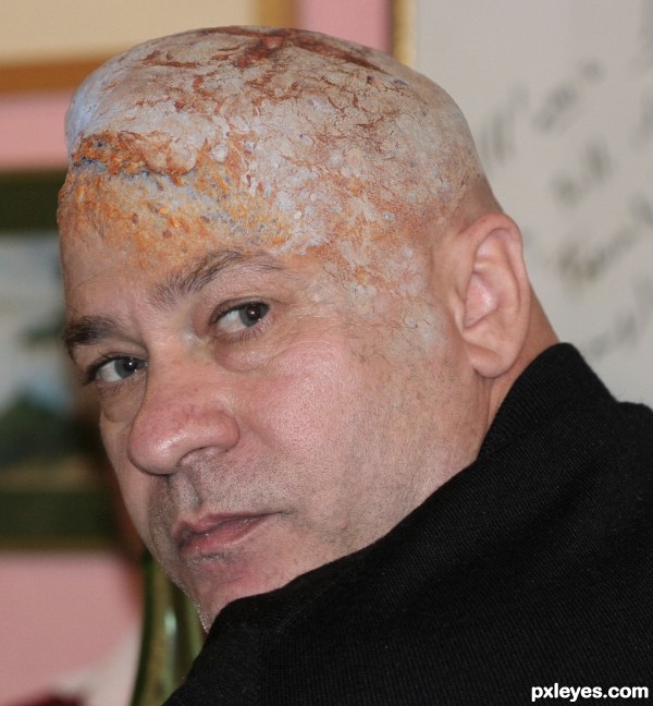
nicely done -- the edge between the skin and the Bread is very well done
Very nice, easy and well done. Good luck!
WOW!!! Good luck author!
awesome love ur work
1st and 2nd place! very well done! congratulations again!
Congrats! 
Congrats! 
Congoooo  !!!
!!!
Congrats!!
Nice Congrats! 
Howdie stranger!
If you want to rate this picture or participate in this contest, just:
LOGIN HERE or REGISTER FOR FREE

(5 years and 3106 days ago)
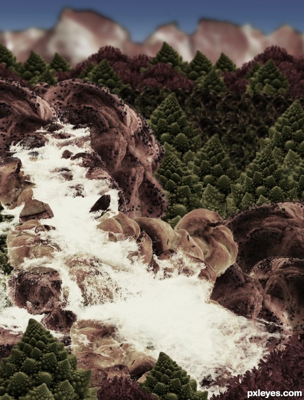
It's so dark and monochromatic, you can neither make out the differences between all the sources you used, nor appreciate the wide variety of different items creating the foodscape.
Carl Warner lets the food be the landscape, not hide it behind overly dark values. Perhaps lighten it up and allow some of the real color to show.
do u think that step 9 will be ok?
step Nine is much nicer then the dark version for being able to see the actual food.. IMHO
EDIT: Much Improved!!!
Thanks a lot Drivenslush!, I'll change it
I would drop the pizza, and I would go back to step 9, desaturate and colorize a little bit. If you blur the farther away parts and the farthest even more, it'll give it some depth. Also, in an actual landscape, the farther hills and mountains are from the camera, the gradually lighter and duller they look. Check out this picture you'll see what i mean
http://www.redbubble.com/people/natureshues/art/2059066-blue-mountains-sunset
I think you have the pieces and everything for a great entry, just needs a little tweaking  hope this was helpful, best of luck!
Changed it, hope it's better now!
WOW! What a difference that made! MUCH much better, I'm glad I waited to vote. High score from me, you've done a wonderful job!
YAY! Absolutely great! What an awesome improvement! You take suggestion extremely well 
Thanks for your comments 
Howdie stranger!
If you want to rate this picture or participate in this contest, just:
LOGIN HERE or REGISTER FOR FREE

(5 years and 3314 days ago)
Whoa! This is great...but almost looks eerily like it could be from a medical journal. 
i'm with pixelkid. :lol: its awesome blending, but it looks more like he has a skin condition :lol:
Creepy bread head! Who would have thought it would look sooo strange to have bread for brains!
great blend author...best of luck
Great job blending pics. GL
Thanks!!
nice job... congrats
congratulation...
Hi, congratulation...
Hi, congratulation...
Congrats
Thanks!!
Congrats!!
Congrats
Howdie stranger!
If you want to rate this picture or participate in this contest, just:
LOGIN HERE or REGISTER FOR FREE

all my photos
FULL SBS NOW UP
Thanks to Qbrushes and Tinydl for the smoke and water brushes for texture (5 years and 3536 days ago)
nice.
this one has no sources eihter. you all gonna be fraking on this one to?
lol mexe
at least the author posted his sbs
nice one author
all sources are in my SBS.. I just haven't have enough time to put the rest of the steps. (If I don't finish them tonight.) ALL PICTURES ARE MY OWN IMAGES.. rest of sbs is coming.. but I gotta go to work til midnight tonight.. so I'm going to be a bit exhausted (please be patient)
EDIT SBS IS UP AND WORKING 
Amazing work!!!!!
I LIKE IT ! GREAT WORK ....G L
something seriously wrong with you dude 


to funny author.
It's my 1st. experience with a carnivorous bunny!... 
Always a crazy (read creative here...) surrealism comes out! 
Nice entry, author! 
WOWOWOW great ^^
Love it when you scroll down it becomes more and more bad 
GL author !
Nice work --- in a strangely appealing demented (LOL) way.
Great job author .......... all the best to u ........... 
Hahahahaha...fantastic...well done
good work!
Howdie stranger!
If you want to rate this picture or participate in this contest, just:
LOGIN HERE or REGISTER FOR FREE
Howdie stranger!
If you want to rate this picture or participate in this contest, just:
LOGIN HERE or REGISTER FOR FREE