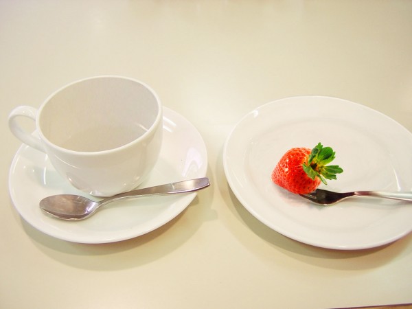
Decaf and low-calorie. (5 years and 3755 days ago)
- 1: Strawberry

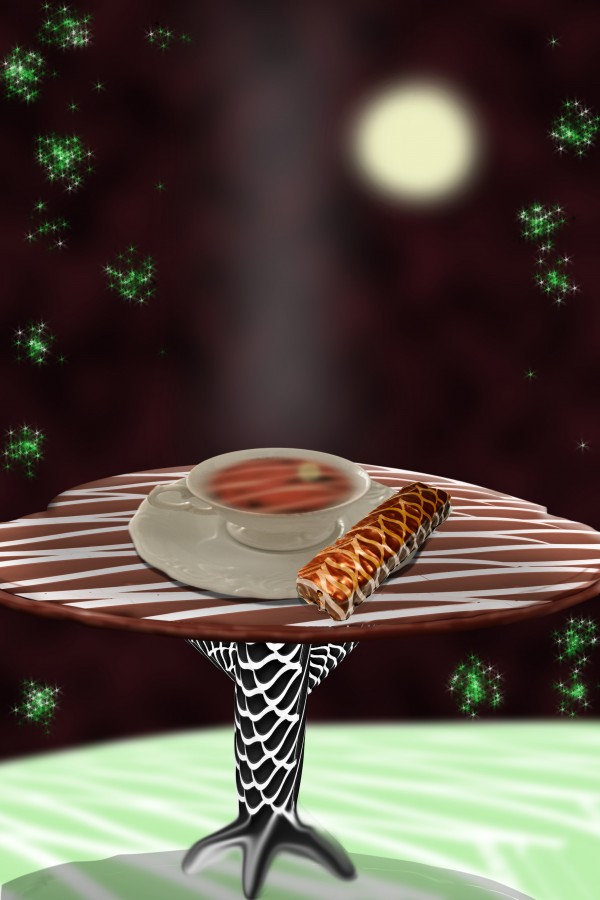
I used two external sources of chocolate and cup
Thanks to http://www.sxc.hu
Author: Sarej
Author: straymuse
SBS will follows (5 years and 3765 days ago)
cool green sparkles, fun and creative use of source author  nice thinking out of the box.
Howdie stranger!
If you want to rate this picture or participate in this contest, just:
LOGIN HERE or REGISTER FOR FREE

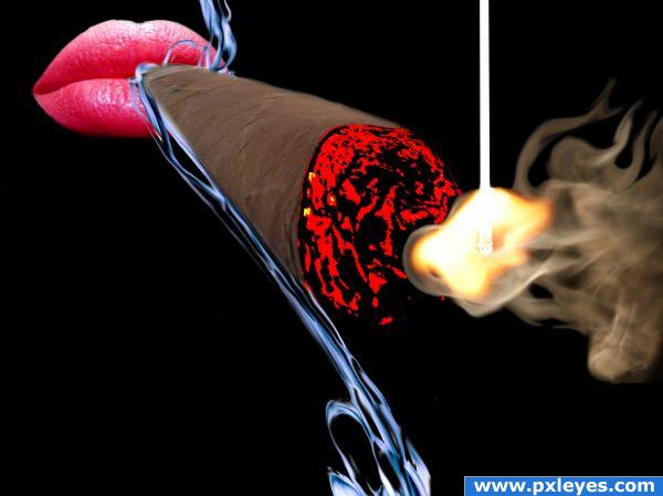
Step 1: Lips
Step 2: Cigar
Step 3: Smoke (5 years and 3812 days ago)
Very nice
Howdie stranger!
If you want to rate this picture or participate in this contest, just:
LOGIN HERE or REGISTER FOR FREE

Thanks and credits to 'boyonabike' and sxchu (5 years and 3873 days ago)
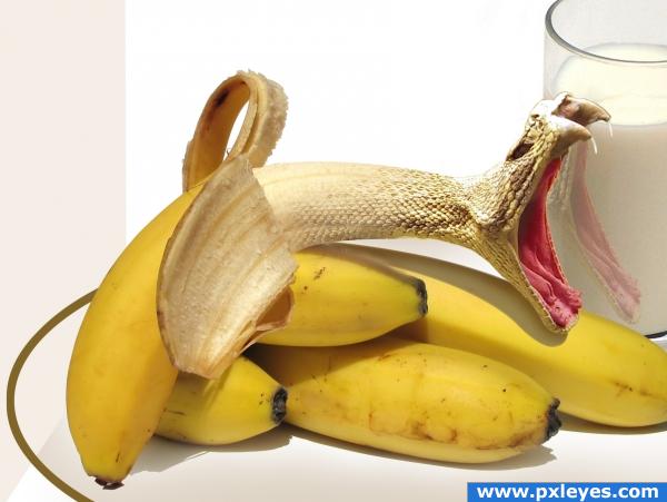
reflection of snake in class is incorrect or is that suppose to be another snake in the milk? if that is the snakes reflection it needs to be flipped. nice work.
Thank you scratzilla1 i just corrected it.
good work ! but i would add snake skin to entire bananna (fruit).it looks great as it is....just an ideea. GL
Scary banana! 

Great image.. very well done.
I like the idea but personally i think sthe snake skin is too strong still to make it appear like its the bananas mouth like the idea a lot tho and its a clean chop 
Nice work but it's not your own idea: http://www.derekleffew.com/banana_snake.jpg/banana_snake-full.jpg
I've seen a few images on this website that weren't the author's idea! But this one is almost exactly like the other image! Good job, though.
Good catch thomasms  . Idea and source both are same.
Other link are :
http://www.derekleffew.com/banana_snake.jpg/banana_snake-full.jpg
http://1.bp.blogspot.com/_Hl5bQduRAMc/SWJr83NpHtI/AAAAAAAADfI/P1stvALIaa8/s400/banana+snake.jpg
http://images1.wikia.nocookie.net/uncyclopedia/images/thumb/e/ee/Bananarattler.jpg/180px-Bananarattler.jpg
http://webspace.ringling.edu/~dswanson/blog/banana_snake-full.jpg
http://media.photobucket.com/image/banana%20snake/mustangger/banana_snake-full.jpg
http://lh5.ggpht.com/_a5wAv708gwU/R_HDcFt_FYI/AAAAAAAAAIE/UU4Fgn5fBMs/banana+snake.jpg
.... looks that its very popular image 
sources are ok but not a very original idea
Much better author. yes there are many whom are posting NON original ideas lately. however, is this because some of the authors are new and gathering inspiration from the net to develop their skills? everyone has to learn .. however, i personally, would like to see more original ideas.
Very nice blending, great idea.
i agree that i have seen such image before!!!, and not actually my own idea.
oh you do? come on man, they're almost identical! 
cool!
Wanted to give high marks, but its to alike.
good idea! i liked... good luck
This is a great image. I'm still a little shakey on the reflection, tho. The lower jaw is closest to us and then the banana. The reflection should have the banana closest to us and then the jaw. Other than that, I really like this image. The blending is perfect.
Congrats for your third place!
Congratulations for 3rd
Congrats!
Congrats!
this should have won.
Howdie stranger!
If you want to rate this picture or participate in this contest, just:
LOGIN HERE or REGISTER FOR FREE
very simple and creative
Nice job.. convincing work!
very clean XD
This kind of work is highly underrated on this site. But not by me. Excellent. Perhaps just a tad more shading inside near the inside bottom of the cup would be great! Is there an SBS?
I didn't make a SBS yet, it's just a ton of cloning, pasting and masking. It took me a while.
Please make an SBS so such a simple yet clever idea for the source will not be removed.
Sweet work, but SBS could be better...
Good work.
congrats
Congrats! for 2nd
Congrats,
Howdie stranger!
If you want to rate this picture or participate in this contest, just:
LOGIN HERE or REGISTER FOR FREE