(5 years and 3023 days ago)
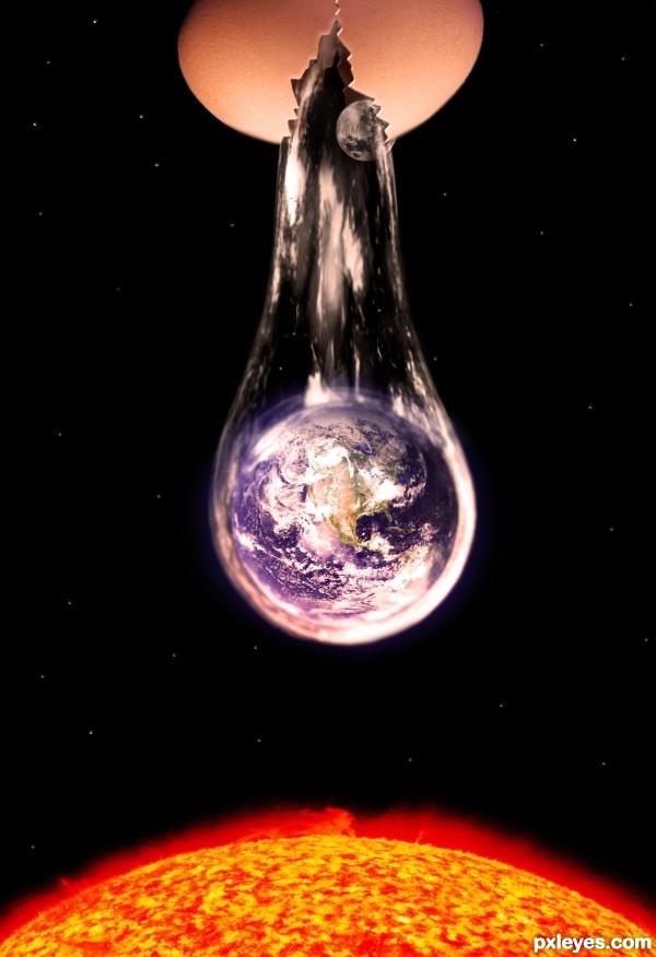
- 1: Coutesy NASA
- 2: Courtesy NASA
- 3: Courtesy NASA
- 4: Bubble
(5 years and 3128 days ago)
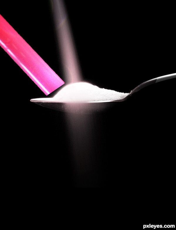
omg that's so wrong! LOL Yet funny 
you better check the bottom of the picture, you can see your brush work....
is it?
My black brush work, over the black background.
Because i looked close and All I see is Black..LOL
My fav!...
Good idea...... difficult subject, but did a good job.!
Howdie stranger!
If you want to rate this picture or participate in this contest, just:
LOGIN HERE or REGISTER FOR FREE
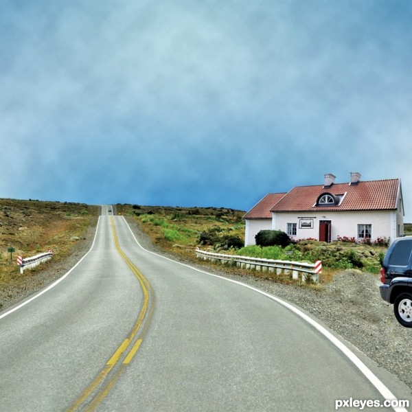
Thanks to the following people at www.sxc.hu for the use of their photos :)
windchime for the car.
ChillaII for the cottage house.
Ayla87 for the sign.
much appreciated.
re-uploaded, don't know if its just my computer but it went very dark when uploaded. Have made the image alot lighter so it was clearer on screen :) (5 years and 3239 days ago)
Your work is nice, but I suggest a more interesting sky, with a few clouds or something.
Howdie stranger!
If you want to rate this picture or participate in this contest, just:
LOGIN HERE or REGISTER FOR FREE
Spec Thanks to Rev Xanatos Satanicos for use of his picture found on Flickr photo sharring.com
Spec Thanks to Lynette S. for use of her picture found on Flickr photo sharring.com (5 years and 3503 days ago)
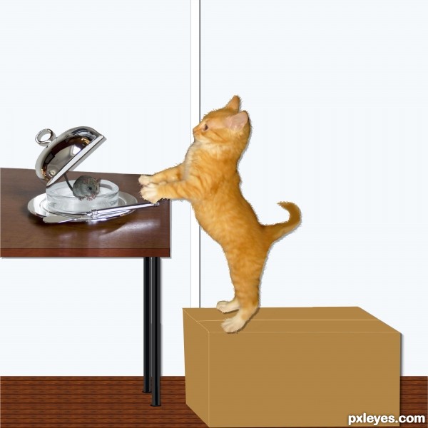
Table is skewed, and everything should have a shadow, not just the cat. 
very cute image author, I love the idea.. a little tweaking will help, but the overall message is very readable..... good luck 
like the idea -- the shadow does not give the cat enough distance from the wall and the table needs to be adjusted for perspective
Idea is very cute and funny. But you really need to fix the table's perspective, add shadows. The bottle is unnecessary, IMO. For kitty's fur, smudging needs to be in the same direction. 
Hey thanks all for coments and help. I did have shadows but maybe hade them wrong anyway I made changes hope I didn't make it worse.I took care of the things you all mentioned Did I get it right?....Thanks to all
applied shadows conflict with the original photograph - otherwise a nice effort.
Thanks Oriel ..Can I ask why shadows conflick with original its a brighter and bigger back round
awwwwww!
HI AUTHOR - sorry Im slow - if you look below the butter dish there is a patch of shadow as if the light is shinning from the top - the shadow AROUND the cat and the box and to the right of the table looks as if the items were merely a flat cut out with the light shining from the left side. You can see the shadow of the butter dish clearest below and slightly to the left of the dish itself - what you mostly see under the dish is a reflection.
Howdie stranger!
If you want to rate this picture or participate in this contest, just:
LOGIN HERE or REGISTER FOR FREE
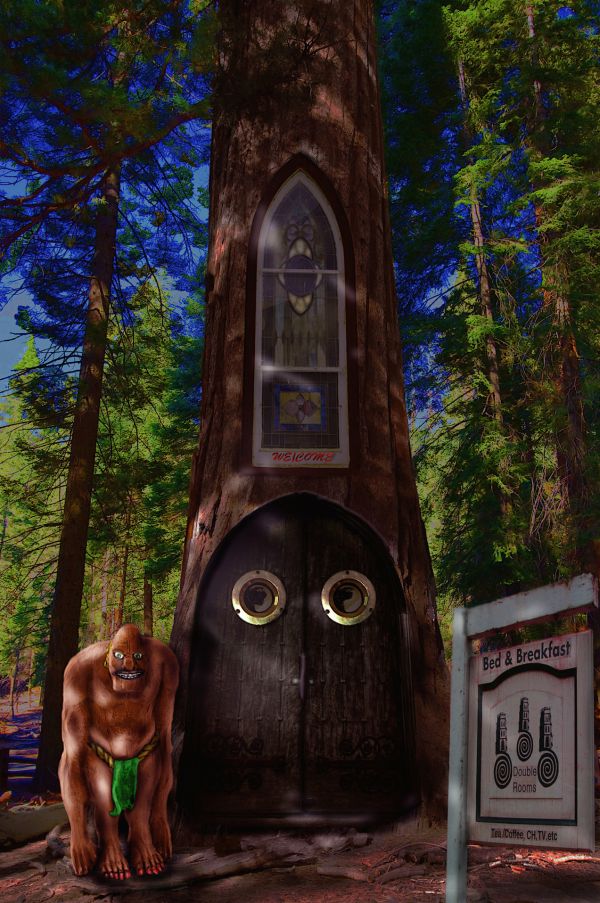
Personal pic was used in a small part of this contest.
Thanks to Eflon,roadman22, Jody Mcnardy, Jimd2007 and Bixentvo all at Flickr. (5 years and 3720 days ago)
Very cool image  great job author!
Wow, the guardian in front looks dangerous! 
Great work with a guradian...other parts are very nice too...good luck author
I like the doors and windows...I think if I saw that guard...I would turn and skip bed and breakfast...lol.
Thanks for the compliments people.
Howdie stranger!
If you want to rate this picture or participate in this contest, just:
LOGIN HERE or REGISTER FOR FREE
Awesome!!!
Super creative fun!!!
What a cool idea author!!..lov it.
High marks for your creativity!!!..GL
I Really like it... But Shouldn't the moon be a bit more closer to the earth.. seems like the sun is more closer.. well anyways good art.. and GL
Very clever!
I like the Manipulation ... but I also like the statement!
Howdie stranger!
If you want to rate this picture or participate in this contest, just:
LOGIN HERE or REGISTER FOR FREE