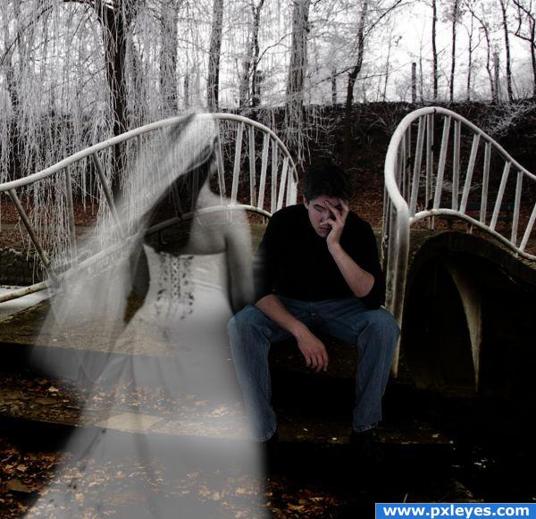
A groom mourns the loss of his bride-to-be at the place the ceremony was to be held. (5 years and 3857 days ago)
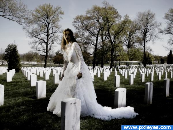
I'll see you at the cemetery... and then we can be together...
I didn't add a step by step guide because it was a very straightforward manipulation. I wasn't going to upload it due to its simplicity, but i gave it a go.. this took about 3.30 hours, and most of that was with the adjustment layers, i wanted to create a soft, melancholy effect, but at the same time achieving a withering and ageing effect. The final image consisted of 5 groups, each contaning around 20 adjustment layers, and for once in my life i didn't use the Brightness/ Contrast.. promise!!! Again.. i apologise for the simplicity of this cliche entry. Thanks :)
Thanks to Lelaina and CMYK - i fixed the light sources (5 years and 3897 days ago)
this would be very good if you lowered the brides opacity to make her look transparent like a ghost...just a thought
Thanks for the comment, i originally had the oipacity turned down, and i had fog in the image, but the finished thing didn;t looks right to me, where her head was it was too bright and detail was lost very quickly. Thanks for the comment!
I believe the light direction of the lady is opposite of the source image. Try a horizontal flip of her and I think it will work better. I like the different tone of your work. 
good work! but after reading the descritpion, i have a few questions... you have only one outside source, but yet made 5 groups with up to a hundred adjustment layers in total!!! i just don't get it!  are there even 20 kinds of adjustment layers (minus the brightness and contrast) ?? please explain!
Right elficho i suppose i should explain xD My base group is the actual image that i created, i then duplicated the group and merge it, then i apply adjustment layers to that and group it, and i repeat the process top create some kind of stacking.. my workflow is kind of all over the place and myr ecent discovery of the Group layers has really made me a little bit too cautious. There aren't 20 adjustment layers (minus B/C) but i stack two or more of the same ones in one group as well, but yeah, i hope that's valid enough to not make me look crazy. Thanks!!
author, you're borderline crazy 
 well, your comment made me laugh, don't know why.. EDIT: oh, it's you! good work again, i'm a fan
Haha! Thanks!!
Opposite light sources...
i kinda lik the image is ok
One of my moms' coworkers got married in a graveyard. I saw the pictures. Some of it was nice. Some of it was creepy. And some of it was just plain crazy (she had a bunch of Barbie dolls in attendence.)
I like this look
Very nice idea and mood, great job 
Nice mood, but if you look, the shadow on the woman is on the right, whereas it's on the left of the stones...
If you look at the original image, there's a dark spot where i placed the bride, i didn;t actually add a shadow myself, it just got darkened up as i added adjustments.
Is she lookig for her housband? Very nice..
Well... thank you for thanking me, but I think you meant laulei  I didn't said anything about light sources
  I really like the atmosphere
  Good luck!
Ahh! Sorry Laulei, i didn't give you the credit, my mind was elsewhere. Thanks to everyone who commented!
Congrats Matteo! 
Congratulations for 3rd
Congrats!
congrats
Congrats!!
Thanks!
Howdie stranger!
If you want to rate this picture or participate in this contest, just:
LOGIN HERE or REGISTER FOR FREE
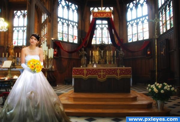
Thanks to stock.xchng and papaleguas for the nice picture. He has been notified.
Tha picture of the church is my own.
Lots of blending and masking. (5 years and 3920 days ago)
I've been waiting for an entry like this!!! lol.. nice work!!
Author.. You should really show the process in a STEP BY STEP.. mainly for you it will get you a higher score when peeps can see your work and Secondly.. others would love to learn the method so they can do the same with their photo's.. especially a wedding image.. GOOD LUCK
very beautiful,
very good!
perfectly done 
ok for the making but the idea is so obvious.....
Good work!
Eye Pleasing... 
nice blending
Howdie stranger!
If you want to rate this picture or participate in this contest, just:
LOGIN HERE or REGISTER FOR FREE
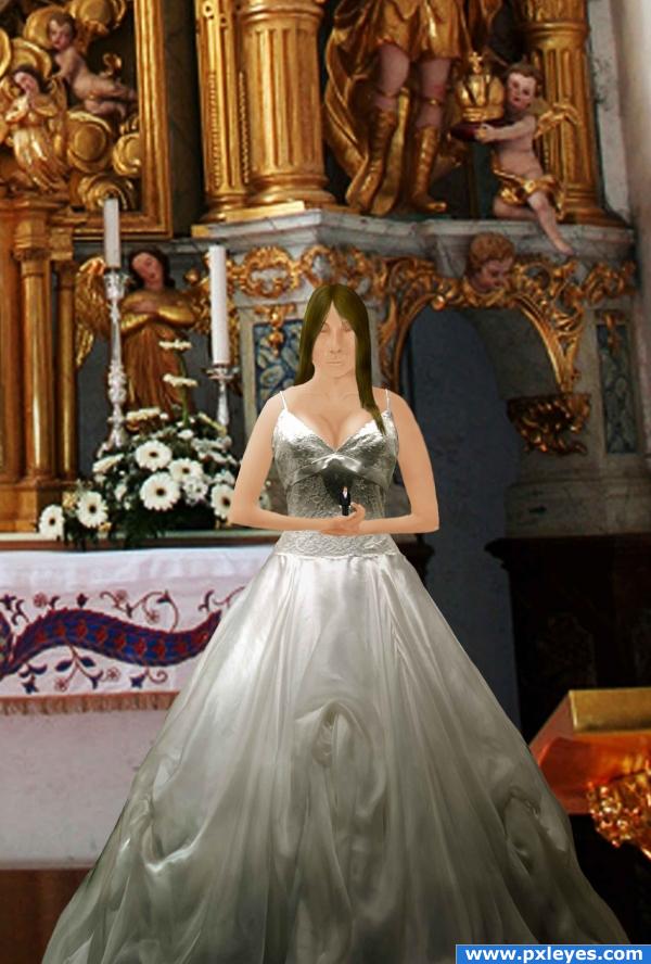
The old, yet tragic story.
Thanks to Glenmcbethlaw on Flickr for the background pic.
Everything except background and the dress was painted in by hand. (5 years and 3921 days ago)
awesomness
good
Can you blame him? Good work, author...but your background image seems very low resolution. If you were able to get a higher res file, it would help this greatly.
I know that the background is fairly low resolution, but it's also the highest resolution I could find for this picture.
The girl must be a giant compared to your choice of background. I dont know why you have made it so blurry. I just downloaded it to see res, and it seems fine to me. You have cropped it too close. The girl shouldn't be much higher than that stand next to her... Judging by what I have seen in movies. The place you have put her make it look as though the floor is almost at the top of the stand. Also I would try finding a real person... A drawn image doesnt suit the background... otherwise try drawing the background as well to fit the girl.
oh god.....seems a man! 
Cool, but methinks the head is a tad small? check it out...dono, might be worng..Good Luck
Howdie stranger!
If you want to rate this picture or participate in this contest, just:
LOGIN HERE or REGISTER FOR FREE
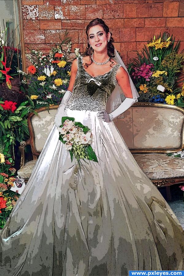
This is a picture of the bride in a wedding dress, I put the main picture over and use poster edge, blending and wrap tools.
Those pictures belong to the author, took by me (5 years and 3921 days ago)
beautiful PIC!!! good luck
yes, a beautiful bride indeed! nice work i kind of like the poster edges
good work. top areas looks real and bottom areas like a water color paintng. Is it intentially did?
Thank you guys, gopankarichal; because of the dress many colors, I did a lot of changes to get to this color, I hope it looks ok because it had so many white spots around from the light over it, I love to try to change if you have an idea in mind. Thank you again.
nice work But.. why did you colourise the frog ...
What Frog sj077? I don't have any frogs around 
so beautiful. good idea and good job author 
awesome !! really cool author!
a wedding dress...over a wedding dress...hmmm goodluck.
Howdie stranger!
If you want to rate this picture or participate in this contest, just:
LOGIN HERE or REGISTER FOR FREE
Beautiful and sad. Glad you explained step 6 in SBS. I was wondering about the opacity of the top section of her body and gown versus the bottom. Best of luck to you.
Thanks I am glad you read that.
Nice concept, but the figures are too big...
hey dis one is really nice,vry touching too......................all da bst
Art imitates life? Graduate student at Yale U. Nice idea but yeah, people are too big. If he were walking across the bridge, the rail would only reach his knees.
This actually made me laugh...I'm sorry if that was not your intent. It made me think of the situation of woman trying to push the man in a relationship for marriage...and 'here she goes again'....
That man is a giant! Good luck! Like the concept.
Just shrink 'em and you'll have a great entry...
I've been gone all day doing photography :p At first I thought this was a foot bridge, but maybe not. I will try shrinking it a bit later.
shrunk... much better. Guess it wasnt a footbridge afterall
Very nice feel. I would make a story out of this image Good Luck
Howdie stranger!
If you want to rate this picture or participate in this contest, just:
LOGIN HERE or REGISTER FOR FREE