(5 years and 3860 days ago)
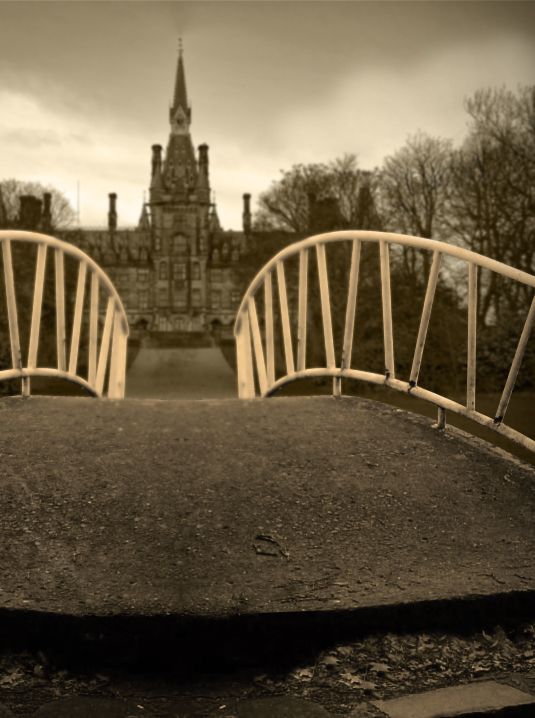
- 1: castle
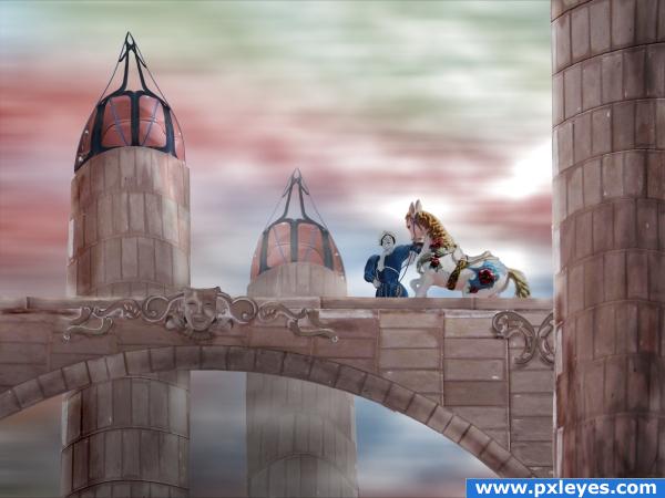
I'm not quite satisfied with the end result, but it has to do for now.
All source. (5 years and 3867 days ago)
Awesome job! Good Luck 
Awesome job!
very nice author
Nice and ethereal.
Author, I like your idea, so permit me to nitpick.  The foreground tower & arch should be darker than the others to create depth, and the tower at front right is leaning in...otherwise it's an admirable effort. Good luck.
very odd in a wonderful way... but the source has so much to offer that this entry really pays tribute to it... good luck!!
Did a wonderful job with a difficult source image. 
Love the colors! Great job! The horse and clown could have had that same pinkish/peachish tone to it but it is still great!
I have no idea why you're not satisfied with this beautiful image!
@ponti: I did a lot of experimenting on the horse to make it more 'drawn' (like the horse and the bridge) -without success. The horse is more 3D/photographic compared to the clown and the buildings. Other (minor) points where the perspective of the towers and the blending of the ornaments. But is was very pleased with the mood of the image.
gratz!
Congrats for your second place!
Congratulations for 2nd
Congrats!
Congrats!!!!!!!
Congrats!
Howdie stranger!
If you want to rate this picture or participate in this contest, just:
LOGIN HERE or REGISTER FOR FREE
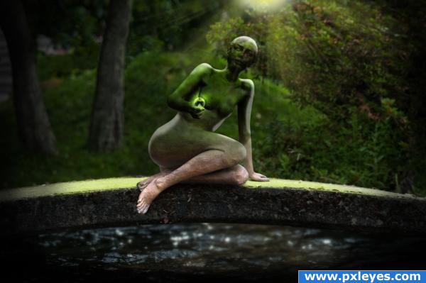
An imaginary place where one decides to be spirit or solid. Transparent or opaque, but not live. Sources noted. Please see high resolution. (5 years and 3883 days ago)
IMHO light above figure could be softer, but it's a good image...


You forgot to remove some of the background between the knees and the arm. Otherwise its really nice..
CMYK thanks for the suggestion. Took your advice. Palaekman: Thanks for your keen eye. Took care of it. 
First of all.. gave you a high mark right off the bat.. but reading your SBS I was like... WHAT Moron gave two right feet to a sculpture (then I looked at the source and got it... LOL) beautiufl image.. but extra high marks for the confusion LOL.))(I scrolled through the steps to fast)
Spectacular work!
i like what you did to the leg! great image 
Nice Mood...Subtle Image
Congrats for your second place, Rob!
Congratulations for 2nd, nice one.
Congrats!
Congrats! Way to go!
Howdie stranger!
If you want to rate this picture or participate in this contest, just:
LOGIN HERE or REGISTER FOR FREE
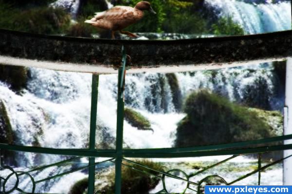
Duck over Trouble Waters
Thanks to Duckworks (funny as it may seem) for the waterfall picture from www.sxc.hu (5 years and 3887 days ago)
Good!
very cool! but i think you cropped too much of the top! there sould be a bit more space above the duck 
very nicely done, but I agree with elficho, the duck is very close to the top of the image.
You will struggle for good results if you use a low resolution image - and make sure that the image you are using is upgraded to 300dpi
Howdie stranger!
If you want to rate this picture or participate in this contest, just:
LOGIN HERE or REGISTER FOR FREE
(5 years and 3888 days ago)
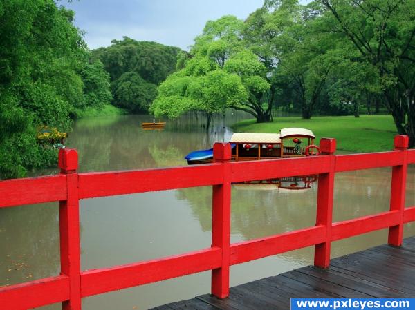
It's nice work but the original source should probably play a more prominant role.
Looks good.
Love the Red Rail... AWESOME
The boat needs a beter blending with the water, the edge is much lighter than the water itself.
the red fence kind of takes away from the beautiful scene behind it. awesome job though!
Allright makes me want to go fishing Author  You got my mood
I like it
what a nice image!
Howdie stranger!
If you want to rate this picture or participate in this contest, just:
LOGIN HERE or REGISTER FOR FREE
Looks good! I'd suggest putting some leaves in the center foreground so you avoid the symmetry of an obvious flip job...othwerwise nicely done!
very nice feel.. the color selection is very 1940's good luck (excellent work)
EDIT: WOW.. the simple crop is SIMPLY EXCELLENT.. makes it even better (thank god I gave you a super high mark to begin with.. hehehe)
This is great! Ditto CMYK...perhaps also darken one of the foreground sides of the cement to further avoid symmetry issues...

EDIT: Really looks great, now. Love the crop and angle now! Looks more interesting to me now!
I cropped the image differently and added some shadows, so that it no longer looked symmetrical. I am happier with the result now, kind of an interesting perspective. Thanks!
I like the DoF you put into it.
Awesome job! *favs it*
Beautiful! Love the mood
The perspective is great! I just like the whole compositon with the castle in the background and especially your colour choice. Good luck!
Howdie stranger!
If you want to rate this picture or participate in this contest, just:
LOGIN HERE or REGISTER FOR FREE