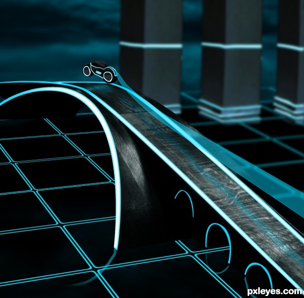
I love disney tron so much so i made my very 1st tron theme artwork . thanks for viewing. (5 years and 3273 days ago)
- 1: sky
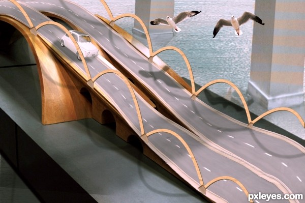
Used two external sources.
1. road
Thanks to http://www.sxc.hu/photo/1357077
Author: camuna
2. Car
http://www.sxc.hu/photo/208909
Author: broken arts
3. Birds
http://www.sxc.hu/photo/1355759
Author: saidoe
(5 years and 3273 days ago)
Try to find a real bird, and un-squish the car. Might want to add shadows to the arches you made, too...
The white lines are crooked and sloppy looking, and the "roads" are not even in width proportion.
Cute concept, but the execution of it needs work.
Thanks for your comments. I made some changes. 
cute.......improve the water at the edges of the pillars 
I see a reflection in the water of the seagull, but I don't think that that should be visible... the shadows are too big, the road is too deformed and the arches need some improvement.
just spotted, the nearest pillar's perspective should be the same as the one behind 
Cool adding the birds to the picture.
Howdie stranger!
If you want to rate this picture or participate in this contest, just:
LOGIN HERE or REGISTER FOR FREE
(5 years and 3275 days ago)
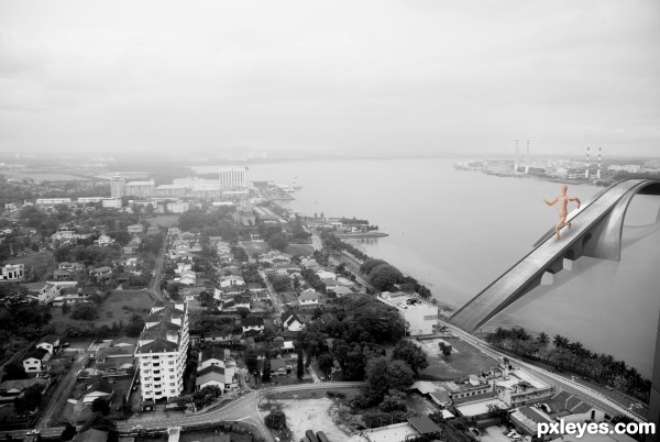
instead of the "guy" crossing the bridge, suggest substitute with ships/boats below it.
take care of the blending of the bridge and background image, so that they look as one.
perspectively speaking, the right side of the bridge should be smaller, since it is the furthest part.
it looks like an old postcard.... nice 
The wooden mannequin ruins the illusion of this piece. He just looks out of place, proportionally and color-wise. I agree, either ships beneath, or a bunch of tiny cars would fit better.
Try to manipulate the point where the bridge touch the land so the vehicles who pass can continue their journey in the road :p. There needs a path becuase it seems that you have not access to the city.
I agree for the wooden mannequin, looks like e giant who has swallowed the colors of the city, and because of him you are loosing the idea of an old postcard.
Good luck.
yep, the wooden figure doesn't fit, try to blend the bridge in to the picture and you should cork a bit on the reflections. in high resolution you can see the reflection details that it doesn't fit.
All the best 
Larger than life concept there.
Howdie stranger!
If you want to rate this picture or participate in this contest, just:
LOGIN HERE or REGISTER FOR FREE
(5 years and 3279 days ago)
Howdie stranger!
If you want to rate this picture or participate in this contest, just:
LOGIN HERE or REGISTER FOR FREE
(5 years and 3372 days ago)
Really nice idea!
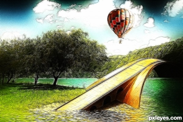
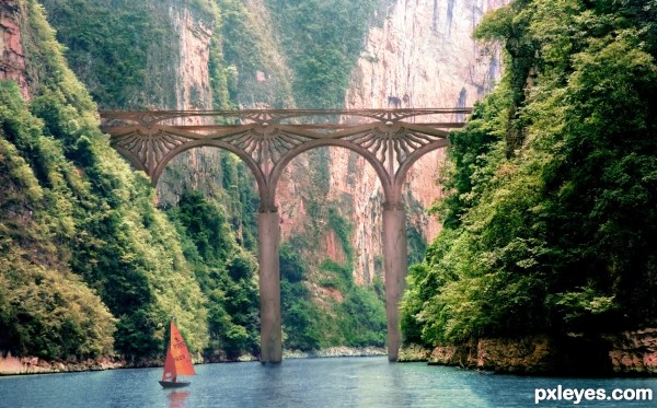
Beautiful concept, but the support beam on the left doesn't look like it goes all the way down to the bottom, much less down into it...
Also, the shoreline on the left has a very dark line of demarcation where it meets the water. Needs a bit of tweaking, but it's still some good work!
i disagree with you MossyB
1. the support column is in the perspective to where the bridge goes
2.the shoreline is not manipulated in any tweaking manner (check the source) the dark line is original
edit: ok darker reflections , lowered the column a bit , not changing the photo 
Very good idea, but Mossy is right, and the reflections could be a bit darker. Still, good work. 
Nice construction. You could overlay a bit of or red & gold for a better blend, and to make bridge stand out, by contrast.
Another thing that would really help is human scale, either people walking on the bridge or a small boat in the foreground. That would make the viewer better perceive the dimensions of the bridge.
very beautiful!
Very nice, GL!
Very cool work author...best of luck
Howdie stranger!
If you want to rate this picture or participate in this contest, just:
LOGIN HERE or REGISTER FOR FREE
GREAT~!
hey Tron... kool.. i liked that movie and so nice to see this in photoshop contest... all the best !!!
thanks mate hehe
the 'road' the far left (near car) doesn't look right. lite blue line should go downwards
Interesting take on the race.
congrats!
Congrats, nice work
OMG thanks a lot guys! HAHA. never expected it,
Congrats!
Howdie stranger!
If you want to rate this picture or participate in this contest, just:
LOGIN HERE or REGISTER FOR FREE