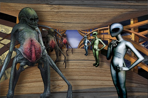
Battle of aliens on the bridge (5 years and 3870 days ago)
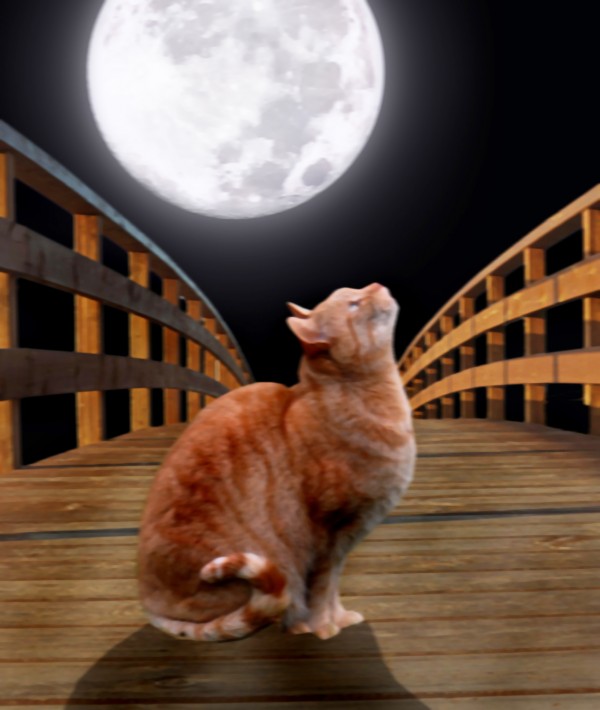
cat who wanted to be a wolf... (5 years and 3872 days ago)
Nice idea, but a lot of hard edges on the cat, rough selections on the bridge, and you could have reconstructed parts of the cat's feet & blurred the shadow...
Agree with The master above masking needs to be worked on.
soften the edges of the cat and the shadow. plus i feel that the cat would be darker from having the light source behind it  hope that helps
I see where you getting at, but work on the right railing on the bridge, it has rough edges. And the cat shadow should be directly in front with the other shadows, and soften a bit. Other then that, great work.
in an attempt to soften the edges i think you just blurred the entire image.. instead try going around the edges with a soft layer mask or eraser so that the fur looks more realistic
I'm not sure what it looked like before but ponti is right. It's too blurry now.
I love what you tried to create... if you not sure what people mean by edge softening etc. feel free to message me and i will explain and give a couple of ideas how to go about it... GL>
Howdie stranger!
If you want to rate this picture or participate in this contest, just:
LOGIN HERE or REGISTER FOR FREE
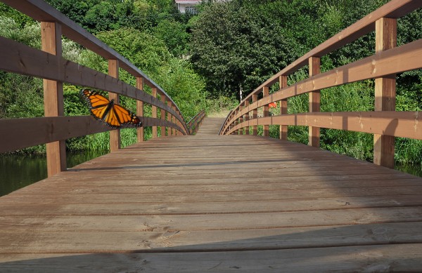
I've used transform tools (floor, railings) for the end of bridge . The butterfly with Gaussian blur and motion blur at low opacity. The rest is obvious.
Edit2: Butterfly shadow.
As I see it now.Light source is from the left and low, 4 o'clock direction.
Adjustments of position, size, tone, saturation and opacity.It is not easy. (5 years and 3873 days ago)
interesting idea, but the butterfly doesn't fit in with the rest of the image in my opinion, but good job finishing the bridge - good luck!!
Agree with Ponti, and shadow of butterfly is wrong...look at the other shadows...
Edit: correction butterfly shadow. I'm not sure...if this is better.
Light source is from left.
CMYK Thanks, now I understand. The projection of the shadow of the railing on the right me confused. As can I correct it.
very nice indeed. but the first 3 openings on the fence on the right still have some of the sky showing .. can't see it on the normal res but the hi res shows . g/l
pretty image.
Howdie stranger!
If you want to rate this picture or participate in this contest, just:
LOGIN HERE or REGISTER FOR FREE
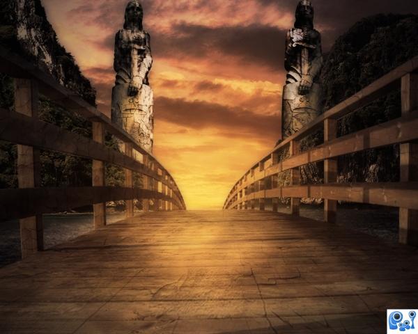
Thanks to Falln-Stock for her wonderful statues (5 years and 3873 days ago)
Nice idea and good colours, but the bridge is blurrer than the statues and I think you should place the mountains and statues lower and reduce them since the bridge is curve and its end probable is lower than the horizon...
I'd flip one of the statues & pay more attention to light & shadow, but nice image...
Definitely flip one statue. They'd look much better facing the opposite way.
Thank you very much all of you, i used dodging and burning to apply light to the figure on the right. Thanks 
nice sbs author !! G/L
reminds "The Neverending Story" - one of the films most affected me in my youth.. i love step 13 in SBS - it's greener and more interesting than final result
I love the feel about your image author. good use of source. 
Congrats for your first place, Matteo!
congrats Matteo! 
congrats! for 1st place.. Very nice color 
congrats
congrats! for 1st place.
Congrats!!
congrats 
Howdie stranger!
If you want to rate this picture or participate in this contest, just:
LOGIN HERE or REGISTER FOR FREE
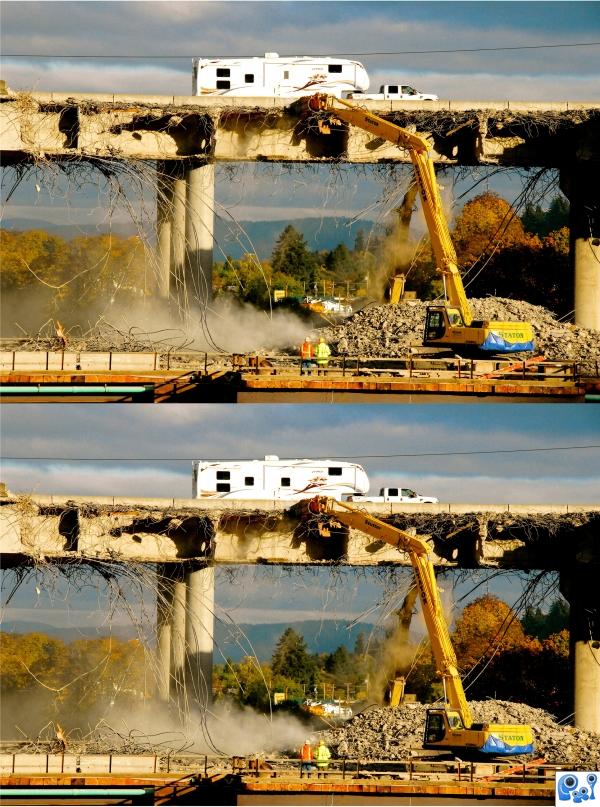
(7) differences.....used personal image (5 years and 3879 days ago)
Howdie stranger!
If you want to rate this picture or participate in this contest, just:
LOGIN HERE or REGISTER FOR FREE
Unfortunately you are not allowed to use premanipulated images in your submission (unless the alien is a real photo which I'd doubt . You will have to create your own aliens and replace these I'm afraid.
Sources look OK now...try to work on the shadows, and good luck now that your image is "legal".

good good
good attempt author.
you weren't supposed to use aliens... the idea is not bad, though
Howdie stranger!
If you want to rate this picture or participate in this contest, just:
LOGIN HERE or REGISTER FOR FREE