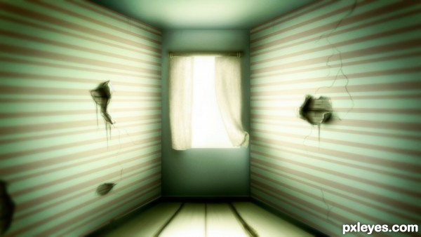
Created everything from scratch. No references/sources were used. (5 years and 3293 days ago)
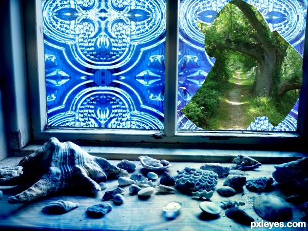
To make this a little fun I hid a butterfly, can you find it? (5 years and 3326 days ago)
The image looks like the glass was broken from the inside - there are no glass shards on the windowsill with the shells... Well done, but a bit confusing.
I know, a bit confusing to me too, lol. But did you find the butterfly?
This look so cool...U did really good job with hard source image...best of luck author
Beautiful work!! And yes, I found the butterfly!!!
I hope it took you quite some time to find it, lol. Thanks guys.
It did! It could only be found in the enlarged high res! Again, wonderful job!
With the amount of green happening 'outside'...I would think there would be more traces of that color showing thru the blue window...but the way you have it is cool...I wouldn't change it. It's more dramatic this way...
A nice idea, and about that butterfly it took me 3 sec, sorry  . It's just cause it's placed in the left side and as soon as you Hi-res and scroll down you see it. It was fun nonetheless, and you made your viewers check the high resolution, which is always a good thing to do.
lol, didn't think about that, too bad it only took you 3 seconds, I was hoping for at least 5 = )
And thank you all for all the nice comments, and I agree with the green, I did add some, but not enough I think so too.
Great concept and well done ... I found the butterfly ...it took me a little longer than greymval but not too much. I was very methodical about it and definitely has to High-high res to locate it! Lovely work! Bravo!
I am surprised this didn't do better. Lovely concept ... maybe it was too subtle. I think a lot of people don't view in Hi-res and in this picture it was very important to "see" it. Anyway it is a winner in my book!
Howdie stranger!
If you want to rate this picture or participate in this contest, just:
LOGIN HERE or REGISTER FOR FREE
(5 years and 3344 days ago)
Very good idea!!
thanks.. still learning to enhance my skills.
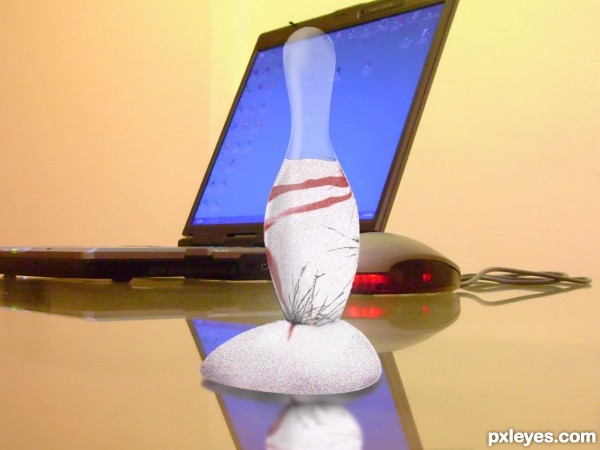
The idea is cool, but execution can be improved- maybe having an environmental that would complement not compete with the main object, and fixing that reflection would help.
You could try to see how reflection works for that type of shape either by using a 3d program or by pouring flour on a mirror in real life and taking a pic of it.
thanks for your comments greymval.. i hope i will learn more from this site to improve myself..
cool idea...gl
thanks
Howdie stranger!
If you want to rate this picture or participate in this contest, just:
LOGIN HERE or REGISTER FOR FREE
(5 years and 3421 days ago)
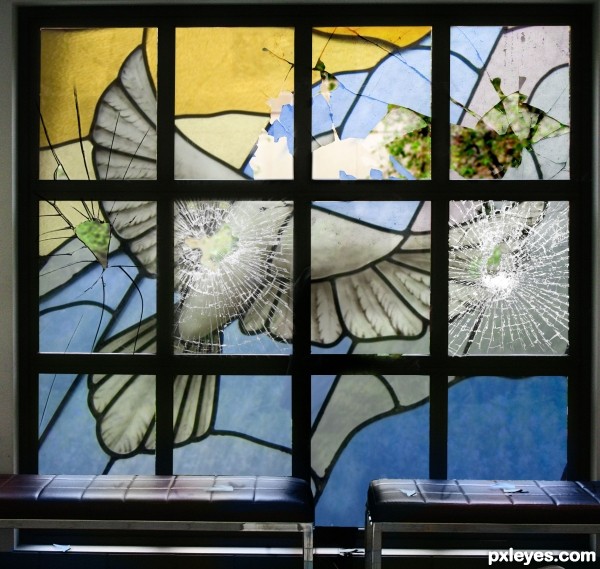
Except for the foreground, it's not a bad chop. The only suggestion I would make is blur the foreground just slightly. It would give it more depth. In high res, some edges could use some touch up but only noticeable in high res. GL!
Good idea author!! Now I personally have never tried to make glass shards but to me they look like they lack depth...kinda looks like paper and not glass....Hope that makes sense  Best of Luck
It might look better without them.
Thanks, removing them in a moment.
In real life, if you have an window like that, when a part of it is broken the craks are only on that part, they cannot extend to the other pieces, for example the midle left piece, the crack should not extend up or down. I hope you understand my point of view.
OH NO! JOSH! THEY BROKE YER GLASS!! hehehe  Good work here.
Author final product is very very nice...I don't agree about glass shards...think they made very well but that is MHO...maybe u could create some rays of light passing through holes to achieve more effectiveness...Any how...high marks from me
@ MnM FunnnAY!!! 
good work author........
Awww, thats not nice! I mean the image is, just what happened lol. Great job at achieving that effect.
Howdie stranger!
If you want to rate this picture or participate in this contest, just:
LOGIN HERE or REGISTER FOR FREE
(5 years and 3421 days ago)
nice work...gl
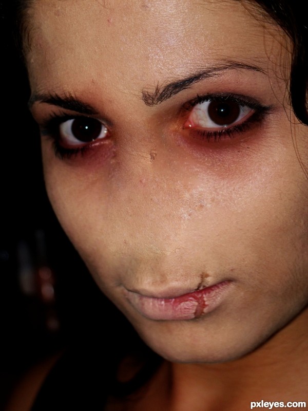
Nice blending here.... it seems that she was born without a nose... good luck author.
Very realistic.
Howdie stranger!
If you want to rate this picture or participate in this contest, just:
LOGIN HERE or REGISTER FOR FREE
wow beautiful work
awesome!!!!!!!!!!!!!!!!!!!!!!!!!!!!!!!!!!!!!!!!!!!!!!
hehe.. right out of the Matrix.. good luck author
Very nice! Simple yet very effective!
Super cool work author...GL
I like the glow effect in the room =)
Howdie stranger!
If you want to rate this picture or participate in this contest, just:
LOGIN HERE or REGISTER FOR FREE