(5 years and 2770 days ago)

(5 years and 3035 days ago)
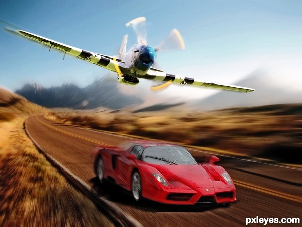
Cool race! My money's on the plane, tho. Nice job, author. 
Cool car Nator, that Ferarri F140 V-12 Enzo is giving that supercharged V-12 Packard Mustang a fit down low @ nearly 330 km/h. Yeeeeeeeeee Haaaaaw! 

well done -- nice work on the motion -- really gives it a sense of speed
Congratulations! 
Congratulations, great shot
Howdie stranger!
If you want to rate this picture or participate in this contest, just:
LOGIN HERE or REGISTER FOR FREE

All pictures added are mine. some of the snow was created with the help of this tutorial > http://www.photoshopessentials.com/photo-effects/photoshop-snow/. Additional smoke was added with a cloud brush created thanks to > http://www.tutorialized.com/view/tutorial/Clouds-Tutorial-By-Genny/64650 (5 years and 3089 days ago)
Please view high res. I took the name from one of my favorite Dire Straits songs.
By the way, after I published I noticed the previous entry used the same snow tutorial, Purely coincidence, but a great tutorial! 
Yes, it really should be viewed in Hi-Res!
Godd work! 
the people should of been blended better just a bit more, the colors of the men seem cooler than the image itself.
Howdie stranger!
If you want to rate this picture or participate in this contest, just:
LOGIN HERE or REGISTER FOR FREE

With thanks tothe following:
Playground by Agrid
Legs by klsa12
Ball by IJeyash
Boy by Annalog85 (5 years and 3602 days ago)
its a nice image but there are a few odd things about it... the lighting of the steps doesn't match the light cast on the figures (maybe flip the steps horizontally) i dunno if you meant to do this but the perspective is way off, as the figure on top should be much smaller. also since im picking nits, the child with the ball looks transparent around the boarders
Krystian - that's one mighty comment! - so one by one - the lighting on the steps - yes, but the figures have been flipped so much that they are dizzy! - well the little girl is anyway! Regarding the perspective, well, I'd love to say "yes I wanted it like that" but that would be lying! I'm not good with perspective, but on the whole I didn't think this one was too bad? (Obviously it is...) I will point out that the figure at the top is an adult and therefore meant to be bigger. And lastly that poor transparent child-yes you're right she does look it ,but honestly - she really isn't!
Nice concept, but the tiny steps at the top of the image don't really match Papa's big butt. Also the right-side railing's shadow that nearly covers the stair steps is at odds with the lighting of the upper two figures. And the left railing seems higher than the right railing which is unexpected.
DanLundberg - I see the small steps and the big butt......but - he had to squeeze himself on there to keep an eye on the children! The rest of your comments I take on board. Oh, and I owe an apology to Krystian - poor child WAS a bit transparent, I've doubled her up now and given her a good meal - she looks better now I think. She says she certainly feels better......
nice idea ........ 
Your biggest problem is that the dad is sitting with his ass like 12 steps higher than his feet are. So his legs are about 4-5 meters long? 
Ressiv said ass... giggle snort.. Very nice concept author.. good luck!!!
GL to you!!
Howdie stranger!
If you want to rate this picture or participate in this contest, just:
LOGIN HERE or REGISTER FOR FREE

thanks to Falln-Brushes on Deviant art for the smoke brushes. (5 years and 3641 days ago)
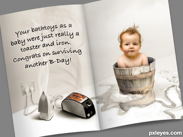
hehehe.. AWESOME... nit pick.. SURVIVING not serviving (that would be like you would be serving the baby up for dinner.. hehehe.. which is pretty funny in it's self... GOOD LUCK
EDIT: Excellent.. very very cute entry.. it's really difficult to show a card with a front and a back... but I believe this will be a fun contest... 


Thanks Drivenslush! I knew I was missing something just didn't know what.
Goooood 
"Good" idea, well blended! Would be nice if you could bend the text so it would look as if it was on the card rather than above it.
Thanks dusfinger! Adjusted accordingly.
i like it
Yes, certainly better now!
Very cute although not offensive.
Super cute..  hee hee
This is well thought out and a pretty picture but the toaster and electricity plugs are too distorted
thanks lchappell, you are absolutely right. I missed the plugs distortion problem but I believe the toasters distortion is from the skew in the paper. Thanks for pointing it out.
GL
so cute! great idea... gl 
nice job
Congrats for your third place, Chalty!
Congratulations for 3rd
Congratulations! 
Congrats!
Congrats !
Congrats on 3rd 
Congrats!!!! 
Congrats!!
Howdie stranger!
If you want to rate this picture or participate in this contest, just:
LOGIN HERE or REGISTER FOR FREE
Howdie stranger!
If you want to rate this picture or participate in this contest, just:
LOGIN HERE or REGISTER FOR FREE