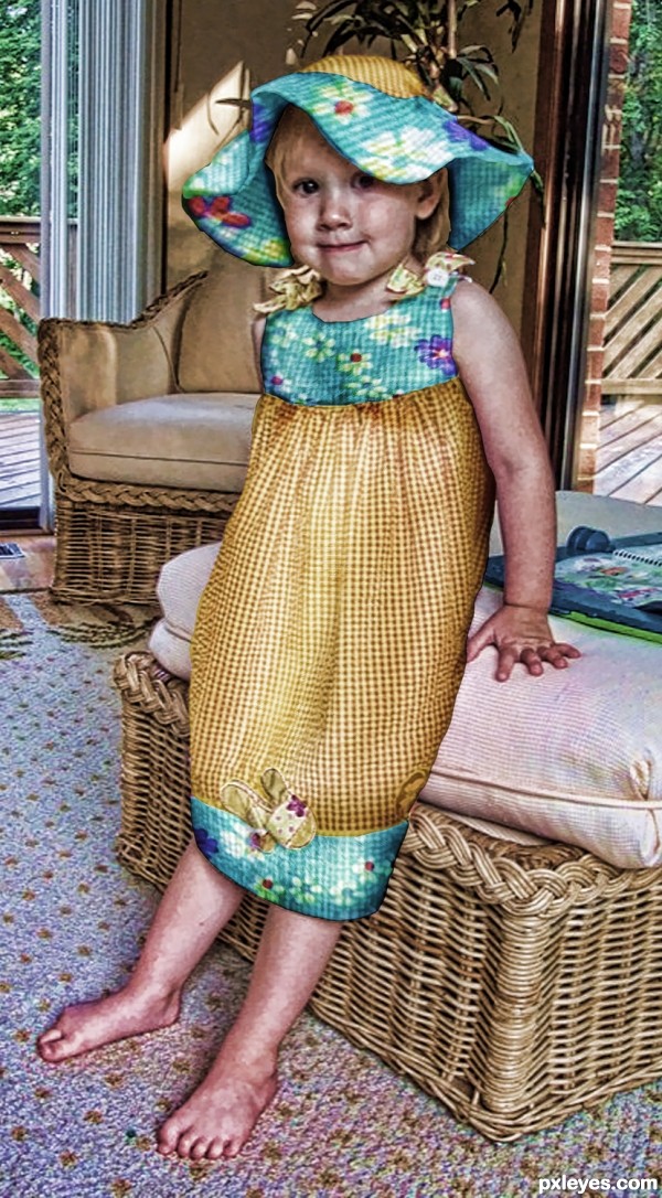
(5 years and 2939 days ago)
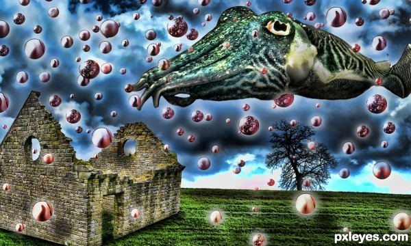
(5 years and 3001 days ago)
Yes, great work, and I'd like the name of your pharmacist! 
Totally psychedelic, good work as always! 
Howdie stranger!
If you want to rate this picture or participate in this contest, just:
LOGIN HERE or REGISTER FOR FREE
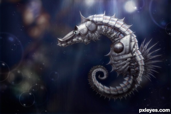
I knew I wanted to do this contest but it took me a long time to deiced what. I was almost going to but armor on a regular horse, but that just seemed to typical, then I realized I was just thinking of the wrong type of horse :) (5 years and 3171 days ago)
very nice armor design, top three for sure  !
!
Very cool
Very cool
this is great!
You've made the right decision imho,putting armour on a sea horse is original 
very elegant! Good LucK
Thanks everyone!!!! so glad to hear all the positive feedback 
great job good score.

Fantastic
Great choice, fantastic outcome! 
Always a pleasure to see your work! Wonderful entry!
Fantastic work author ..GL!!
wooo! this is amazing! beautiful.
Congrats!!
Congrats again Robert,  absolutely stunning work
congrat
Congratulation again 
Congratulations ! 
Saw this on the front page. Its brilliant! Congratulations! 
Why thank you!
first of all congrats!
You may not like what i am going to say...
the contest is to armour creatures, although your creation is great, the seahorse is fully-covered and there is no hint of the original seahorse.
it is a case of re-working based on the shape of the seahorse and not "armouring"
the other two entries are not as perfect as yours, but theirs are closer to the theme.
my hat's off to your art though  I don't think I can top that easily...at level 5 only
Howdie stranger!
If you want to rate this picture or participate in this contest, just:
LOGIN HERE or REGISTER FOR FREE
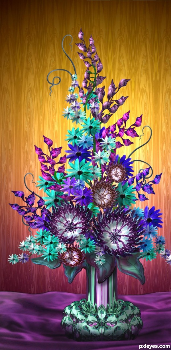
Just the source is used in this entry for the container, all the flowers, and the background. Please see SBS for all the details. (5 years and 3214 days ago)
unusual colors for flowers :O
Beautiful.. really beautiful.. I would really love to see this with a reworked back ground.. ( the bottom only.) Now it looks less detailed than the top... only a suggestion... good luck to you
Beautiful colors, GL!
hereis, Thanks for your input. Really appreciate it. I lowered the backlighting to put more light toward middle and bottom, but don't want to let background over power the main part of image
Kid, I don't know if there is a color that you can't find in flowers these days - even black. What doesn't come naturally, florists will spray to get desired colors. .
I love the imagination combined...
Love the blossoms but the vase is really one of a kind 
Beautiful as usual, but I especially like those large lower leaves and the fabric behind the vase. 
This is sooo beautiful!!
Beautiful flowers...as usual.... Congrats for fourth.!
Howdie stranger!
If you want to rate this picture or participate in this contest, just:
LOGIN HERE or REGISTER FOR FREE
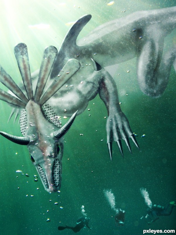
Protecting his submerged vestiges in the North Pacific Ocean, near the ancient city of Tehuantepec, he attacks clueless divers and treasure hunters.
(5 years and 3229 days ago)
I don't get it (good score).. just don't get it
I just made a description for fun it started like an Aztec submerged site hauted by a monster who's the reincarnation of an ancient leader - and from there it evolved.
nice nice
unless you were thinking Montezuma's Revenge? that would make a whole lot more sense
I don't know, I was never good at making titles. But of course I can change it if anyone gives me an original suggestion  . Montezuma's Revenge sounds good, but it's taken.
(montezuma's revenge is Diarrhea author.. ) oh lord.. why do I try
LOL, that too! Thanks for stopping by !
Edit: changed name to Diverhunter so it won't be associated with the crappy video game 
love the colors the lighting and the overall construction of the monster, good luck !!
Thanks nanaris & andi. It feels good to know, that there are people who get and like my entry and that my efforts are appreciated 
You've done a good job on this. I think it might look a little better if your creature were more the tone of the water like those divers are. Just my 2 cents...nice work.
Thanks for the comment, i'll give it a try, but i especially made the creature white so it stands out more, like a big shark.
Made a slight blend adjusment, you can see the before in the SBS. I can't guarantee you ll notice a difference since it might also dependsof your screen.
great work author!
I really like what you've done author! Good work!
This entry was dedicated to Drivenslush for helping me get through my laziness. I managed to instal Ps3 and create this entry using multiple psd files so that my laptop could handle the memory. It was fun, thanks again Drivenslush.
Howdie stranger!
If you want to rate this picture or participate in this contest, just:
LOGIN HERE or REGISTER FOR FREE
Howdie stranger!
If you want to rate this picture or participate in this contest, just:
LOGIN HERE or REGISTER FOR FREE