
A logo for the National Bull Breeding Association (it was too long for the title form field) inspired by the logo of the NBA. (5 years and 3315 days ago)
(5 years and 3334 days ago)
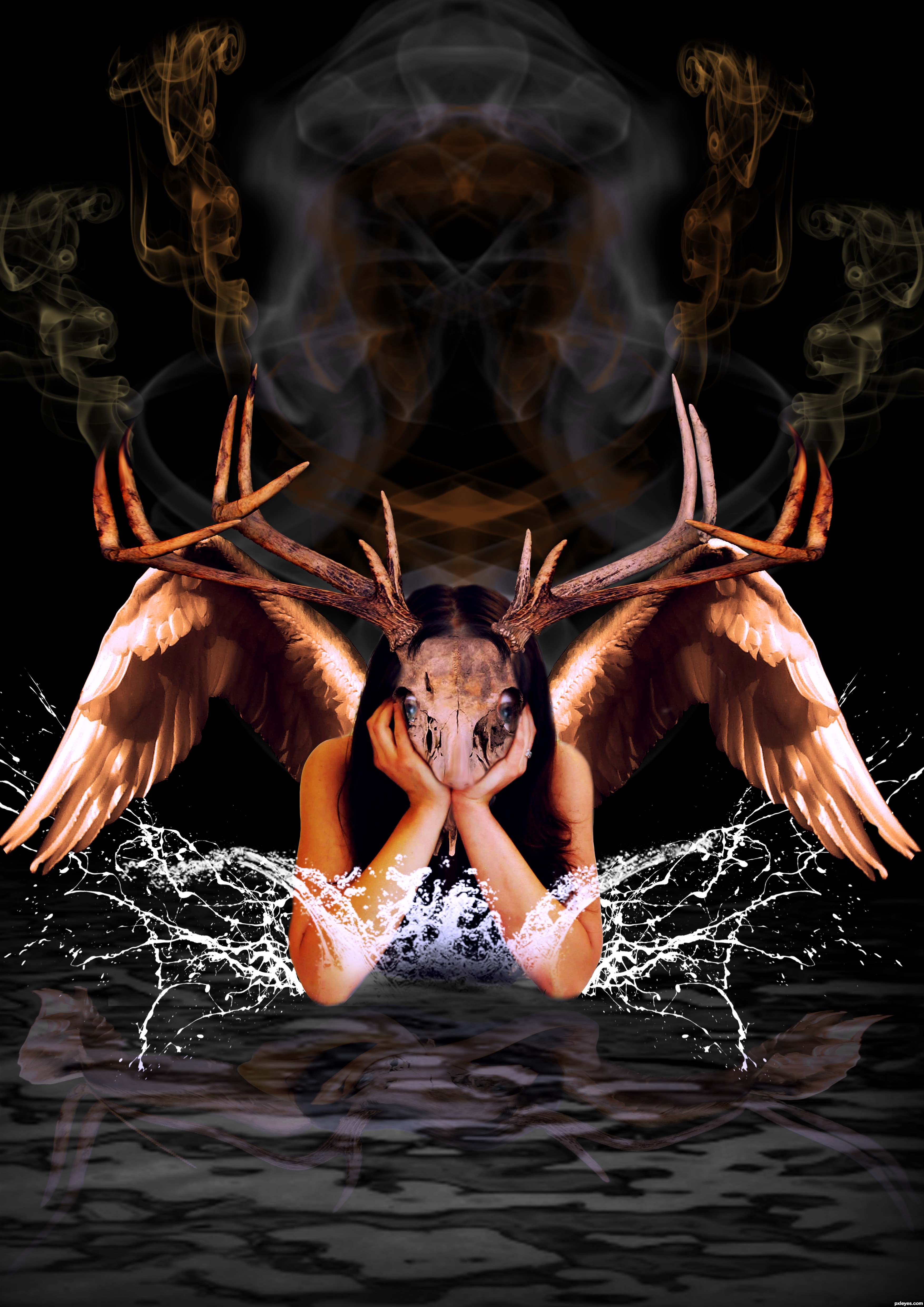
some fade and burn to the water splashes might help for the blend (maybe just blur).. but that is just IMHO.. it's a very inventive chop.. good luck!!!!!!
EDIT: my favorite part is how the face is mooshed into the hands.. it's WONDERFUL!!!!!
thanks driven
Interesting/moody/dramatic but I think the near-perfect symmetry of virtually every element is excessive (i.e., too mirror-like) and ends up detracting from the potential impact of the central figure. The contrast of a largely-symmetric central figure situated within a somewhat chaotic environment would be more compelling IMO.
woooow danlundberg talk inglish so i can understand you hahahahaha but thanks
Howdie stranger!
If you want to rate this picture or participate in this contest, just:
LOGIN HERE or REGISTER FOR FREE
(5 years and 3530 days ago)
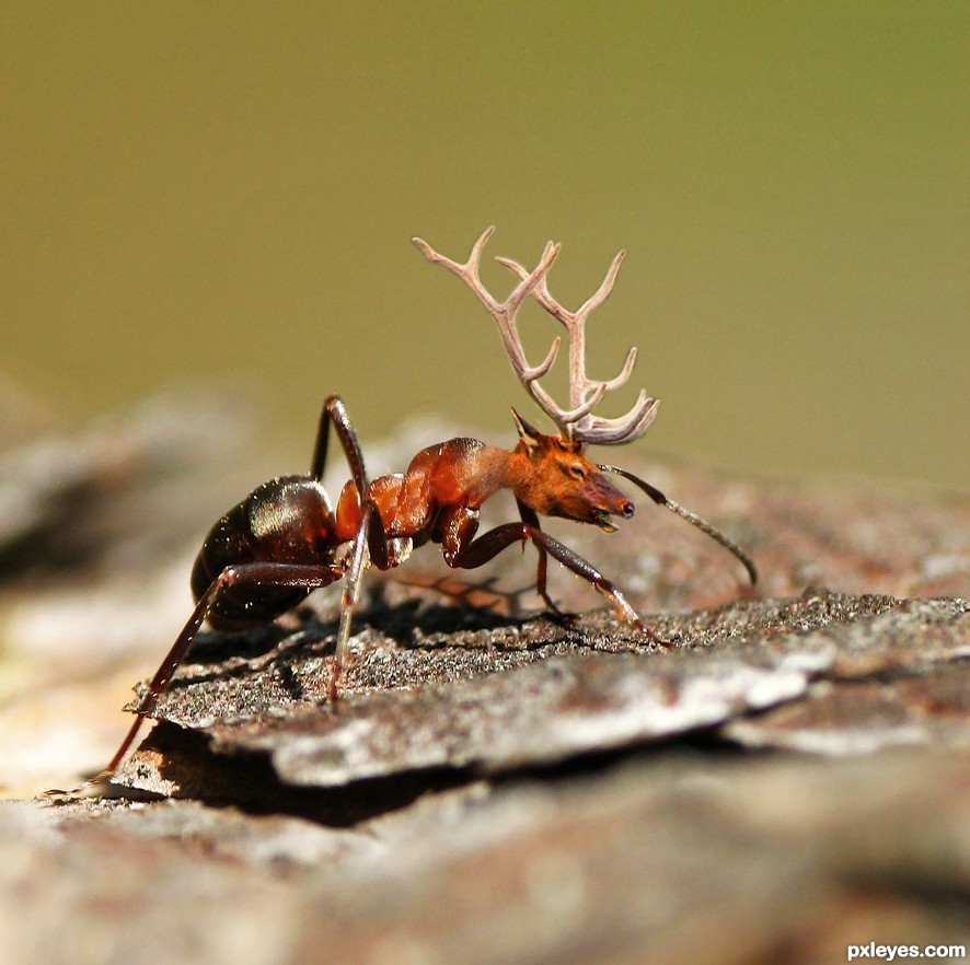
nice! i wonder if Santa can make it to the town with this "Insect-Deer" 
I think it's cool, good blend.
Stunning! 
good work author...best of luck
Howdie stranger!
If you want to rate this picture or participate in this contest, just:
LOGIN HERE or REGISTER FOR FREE
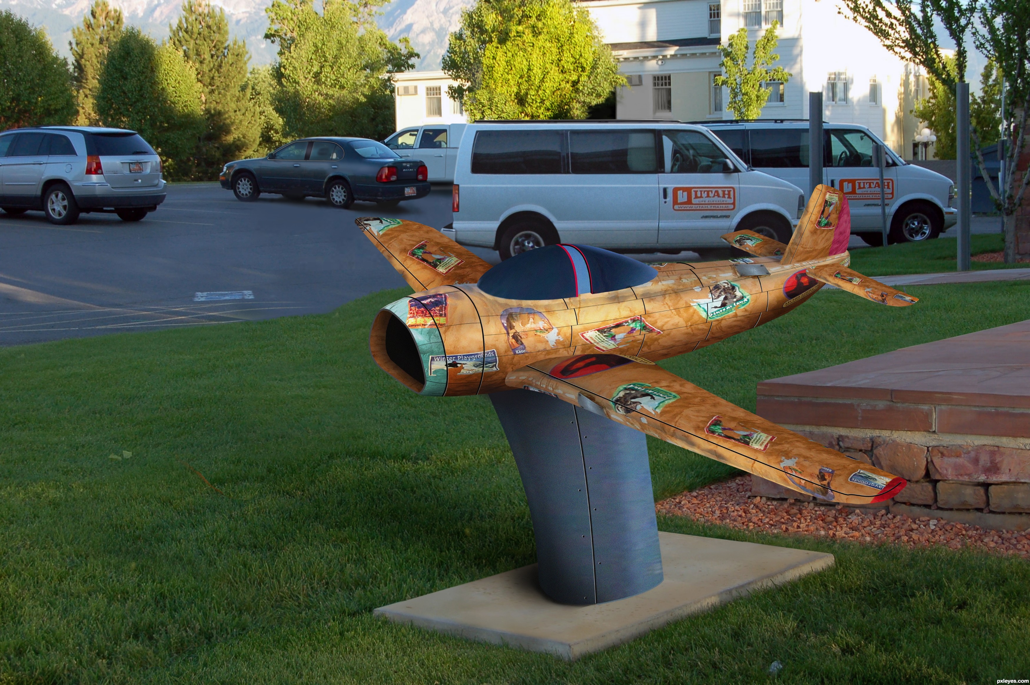
Source image only used
Highrez will look far better then the smaller one (5 years and 3599 days ago)
Well crafted! Canopy is too opaque, and plane is too small, but nice job.
Very nice work on the background == aircraft is also very well done
Both good points, Gonna say its a statue of a plane that covers the black canopy and its size . Van was a pain to make I don't wanna cover it with the plane hahaha.
Yep, gotta say great job on making the van. Making the plane bigger woulda saved you all that trouble and given your pic a better focus...so whaddya wanna look at, the van or the plane?
"De plane, de plane...!" Geez, does anybody even remember that little dwarf? 
The fantasy island guy lol?>
Yep, that's the guy!
LOL Tattoo!!!!!!!!!!!!!!!!!!
Creative response to the travel labels on the bull source. The near van maybe should be a tad bigger as it's closer than the next van. The view through the windows of that near van is not of the van beyond it, and the rear end of that van might benefit from some feathering to transition better into the background. The cool plane sculpture needs a stronger shadow (including from the near wing) consist with the brightness of the highlights on the the fuselage and the darkness of the shadows of the cars in the parking lot.
Great cloning and construction work
great work ! looks like a cross between a Mig 17 and a F-86
Really cool plane construction and interesting pink color on the tail part. Incredible reconstruction of the van, too. LOL @ the part 'pissing you off'!
so much fun!!! (your SBS is AWESOME)
Great construction author...best of luck
People, it's perfect, the plane, the background, everything is cool. 
Amazing! Looks so realistic
Nice chop! Very nice work! GL!
Congrats! for 2nd
Very well done, congrats on your second place win!
congrats.....
Congrats IRONCOW !!
Congrats... for second...nice work.
Thanks guys
Congrats!!
Congrats...great work...
Congrats ironcow! Deserved placing.
James, that's it! Congrats!!!!!!
Howdie stranger!
If you want to rate this picture or participate in this contest, just:
LOGIN HERE or REGISTER FOR FREE
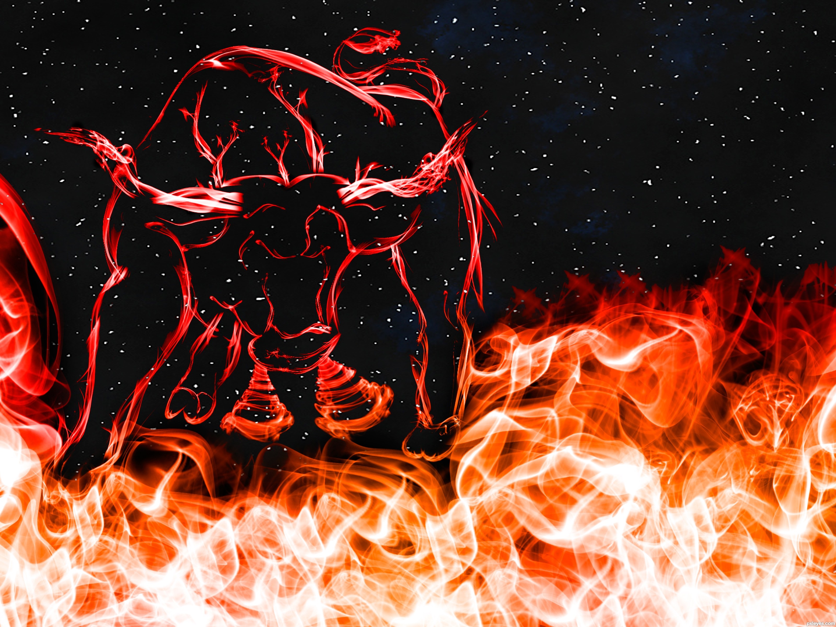
Except background only source image used. Please see SBS and I hope you like it :) (5 years and 3693 days ago)
That is awesome! I think it would look a lot better if you made your own stars though. There are lots of tutorials here on PXLeyes and elsewhere that can help. That source for the stars is just so faded and not clean. good luck Author!
beautiful work ........ all the best .............
Very very nice work author...good luck
Nice work and the source is still visible! GL!
GL to you!!
Congratulations for 3rd
Well deserved place, cngrats !
congrats .............. 
Congrats!!
congrats!
Congrats Mario
Congrats!
Congrats!
nice colours... congrats...
Congrats Mario ^^
Howdie stranger!
If you want to rate this picture or participate in this contest, just:
LOGIN HERE or REGISTER FOR FREE
Photography and photoshop contests
We are a community of people with
a passion for photography, graphics and art in general.
Every day new photoshop
and photography contests are posted to compete in. We also have one weekly drawing contest
and one weekly 3D contest!
Participation is 100% free!
Just
register and get
started!
Good luck!
© 2015 Pxleyes.com. All rights reserved.


Simple and straightforward is good, except I think you wimped out on that with the pale gray instead of text-white for the bull silhouette and border which reduces the overall impact as a result IMO.
Thanks Dan, you're right! So I changed it and I think it's better now.
Howdie stranger!
If you want to rate this picture or participate in this contest, just:
LOGIN HERE or REGISTER FOR FREE