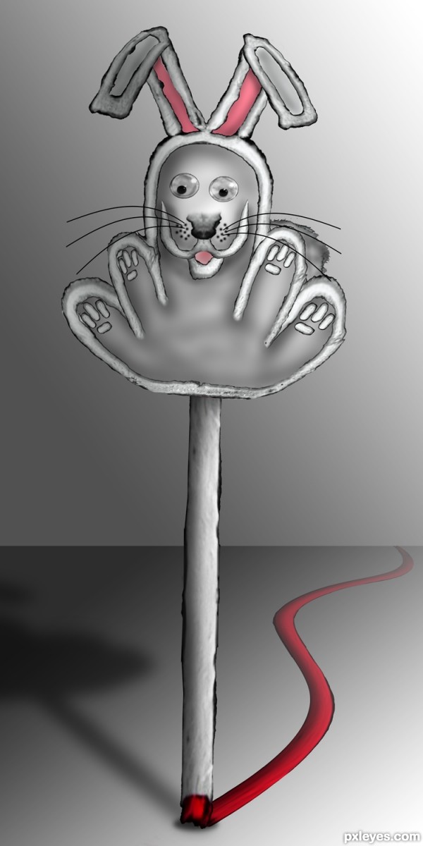
All Source (5 years and 3193 days ago)
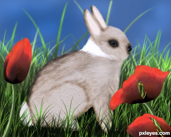
(5 years and 3240 days ago)
Cute little guy. Nice work on the grass and the tulips....good luck.
Sources?
I have only used the source pic and custom shape and brushes in CS5.
See SBS 
wonderful work!
Thank you George55 and Androla 
He is sooo cute!  Good work! Best of luck!
Thank you Olga 
good work
Thank you kushpatel 
Great work on the fluffy bunny but I really like the grass and the tulips. Well done! Good luck.
Thank you Fabter 
Picture before jump.. 
cheers!
Thank you fille 
Howdie stranger!
If you want to rate this picture or participate in this contest, just:
LOGIN HERE or REGISTER FOR FREE
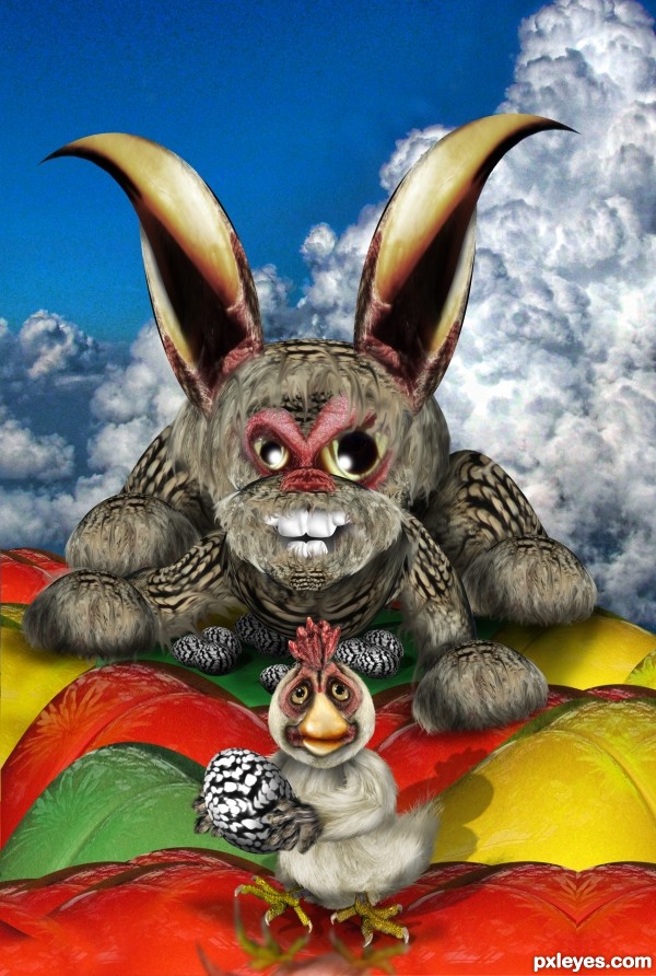
From a chicken's Point of view (5 years and 3277 days ago)
LOL!
Howdie stranger!
If you want to rate this picture or participate in this contest, just:
LOGIN HERE or REGISTER FOR FREE
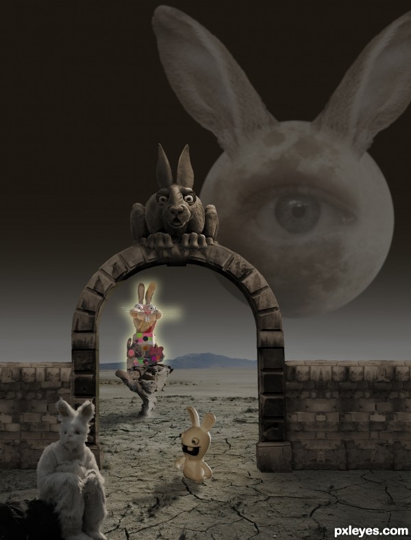
As the crazed Bunny Demon looks on eagerly, his minion beckons the weary traveler... (5 years and 3410 days ago)
Lot's of bunnies in this one.
Is five bunnies really a lot? 
(I had versions with even more...they sucked. You should be glad I spared you!).
Not only that, but I had to re-make the entire pic cuz I foolishly used a source that had to be replaced.
Quite fun. There are some lighting/shadow inconsistencies, however. The archway's shadow isn't as strong as that of the feisty rabbit. The shadows indicate that the light is coming from the back, yet the front of the archway and wall seems lit. I also think the moon thing should be brighter.
This pic went through countless versions. Dan, I appreciate your comment as always. The light source is off canvas to the right, it's not the "moon thing"...the archway wall is visible of course, but not exactly "lit"...and if you compare the strength of the feisty rabbit's shadow and the wall you'll see they're the same. If the "moon thing" were brighter, it would be overpowering.
EDIT: Dan, I have to thank you again! Now there's a highlight on the inner left edge of the gateway that helps establish the correct lighting. 
Where did the eye in the moon come from, is there a source missing?
otherwise, very intereting concept, author - appropriate title. 
Eye
http://www.imageafter.com/image.php?image=b1eye01.jpg&size=full&download=no
How incredibly effin' silly of me to overlook that.
what a nice, crazy, interesting and funny creation...best of luck
Howdie stranger!
If you want to rate this picture or participate in this contest, just:
LOGIN HERE or REGISTER FOR FREE
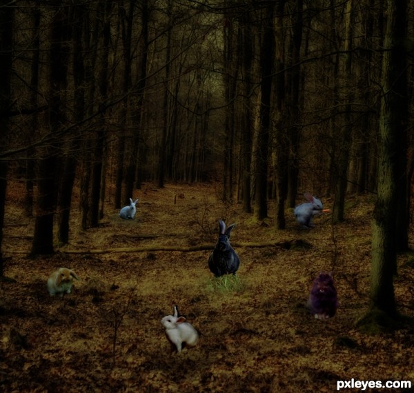
(5 years and 3413 days ago)
nice idea... but try to work on the lighting author... the gal has the sharp highlight and shadows, while the forest isnt showing any signs of light in tht direction... even the lighting on the bunnies contradict the lighting with gal....
also try to check the proportions and scaling of bunnies and gal author as it is the one which shows the distance of the obectsj from camera and also the real size of the objects...
not tht i am gr8 at it, but i feel the bunnies can be smaller in size....
and once lit well you can add shadows to appreciate the lighting... and there is always the scaope for improvement...
hope my suggestions is of any help to you.... 
Completely agree with closedeyes
Too dark, and the edges around the bunnies show too many stray pixels and are too sharp, giving them a definite "'cut and paste" effect.
Lots of shadowless bunnies in this one...
Man if you need help with shadows & stuff send a PM to the commenters ( the ones before me) they will help you.
Howdie stranger!
If you want to rate this picture or participate in this contest, just:
LOGIN HERE or REGISTER FOR FREE
Cool
Howdie stranger!
If you want to rate this picture or participate in this contest, just:
LOGIN HERE or REGISTER FOR FREE