(5 years and 4011 days ago)
- 1: Thanks
one outer source used.
Thanks to www.sxc.hu
and
Author: Sias van Schalkwyk (doc)
(5 years and 4012 days ago)
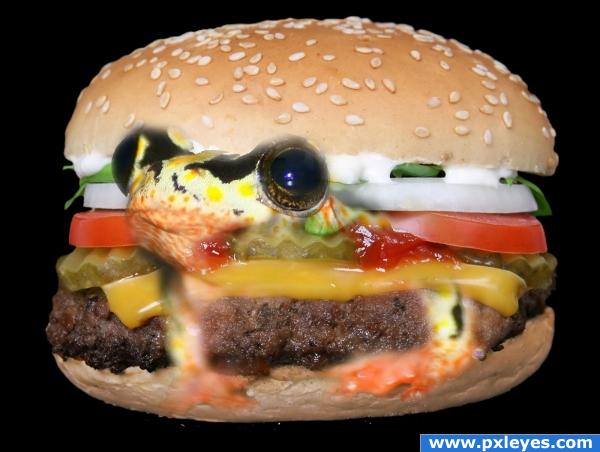
a see through frog?
frog not fixed propperly
blury
The effect really doesn't sell. Try watching or reading some blending and masking tutorials. Good luck!
I know what you trying to do and it wuold work but the way you have done it is just not working sorry 
its a little blurred
The frog looks a bit "fuzzy" (especially around the eyes). Also, he doesn't seem to actually be a part of the sandwich but rather floating in front of it. I would take the frog's head and blend it in to the piece of hamburger meat, changing the color of either appropriately. Maybe you could even stick a frog leg or two in there. Great start, and once you get some more polish on this it will be a great (and funny) piece!
Yummy!!!!
too alive for me to eat... 
Howdie stranger!
If you want to rate this picture or participate in this contest, just:
LOGIN HERE or REGISTER FOR FREE
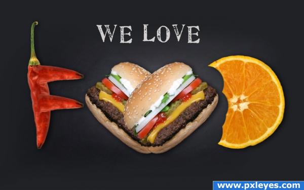
I have used only the basics for creating this image.I applied Gaussian blur in the background. I downloaded some images from cgtextures.com and used them.
This is my first image in pxleyes so correct me if I am wrong. (5 years and 4012 days ago)
very nice.. good luck
i guess its pretty cool
nice work
i'm really not sure about this one... it's a nice image, but the source itself really hasn;t been changed too much.. i suppose that isn;t the point. Myabe to make it more interesting put it as the name of a restaurant, or on a street sign or something.. i just lacks something, but i'm not too sure.
nice work, good luck, but you will find since you are new here that the winning entries are usually much more detailed and more work goes into them. Good luck thought 
good idea
Love the idea, but the burgers should be separated a bit more. As it is, it looks like you are trying to form one letter with the two of them (instead of "oo", it looks like "v" . Still, nice idea and I love the pepper "f"s. All the best!
FUD? fear, uncertainty and doubt? 
I think you should have manipulated the source image more... it appears to me like you just added some extra stuff to it 
Howdie stranger!
If you want to rate this picture or participate in this contest, just:
LOGIN HERE or REGISTER FOR FREE
(5 years and 4013 days ago)
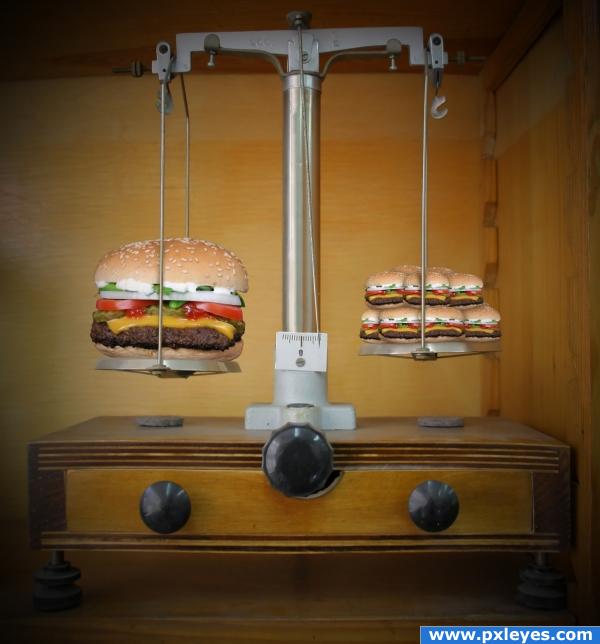
very good work and the combining of two sources.. extemely well done (I'll take three little ones, fries and a Coke) I'll get the big one for my 22 Year old nephew.. he could eat a truck and ask what's for desert.. hehehe.. great job
Good!
cool
lol nice work I like the humor of this piece.
nice
good
nice
hmm... goo job but idea don't work for me much...  but technically very good!
Howdie stranger!
If you want to rate this picture or participate in this contest, just:
LOGIN HERE or REGISTER FOR FREE
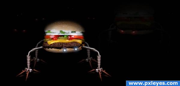
Changed it up a bit....watch your back! (5 years and 4013 days ago)
make a baby one looking up at him..LOL.. that would be the bomb... good work author (don't mind me.. I see things in my minds eye all the time and I just spit it out LOL)
I love the robot burger! Not sure if it's twin/reflection is necessary, though. As Golem said, maybe a baby burger (like a slider!) looking up at him would work a little better. Still, nice work author!
AHHHHHAHAHAHA love it
is that a reflection or his "evil brother"? either way, it's feet should be more visible, and its top (the bottom of the image) less visible.
good work, but reflection not ok
check high rez! ^^
Good Luck.
good idea
Excellent image and idea

 very UFO!
Howdie stranger!
If you want to rate this picture or participate in this contest, just:
LOGIN HERE or REGISTER FOR FREE
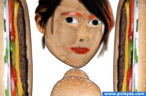
It's a very nice idea, but you left so many areas white, you need to go in and make sure that you don;t leave any blank areas on the woman or on the hamburger itself. Good luck!
good work
Nice work on the face, I am not sure about the burger walls and 'neck?' If I were you I would crop everything away except the face.
hmhmhmhm
good
I would ditch the burgers on the left and right hand sides and just go with the face. Its a great image, and I think focusing centrally on that would get you better scores/look more impressive. Nice job!
i want to bite it on the face!
Howdie stranger!
If you want to rate this picture or participate in this contest, just:
LOGIN HERE or REGISTER FOR FREE