use source image only (5 years and 4019 days ago)
mods., Remove this.,
Even i don like this one ., so removing it., :D
(5 years and 4020 days ago)
oooookayyyyy .. err umm Author.. slowly back away from all the sharp objects in the room..slowly.... slowly... no sudden moves LOL..
Gives new meaning to 
good add
good luck
good marketing idea
While I applaud your originality and apparently great knowledge of puns I must say that there are quite a few issues with this piece that could be improved upon. For one, the hammer's perspective is a bit off (the way you have it makes everything above the onions appear to be in the background and not on the burger). The white confetti banners at the top of the screen are a bit odd as well. I would either lose them or add more with different colors/shapes. Also, your typography at the bottom of the screen needs some improvement. The font choice is wrong for an "ad" and the grammar is quite...
...bad. I would rewrite it so it read more like this: "Call 911 and say "I Killed Adam" to get your free burger today!" There really is no need for three exclamation marks  at the end of any sentence. Also, put "911" in red instead of green as red is a color of intensity and emergency. Other than that, the words "Just Free!!!" confuse me a bit. If you are trying to create a special giveaway for this product I would phrase it differently so that it was easier to understand (just the word "Free" would even suffice). All in all I think you have a lot of potential with this entry if you choose
to give it another look. But whatever you do, don't give up! Every comp you do will get better and better and you'll eventually realize that what you are making is really incredible. All the best!
i'm sad i didn't saw this...
Howdie stranger!
If you want to rate this picture or participate in this contest, just:
LOGIN HERE or REGISTER FOR FREE
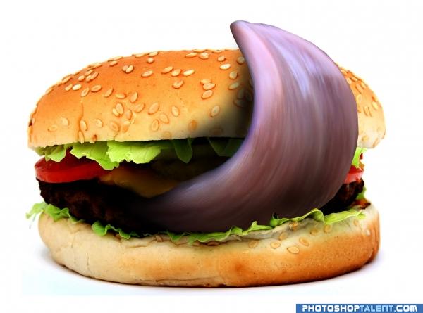
IT'LL TAKE SOME LICKING !!! (5 years and 4041 days ago)
good work
Absolutely stunning... I'm going to give you extra special high marks for NOT incorporating the nostril.. THANK YOU THANK YOU THANK YOU.. I couldn't have taken that LOL
LOL

It is very good work, well done 
Wonderful Entry........ Good Luck Author.
Like it -- not sure I would even think about trying it (LOL)
so cool
it's funny burger, looks like he gonna it you  but I think you need to fix edges on tongue... GL
Cool & creative work!..
Most excellent work here, some Texan's mouth may be water after seeing this...lol 
Funny and gross!If theres one thing i'm sure of, it's that i will never eat that!!  Well done!!
That's truely supremely evil! ha! I know you can't change it now, but the masking on the bottom of the top bun was a little choppy, and the shadow a little bit too intense, but humor factor is  This is so FUNNY it made me almost spit out my drink.
This one's finger licking good. 
Nice execution, good shadow, looks very real! GL
Great image 
GL author.... love tongue burguers....
nice one ))
great 
Congratulations for 2nd as well
Congrats again 
congrats again
Howdie stranger!
If you want to rate this picture or participate in this contest, just:
LOGIN HERE or REGISTER FOR FREE
(5 years and 4043 days ago)
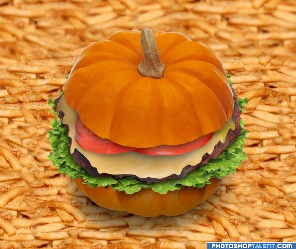
What an eye trick.!.. you can't really see the pumpkin.. you just see bun!!!! excellent
very nice
Not so tasty i guess, well done replacing the bread with a pumpkin
nice
Nice burger, but why the gigantic fries?
I really love the burger, but as CMYK 46 mentioned, the fries don't work at this huge size. Since you've made a pumpkin burger why not make the fries to the scale of a pumpkin. In other words tiny fries next to the pumkin size burger on a little plate. Just my thoughts, I do like the work on the burger!
Nicely done 
very creative burger; the fries look too flat imo
this is very good..i like the french fries blur in the background for depth
Nice work 
Spaceranger, CMYK - maybe it's just a tiny pumpkin?
nice job 
goog good good luck
Good work author!!!!
Fantastc idea and technique!
Well done! Love it love it love it! I really love pumpkins, but i'm not sure if i want to eat a pumkin burger! 
something different.... good luck
Congratulations for 3rd
Congrats!
congrats
Howdie stranger!
If you want to rate this picture or participate in this contest, just:
LOGIN HERE or REGISTER FOR FREE
(5 years and 4044 days ago)
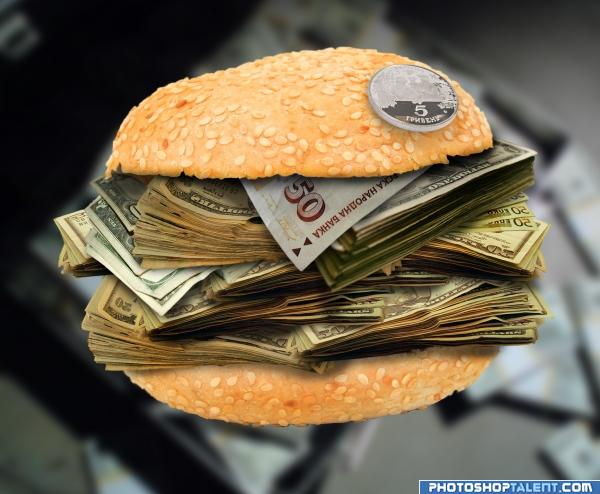
Nice...some shadow on the 50 at the top would make it better. Can I get fries with that? 
there already was a shadow under that coin, but it's more noticable now! thanks
very clever author.. using the burn tool under the lip of the top bun might help... experiment with making a light shadow under the very edge of the top bun.. works for me
real thing! money makes fat!  good luck!
burger money how much its one of those to buy nice idea
No, I meant the bill at the top under the bun! 
I'd also try to curl it a bit.
am I the only one who sees shadows here??  ok.. i've added some more and burned it a bit more.. *sigh* I hope it looks better now, keep the critiques coming!
Good luck
very good setting work but about the rest i dt know g.l.
It's a good image Author.. and you did well, the meaning, compostion are all intact.. good LUCK!!
I can easily buy this burger.. with this burger  good job!
if there were such burgers there would be no more poverty in the world
should have called it "put your money where your mouth is" lol.... good work.
good work
I have to agree that the bun top needs to cast more of a shadow onto the 50 bill. And more curl in that bill would indeed help. (Or just delete it since it's the only non-U.S. in the pile?) [Pretty large bun relative to the bills BTW.]
Really creative, that's a burger most of us would eat 
cool
can i have 5 of those - takeaway please )))) Seriously though, I think just leaving it hanging in the air is not such a good idea, otherwise very nice!
nice job 
Wish i had that burger
how much do you charge for this burger...... good work
i wouldn't mind a burger like that
Great technique!
How much would this burger cost?!?! This must go in the genius world records for most expensive burger!  ! Well done!
Ooooooo, I see Bulgarian 50 Levs banknote at the top of all that dollars!!!  Personally I prefer the bills below it LOL
I like this burger, but I won't order it in restaurant - too expensive for me! Author gl!
Here goes my money..... again.... good luck
you did very well.
Howdie stranger!
If you want to rate this picture or participate in this contest, just:
LOGIN HERE or REGISTER FOR FREE
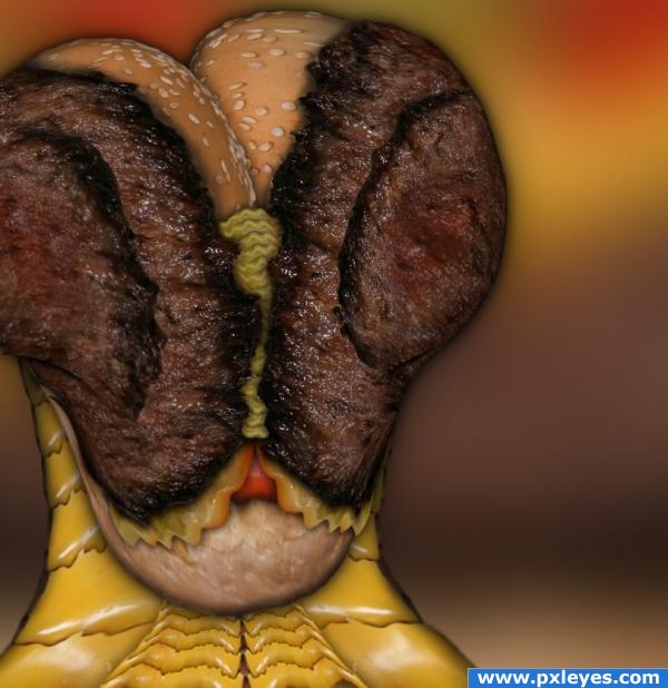
EWWWWWWWWWWWWWWW and WOW.. and ew again.. and then a Fantastic.. and then Oh My I don't feel so good.. and then YIPPEEEEEE COOL.. wonderful imagination.. WOO HOO author
I'm giggling and urping at the same time.. just a wonderful image all round
This is what you're like after 40 years of ingesting nothing but fast food. Creative, but repulsive.
SBS?
what in the...

totally gross, GJ
good work
Awesome!!
This would make a good looking fly, nice work
very nice
Creative! I love the hamburger eyes this extraterrestrial is showing off. I'd lose the drop shadow you put on them, however, as it makes them appear to be hovering overtop of the buns as opposed to resting right on them. Still, great work!
and he eat cows?
Howdie stranger!
If you want to rate this picture or participate in this contest, just:
LOGIN HERE or REGISTER FOR FREE