thanks to radcarper (5 years and 3853 days ago)

cut paste
clone stamp tool helped a lot.
I used filter distort tool.
than exposure, color filter are used for color adjustment (5 years and 3900 days ago)
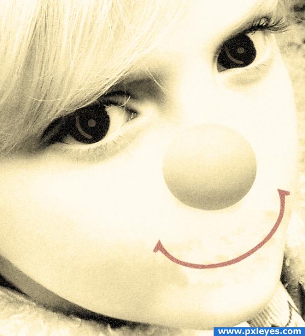
i think the nose sould go more to the left of her face 
Not much use of the source...this could have been done without it...
I agree with elficho, i think shading is also needed here. Good luck!
nice image
It's ok but there is some problem with the nose.
Don't get me wrong...! I love the way it looks....I think it's a very good composition! But I'll have to agree with the rest about minimal usage of source! Best of luck!
Howdie stranger!
If you want to rate this picture or participate in this contest, just:
LOGIN HERE or REGISTER FOR FREE
if you couldn't figure it out already, it is a new avatar for CMYK46
thanks to debsch and asifthebes from SXC for use of their images!
Edited... as per the helpful comments... (5 years and 3910 days ago)
Hey, nice! I'd like this even if it wasn't me... ...but fix the right edge of the head, it's all choppy like.
Niice job!! I'd remove the drop shadow from the egg head and make a shadow according to the light source of the hand.The background is nice and it could be in CMYK colors maybe 

lol... well done 
hahahhahahahhahhaha
haha gr8 work...GL
good idea, edges of hand is too sharp, correct it.
cool
good job 
nice idea
Howdie stranger!
If you want to rate this picture or participate in this contest, just:
LOGIN HERE or REGISTER FOR FREE

(5 years and 3925 days ago)
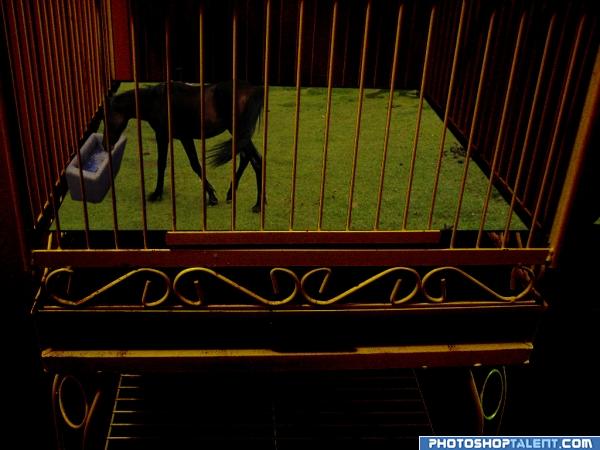
Shadows missing for horse and tube of water  good luck!
cage shadow is required on the grass+ shadow for horse and water vessel.
The horse look a bit small to me....! Best of luck!
awww poor horse! lol
lol
Howdie stranger!
If you want to rate this picture or participate in this contest, just:
LOGIN HERE or REGISTER FOR FREE

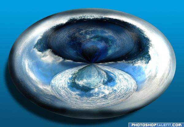
This is a technique I learned from someone else on this site a while back, but it seemed to fit this image really nicely.
Hope you like it, please comment :-) (5 years and 3942 days ago)
always a nice effect.. good luck
I am a fan of the "Planets"...IMO the shadow is too much...Great Idea and Good Luck 
Nice!
Neat GL
Howdie stranger!
If you want to rate this picture or participate in this contest, just:
LOGIN HERE or REGISTER FOR FREE
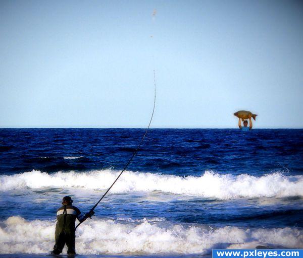
Funny - but I think your scale needs some work or that guy in the water is HUGE!!
Howdie stranger!
If you want to rate this picture or participate in this contest, just:
LOGIN HERE or REGISTER FOR FREE