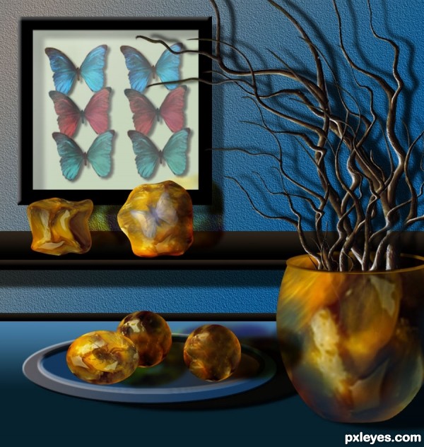
Thanks to Clinge, for the pic of the blue butterfly.
Thanks to mqtrf, for the pic of the spider.
The rest is PS and imagination. (5 years and 3517 days ago)
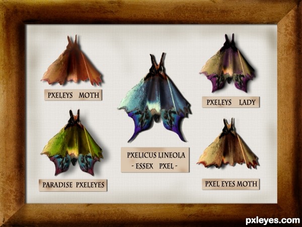
Only one external source used (5 years and 3523 days ago)
Clever idea. Well done!
nice
Very good entry!
Very creative and curious idea. 
Very creative, but the butterflies/moths look flat, not three-dimensional. Some Burn Tool on the bodies and refinement of the shadows falling on the background (different parts of the moth would be different distances from the background and thus would cast a slightly different shadow) would help. A stick pin through each moth might add to the realism.
Hi, everyone!¨Thanks for the comments!
@ DanLundberg
I didn't want to touch the original texture much but, you're right, some things should be improved. I uploaded it and decided to see what the others would have to say . I appreciate your suggestions and, yes, burn tool just might be the best solution for the "fake" inner shadows. i will try to improve that part!
And as for the pins- sorry, i just couldn't!  ))) I made the pins and in the end decided not to use them, I couldn't stab the poor creatures!
Great idea author,i like your different approach to this contest...well done
thanks, erathion!
I made some changes! DanLundberg, thanks again for the suggestions- burn tool really did do the trick (I don't think I use it nearly as often as I should  ). I did my best to achieve a more 3D effect and I think it looks better. I also used both burn and dodge tool to add the same effect to the frame. Then i added some smudges to the background and to the tags- i thought it should be older!
Anyway, I appreciate your inputs! Thanks!
i like it !!!!
I think there's some more depth now. BTW if you create a selection beforehand, that constrains where your burning occurs so you can easily get hard lines between burned and unburned areas..
Congrats...this is really really cool work...
Howdie stranger!
If you want to rate this picture or participate in this contest, just:
LOGIN HERE or REGISTER FOR FREE
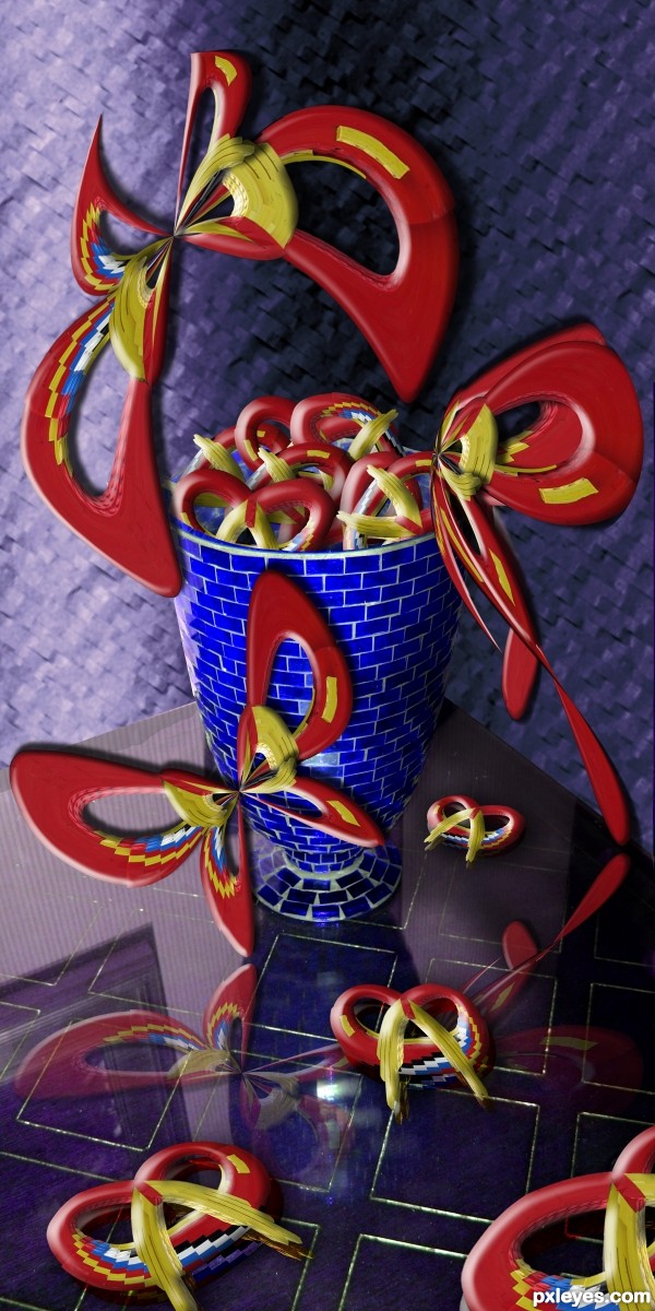
source and my pic (5 years and 3556 days ago)
Very delicate... I love the butterflies! 
Creative use of the lego guy :P
Another great one!
man how do you have an imagination like that?...awesome
Congrats again! You deserve! 
Congratulations for 3rd
Howdie stranger!
If you want to rate this picture or participate in this contest, just:
LOGIN HERE or REGISTER FOR FREE
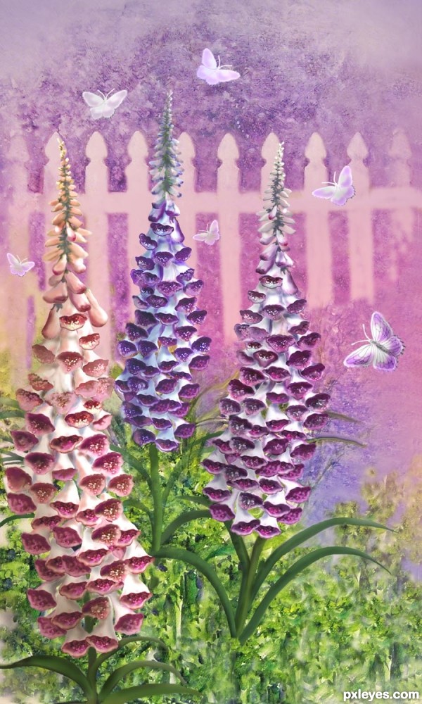
The source was used to create the flowers. The background was created with one of my original paintings as reference, and the butterflies are painted in. Details are in my SBS. (5 years and 3557 days ago)
thats just phenomenal. beautiful and elegant, and you cant even tell its from a veggie close up. you are extremely talented author! great job!
How do you do it? Stunning work.
Fabulous work and a very beautiful image, I hate to say it but if I did not looked at your S.B.S I would say that the source had not been used because its not visible at all,for me the source needs to be clearly visible in the final result.......Sorry
Ponti, I do it with probably 30-40 hours of work, but I obviously love doing photoshopping and am so glad when viewers enjoy my work.
Well it's worth it.. you're an inspiration to me.. and i can;t help but stare at everything you do for hours without stopping.
SHOW OFF!!! LUV IT LUV IT LUV IT.. keep up the great work!!!
beautiful work author - both pieces!
Wonderful it's a poor word to describe it! 
I like the painting style you did 
Wow! This is fantastic! 
Congratulations 
Thanks to you all for your votes!
Always a wonderful work of art! Congratulations!... 
Congratulations for 1st
Congrats Artgirl, beautiful work 
Congrats for 1st 
Congrats
Howdie stranger!
If you want to rate this picture or participate in this contest, just:
LOGIN HERE or REGISTER FOR FREE
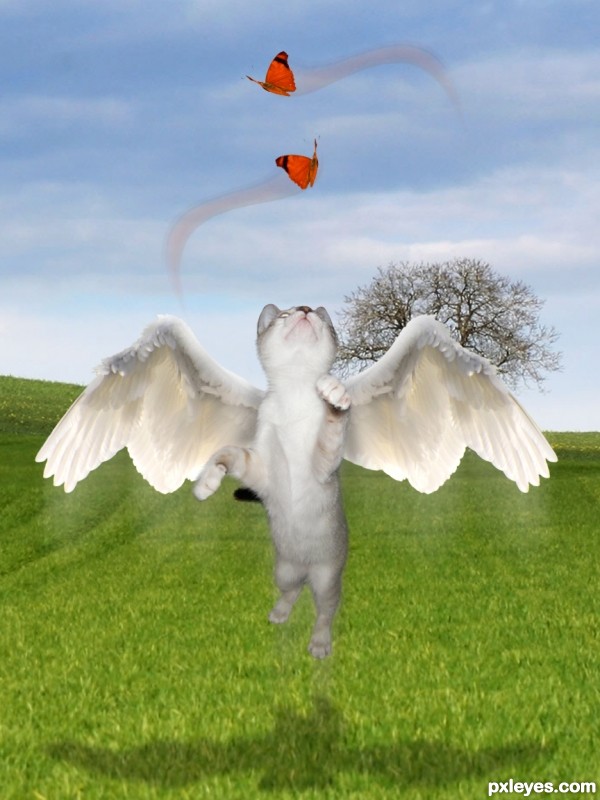
My pic, a source of another contest and some outsource images.
Thanks to:
- jans canon at Flickr;
- 13dede, clemmesen and alitaylor at sxc.hu;
- and Pxleyes.
Edit: I removed some butterflies, but I'll keep my thanks to the authors above! (5 years and 3573 days ago)
Nice image, the only things I would suggest changing are the butterflies (it is too obvious you have cut and paste each one three times, use more different images). I would also remove the blurry train from below the cat and the wings, adding a slight motion blur or manually blurring the ends of the image would make it look more realistic imo.
SOOOOO SWEET!!!... maybe arrange the butterflies in swirl patterns that are playing with the kitty... like that effect you get when you tie a ribbon to the end of a long stick and make it follow a trail pattern.. just an Idea.. the kitty is BEAUTIFUL!!
Just my 2 cents, but if there were only one butterfly (possibly a bit larger), it would give the image more of a focus. Good idea, though!
I COMPLETELY agree with you all! Let me see what I can do... thank you! 
Damn,this kitty cat is very focused...yummy butterfly's...great work author...best of luck
Isn't she so fluffy and cute? 
yes she is fluffy and cute.. just like you.. much improved with the single butterflies!!!
Thanks, Ernie... Fluffy is you, friend of mine... 
Really CUTE! I would shift the bottom butterfly to the right slightly so it's more in the kitty's line of site, and I would drag the shadow layer a little further down so it looks like it under neath the cute flying cat. Motion trails may not be needed, but that's up to you. Such an adorable idea!

congrats girlfriend!!!!
Howdie stranger!
If you want to rate this picture or participate in this contest, just:
LOGIN HERE or REGISTER FOR FREE
most distinctive work ! good luck
Fantastic! Amber is so realistic... Everything is perfect. Just one thing: the vase needs to cast a shadow, doesn't it?
Thank you for comments. Erikury...my monitor is kind of dark, and did not see that right bottom where the vase is standing.... I will add the shadow altough probably it can not be seen, probably I lower the light on the table, to a softer kind of blue... you are right, I will do that.

UPDATE: Added shadow and lowered gradient, so, the shadow can be seen.
I find it odd how some stray shadow is being cast onto the vase from the left as if it were a flat object...otherwise, you did an awesome job. Very creative and well executed.
very nice work author,construction of the elements is great...good luck
Source?
Thank you again for comments.

Gamemastertips: Shadow...corrected.
Perfectchaos: The source for this entry is the "Passion Fruit" picture, I added outside stock, from pxleyes stock pictures. Check my SBS please.
I really like the colors and the way you made the bugs in amber look. Nice job!
The amber is beautifully done
awesome work author! (as usual!)
Howdie stranger!
If you want to rate this picture or participate in this contest, just:
LOGIN HERE or REGISTER FOR FREE