(5 years and 3000 days ago)
- 1: source1

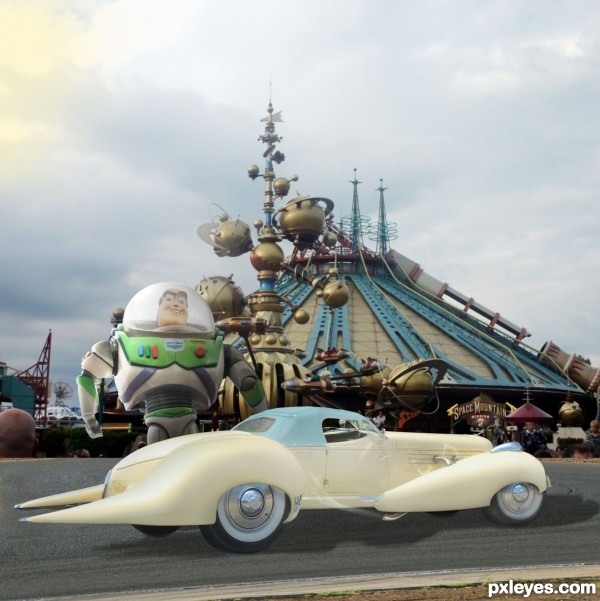
"She's the sleekest classic beauty in the galaxy - perfect for cruising around my spaceport 'hood". --
Buzz Lightyear, of Toy Story fame. (5 years and 3105 days ago)
Good image. The car's kinda small for Buzz to fit in, wouldn't you say?
Thank you, Bob. There's actually quite a bit of leg-room in there, and with Buzz's hydraulics, he fits quite comfortably - tight but snug, like a racecar.
(And if I made him much smaller, he'd get lost against all that great architecture behind him!) 
Great car!
If you shrunk Buzz and put him in front of the car, he wouldn't get lost against anything. Right now his head alone would just about fill up the whole front seat.
Logical suggestion, except that the purpose of THIS contest is to show a CAR manipulation, therefore the CAR is prominent here. I have studied art and design - and have legitimate reasons for how I treat the elements of my work.
I also studied art & design, and taught it as well. Hence my initial comment. Let's just have our own opinions and avoid another flame war. They're getting way too common. GL author.
Buzz seems awfully dark in comparison to the car and the background...He also shows an obvious cutout line on the left hand side, where he is lighter along the edge than the rest of his too-dark body.
The car is also lit from an entirely different direction than the background (Side on the background, Upper Right on the car...)
Thanks, MossyB, valid comment on Buzz's lighting, however it's not a cutout line, it's lighting from the left on him, which I've increased overall a bit, same on the car. Background image IS lit from upper left, as I see it - notice those highlights on the gold globes.
One of Us.. One of Us... One of Us.. giggle snort.. love the car author.. hate to have to back it up into a parking spot though (spikey bumper) LOL... boing boing boing.. extremely fun chop.. good luck author 
Love the background!!!!
love it, i'd give the car some green color as buzz's, maybe the surface, also the shadow must be black, good luck
Thank you for your comment, orientallad. I think that for the bright but cloudy day, the shadow would be only moderately dark. Also, there is a reflection of Buzz's chest in the rear window, but he's not completely green, so I felt that was enough of him reflecting in the car. 
Remember the toystory in a different way.Good thinkingman.. 
Howdie stranger!
If you want to rate this picture or participate in this contest, just:
LOGIN HERE or REGISTER FOR FREE

my photos and source (5 years and 3885 days ago)
that looks realy slick man good job and gl
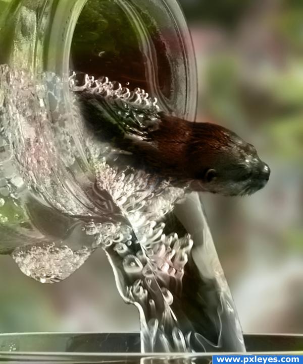
Nice! Maybe try to show the fact that the otter continues into the glass by maybe making a blurred outline... other than that, good job!
Looks quite ok. You may want to check the edges from the bottle again. Right now they look a bit too pixelated imo. Just feather them a bit, could help. Good luck!
Thanks Waz and Ponti, I have a horrible time working with non color, thank you for the usage of your eyes
looks like a turd.
better!
And congrats again, Ernest!
Congrats!
congrats
thanks everyone!!!
Congratulations for 2nd
Congrats!
Howdie stranger!
If you want to rate this picture or participate in this contest, just:
LOGIN HERE or REGISTER FOR FREE
good work author...
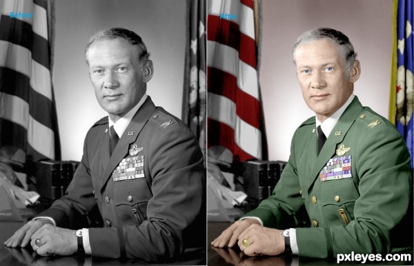
Where is the manipulation at ??
lol @ meatman
meatman, check the flags behind him, he may have changed them a little. lol
lovelly work. i try some colorizing from time to time but i dont have that much patience. it takes to long. but you'v managed to do it really nicelly.
good luck
pardon me. I took it as a color photo that was changed to black and white. lol
I agree with pshoudini it takes a lot of patience to do that kind of work
and u certainly did it..high marks for that author!! GL.
great job author, though I think you need to work on the color of the skin right up to the hair line, his gray hair is running into the scalp, great job all round (IMHO)
Howdie stranger!
If you want to rate this picture or participate in this contest, just:
LOGIN HERE or REGISTER FOR FREE