bye.. see you again...after the contest is over! (5 years and 2705 days ago)
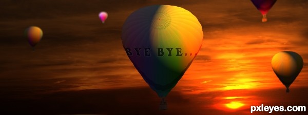
(5 years and 3230 days ago)
The lighting on the top right of the balloon is inconsistent with the very obvious low sunset...
Also, the lettering looks flat, and does not conform to the shape of the balloon, in addition to being difficult to read because the left side of the image is too dark.
I'd lighten the overall image, bend the type to fit around the balloon better, and correct that top lighting.
now its better?
I think there should be no light effect on the balloon but around the balloon. Because you are facing the sun, so there should be a lights coming out from the behind of the balloon. May be it is a rays of light and it stretched out (but it should be very thin because it is a sunset). and there should be a small diffuse light on the lower right of the balloon because it face the sun and also to give it a 3d sphere shape. I also think that texts were write on the balloon, so it would be round like a balloon, so you can use a warp tool to do so.
Howdie stranger!
If you want to rate this picture or participate in this contest, just:
LOGIN HERE or REGISTER FOR FREE
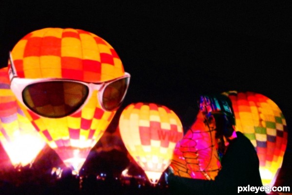
My Daughter took a picture at last year's Colorado Springs Hot Air Balloon Festival (Post in SBS) (5 years and 3350 days ago)
Howdie stranger!
If you want to rate this picture or participate in this contest, just:
LOGIN HERE or REGISTER FOR FREE
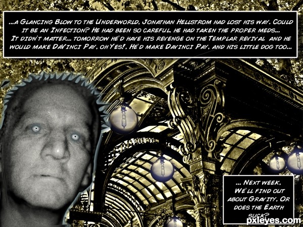
Kind of made this for Jaded Ink, Have no Idea why, but there you go (5 years and 3430 days ago)
OH its so funny because when i saw this in my side bar i got all curious as to what the writing was. and i giggled. and then to see you made it for ME, well then..i got even more excited.  i honestly have to say, the name "Hellstrom" wins...and the wizard of oz reference in regards to daVinci
However i inspired you to do this, i would love to know. perhaps it was the infection. they were giving people the wrong antidote for that btw...found out that the commonly prescribed medications were only making things worse.
and i read this with the deep voice from action movie trailers... 
@jadedink, Your fault, your work does cast a spell.. (hehehe) big kiss and hug 
my favorite part though... "Or does the Earth Suck"
lmao
its fabulous. 
Ultimate humor author with great photoshop skills...as Jade sad Or does Earth Suck is perfectly crazy...well done
That dude reminds me of that movie "I am legend ", lol.
creative 
OMG, love this. Your image in Step 1 is perfect, somehow reminds me of a science lab with the bulbs added and the color you gave it. LOL, your zombie filter, hmmm, perfect for the zombie man? AND his little dog, too! Cool story text blocks, love this one! 
good work!
Howdie stranger!
If you want to rate this picture or participate in this contest, just:
LOGIN HERE or REGISTER FOR FREE
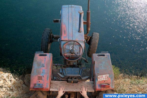
Credit to remidica-stock from DA for the hands.
This tractor just had to go. (5 years and 3926 days ago)
Not a very 'green' idea...but quite funny. Absolutely perfect perspective on source!!! Great shadow too. 
oh no!! why?! :o hehe nice idea  gl
gl
Hehe, very nice!
Nice idea.......G/L Author.
funny idea.gl
agree with everyone. Good luck!
(sniff- sniff) OH NO! MURDER! I see you ... great image. love the originality of this. GL
Love the Idea
YIKES
This is what you call over the hill! LOL 

Howdie stranger!
If you want to rate this picture or participate in this contest, just:
LOGIN HERE or REGISTER FOR FREE
Dear Moderators,
Please don't pull it back. This is created by cloning and copying the parts of the sourceimage itself.
It is very clear that no other image is used.
Any Help??
5.4. No External Source used in your Entry: In this case, your entry must have a step by step provided showing how the entry was made. For level 10- contests, a written SBS in the description is also ok (for simple entries), unless a moderator asks you to add a pictorial SBS.
Pretty good removal, but you left some of her hair at top, and the bottom part of the necklace below.
Thank you.. CMYK46. Corrected.
Unfortunately these types of entries don't fit into the 'wow' factor for most people. I can appreciate the effort since this is what is sometimes required in the 'retoucher's' world. Good work, author.
Howdie stranger!
If you want to rate this picture or participate in this contest, just:
LOGIN HERE or REGISTER FOR FREE