(5 years and 2802 days ago)

hey Media :photoshop
& WATCH THE SBS .
stock credits
1.RosalineStock
2.ALiceFaux
3.liam-stock
4.laszlo-616 (5 years and 3281 days ago)
Nice work! Her clothing looks a little not realistic, IMHO! GL 
An umbrella when it's raining doesn't connote "death" to my mind, which makes the title seem a little silly, but the painting itself is very nicely done.
Well done, the entry is already dramatic so there wouldn't be need for 'death' in the title to emphasize on that. But it's author's choice. 
I really like this pic, great work.
love this!Only, it seems that source 2 is a premanipulated image and Im not sure that we can use in the contest.
thanx 
@ nanaris the source 2 is not manipulated because i hv read it carefully there is nothing written like premade or something  just chill & also it may look like premade coz u think that natural calamity in the image doesn't look like normal .
wonderful! judging from the sources you did a marvelous work! good luck!
Author none of source2s manipulated images say how they have been created so that doesn't prove anything. I do think it is manipulated image. I guess the only way to find out is to ask the author of the image. Aside from that its a nice image with a title that i would not have chosen, but that's your call its your work.
i have changed the title 
Man, I would like some description about your entry, you know ?
Maybe you got lucky or maybe you're really an expert, cause compositionally this image is perfect. I rarely see that around  . So what`s the story ?
hey , author when i looked on deviant on the link given , I saw that there is another backgrounds image clearly manipulated, so I supposed that is one too.
And for the record on deviant the premanipulated photo have this name on title "premade background" or "background" 
so my comment was just a supposition , I don't care what and from who you use your sources, your work is not mine.
Good luck!
Very well done my friend..!!
thanx
Amazing work author...Very very well done...Best of luck
thanx man 
Awesome work, love how you did the wanter inside, love the mood here, perfect reflection of the water in the upper part of the cement tube. Hight votes from me = )
Thank you for ur wonderful comment 
Congrats!!
thanx man 
congratulation!!!
Congrats.., excellent work
Congrats
Howdie stranger!
If you want to rate this picture or participate in this contest, just:
LOGIN HERE or REGISTER FOR FREE

Thanks for the stocks:
Felixdeon
FantasyStock
MaureenOlder
Gromitsend
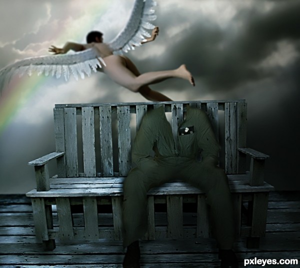
The rainbow was made with gradients. (5 years and 3492 days ago)
Good job except for the wings. One is attached higher than the other. 
Good idea. fixing of wings and shadow of sitting image is not ok.
Yes,
You are both right!
I'll try to fix.
Thank you!
And with the comments above I think you have to finish the flying suit - it's not open behind, is it?
Just one question... Can butts appear? Because I know other contest site where even butts aren't allowed...  Maybe you can place on it a kind of veil...
Howdie stranger!
If you want to rate this picture or participate in this contest, just:
LOGIN HERE or REGISTER FOR FREE

Special thanks to the following for their great sources: chicks57 for the vintage postcard angel, and badastronomer for the nebulae - both at flickr.com Also to dave at morguefile.com for the cloudy sky source photo. Birds I created with brush and smudge tools, as well as roses and ribbons. (5 years and 3511 days ago)
what a cute image!!!
I like the mood very much!
oh my oh my....moody it is,...... is she calling the god ? LOLs......very sweet.....
it is nice pic but it would be better if u draw the hand clearly and need reduce the clouds abit that around with phone..
I really like the mood in this.
Aww, so gracious! Very beautiful and pure. 
Silencer, I might consider giving a bit more detail to her fingers, but how could the phone sit there if that cloud wasn't strong enough??? LOL
Nator, good suggestion. Thanks
Very lovely. To me, the phone looks like it's floating above the cloud she's sitting on because of where shadows are falling under the phone and because the bottom of the phone defines a plane that seems to be above the level of the plane defined by her bottom. A bit jarring to me is the phone cord. Its route is a bit odd with an angular path that clashes with the soft curves that dominate the image. I think a simple catenary between the phone base and the receiver would keep the viewer focused on the important elements of the image.
Dan, That was quite an oration, but the phone line is changed - just for you!!!! lol I do like it better, and thank you for your time and gracious suggestion.
very happy fluffy feel 
I'd just like to say "Happy hippy hugglez" before what's-her-name says it yet again and makes me want to slap her with a live squid. 
Ooooooh - after you with the squid!!!!
Nice Job
Fantastic creation author...well done
Oh come on CMYK I`m sure you`ve spread a little "free love" in your time (but seriously let me have a go with the squid, she makes my teeth hurt)  ........ Oh and sweet entry too author! well done
Just love you all and fun comments especially. Thanks so much.
Great! So inspiring 
Very nice.
Congrats! for third place 

Congrats Lois...
Congratulations, Lois, this is really gracious! 
Howdie stranger!
If you want to rate this picture or participate in this contest, just:
LOGIN HERE or REGISTER FOR FREE

I learned so much from this tutorial... this was one of the best learning days on Photoshop ever thanks Instructor.. AND THANK YOU Sundesigns FOR USE OF THE PHOTO (5 years and 3657 days ago)
well done... 
Thanks that means alot to me.
Good job. GL
its awesome because its different..good luck
congrats
thanks
Howdie stranger!
If you want to rate this picture or participate in this contest, just:
LOGIN HERE or REGISTER FOR FREE
Well Done!
Yup, very good work.
Howdie stranger!
If you want to rate this picture or participate in this contest, just:
LOGIN HERE or REGISTER FOR FREE