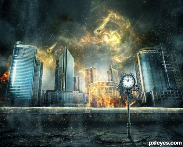
A huge amount of hand painting was used to make this image coherent, settle the lightning and modify some details. (5 years and 2848 days ago)
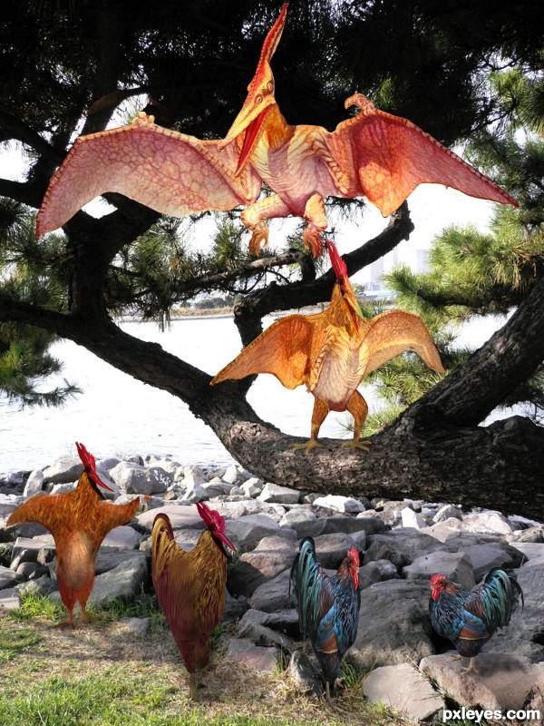
Thanks to amyvdh at flickr for the tree source photo;thanks to Yndra at flickr.com for the chicken; (5 years and 3382 days ago)
Thats really good!
Well done! 
Great work ... love the final Pterodactyl ... he looks so happy that he isn't a chicken (although maybe it is the Pter that is turning into a rooster???), either way ... fun image!
Congrats...
Congrats for 2nd
Howdie stranger!
If you want to rate this picture or participate in this contest, just:
LOGIN HERE or REGISTER FOR FREE
(5 years and 3483 days ago)
artistic n creative one.... like it 
This has a different feel, I like it 
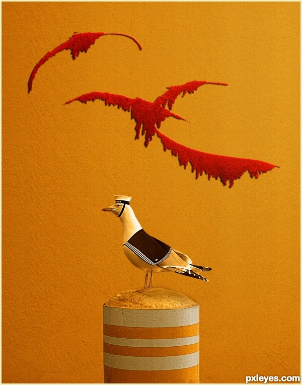
Just waiting for him to salute! Great and different work. Like the originality; the hat and coat are just too perfect!
I like the bird and background but maybe should be better if the bird look a little bit more white to put a contast.... Good luck author !
Howdie stranger!
If you want to rate this picture or participate in this contest, just:
LOGIN HERE or REGISTER FOR FREE
(5 years and 3496 days ago)
Howdie stranger!
If you want to rate this picture or participate in this contest, just:
LOGIN HERE or REGISTER FOR FREE
(5 years and 3498 days ago)
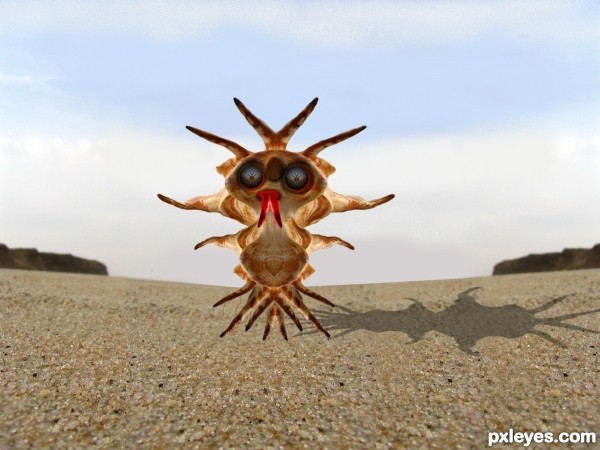
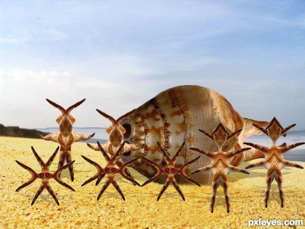
idea is good -- patch of sand in front is showing a bit too much of cloning -- shadows could use some softening -- maybe some spread as they have too hard and edge also they seem a bit too much on top of the sand try a different blending mode maybe overlay with another layer in multiple with a lower opacity
Thanks Alan I did some touch up any better ?
And Thanks Giulia I took care of that I don't know how I missed that 
cute little guys...the top of their submarine needs a bit of adjusting, though... the cut is too straight, maybe try to make it more round?
Howdie stranger!
If you want to rate this picture or participate in this contest, just:
LOGIN HERE or REGISTER FOR FREE
Wonderful work (though it is not necessary due to having sources, a nice touch would be to add a step by step to see the work)

Love the finished texture overall, looks like a modern graphic novel image
Thank you so much

Well, to be honest, I have started doing a step-by-step of this work, but due to the complexity of the image (I worked 3 whole weeks on it, the pds file has more than 400 layers and 577MB size) and the huge amount of my own painting, the step-by-step turned obsolete. I mean, if I would do it right, it would have had about 50-pages. Something like a 10-steps-length-thing that was what I was intending to do would have have one step so very different from the other that would be no help at all.
I am really sorry about it.
Hi-res looks good except for one thing: There's no destruction...not even a broken window.
Thank you.
Well, to be honest it was supposed to look like this. I mean, at the first plan, in the place where the clock stays, it’s kind of destroyed, because – as the title says – it’s time has come and it’s symbolized by both clock handles standing at "12". The city behind is about to start to be destroyed, that’s why I have placed fire only at the front and the meteors falling. Of course it’s only my view.
Seems fantastic, I love the "burning" mood you have given this image.
That's so very kind of you. Thank you so much
wonderful
Thank you
Flawless,perfect..and awesome..GL author
It's so kind of you. Thank you.
Lovely and catastrophic! I really like the burning fire above the sky and the dynamism on the whole image, great job author. Perhaps, I also think that some destruction over the buildings would have made it perfect! Good luck!
Thank you so much
congrats pal on first Entry and First Place Got Lucky ....
Thank you
Congrats!!
Thank you
Congrats!
Thank you
Howdie stranger!
If you want to rate this picture or participate in this contest, just:
LOGIN HERE or REGISTER FOR FREE