hoo hoo! (5 years and 3844 days ago)

(5 years and 3878 days ago)
awesome job author.. but your plant source is missing (You doubled the man source) fix that so you don't get no grief 
Oh never mind.. you know how to fix it LOL
I really like this image.. very captivating. Good luck!
nice work with the dodge and burn tool
Wonderful.....wow
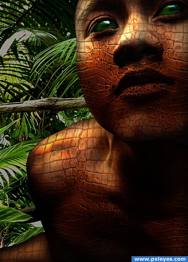
Wow this is a fantastic job, i first thought it was a snake's skin but now i saw it wasn't, still amazing work!
Not bad, would be better with a displacement map.
it's crocodile skin and thanks for your comment.
Gorgeous! Fantastic! I don't know displacement map. But I think it's a great job.
wow, this is quite perfect!
Nice colors and pick of source. Skin looks quite ok, at some parts a bit flat though. Have a look at the nose, that has some depth. The skin however is still flat where it should go up (middle of the nose). Also the left side (for viewer) of the nose the texture should go down again (but then barely visible that you see it going down, because you cant see that much from that angle). It can be fixed, try to use some liquify and gently push up the texture where the nose has more relief. Same can be said from the shoulder. Good luck!
thanks to sol one, linden larsena for the picture of the man http://fr.mg40.mail.yahoo.com/dc/launch?.gx=0&.rand=ddvfvuop6e1lo
thanks for your advice wasowski i fixed the nose with the fluidity filter hope it's better now...
ur not alowed to show your identity on entries.. i suggest you remove your name. I like the work but i think the edges are too sharp, i sugest a soft blur on the edges cus the black outline it has makes it look weird. arround the nose i would try to make the shapes on the skin make look rounded so they follow the body shape and not go straight over..
excellent!
Nice work - you have a dark outline on the side of the face and the shoulder etc, just a little distracting especially at the shoulder.. Maybe refine your edge slightly?
Looks Great
neat
gratz!!
congrats, good work
Congrats for your first place!
Congrats, nice work 
Congratulations for 1st
Congrats!
Congrantulations on 1st
Can I ask pls where's the tutorial for this design? Please I want to learn doing this...I am just a beginner in Photoshop. Thank you so much!
Hello ! Unfortunatly There no Tutorial for this one.
but why? i thought every entry should have the making/tutorial posted...
i agree with you but it's not an obligation.
Howdie stranger!
If you want to rate this picture or participate in this contest, just:
LOGIN HERE or REGISTER FOR FREE

Thanks to mmayerle for the background photo (Has been notified by sxc pm) (5 years and 3930 days ago)
very smart image... really is a nice scene.. maybe add some tire tracks in back.. but not really necessary..good luck author
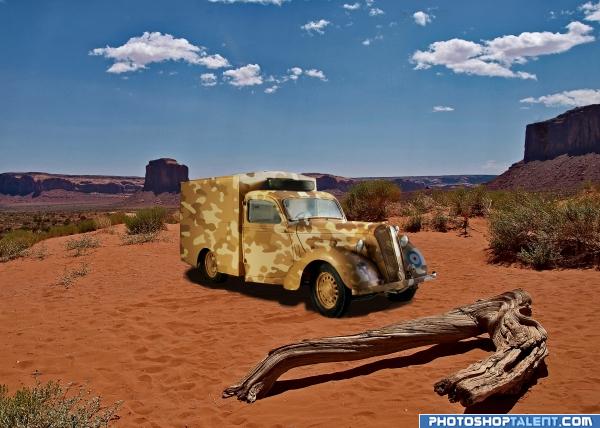
May I suggest more light on the top of the vehicle as on the front fender? The shadows indicate light from directly above, not the extreme right. I think some of that glare on the hood and the roof would make your truck look right at home. 
Great idea. I agree that there should be more light on the top of the truck. Also, look at the shadow under the piece of wood, I think you could go darker under the truck. Good luck.
Adjusted the lighting and darkened the shadows
Shadows could be blurred more :P gl
hahahhha like the camo!!
nice work
nice idea author 
Nice camo job. A sharper shadow would match the one under the dead tree.
good
nice camo! just clone out that black artifact on the top of the image (kinda pops out in high res) and it continues to the right around that little cloud. also, the white line on the top of the truck jumps out of it a bit so cut that out too 
nice
Much Thanks elficho missed that ==had a wrong layer position
Howdie stranger!
If you want to rate this picture or participate in this contest, just:
LOGIN HERE or REGISTER FOR FREE
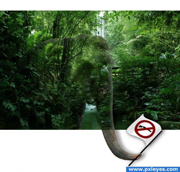
i don't think you can use the logo...
thanks, I changed it
This is terrific. Glad you changed the logo. Good luck.
I like the image... g/l and keep chopping!
Howdie stranger!
If you want to rate this picture or participate in this contest, just:
LOGIN HERE or REGISTER FOR FREE