(5 years and 3856 days ago)
thanks and credits to sxchu (5 years and 3882 days ago)
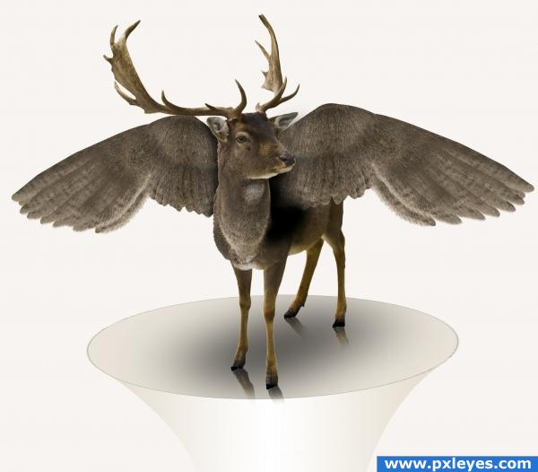
Fantastic work... but not satisfied with the shadows... and the wings are amazingly fine
deer season AND bird season- oh no! lol
uhm arent the wings the wrong way arround or are they attached to the neck? they do blend in nice with the colors tho
i think the wings are too close to the neck.. try pushing them a bit further back 
good blending job..nice work
Howdie stranger!
If you want to rate this picture or participate in this contest, just:
LOGIN HERE or REGISTER FOR FREE
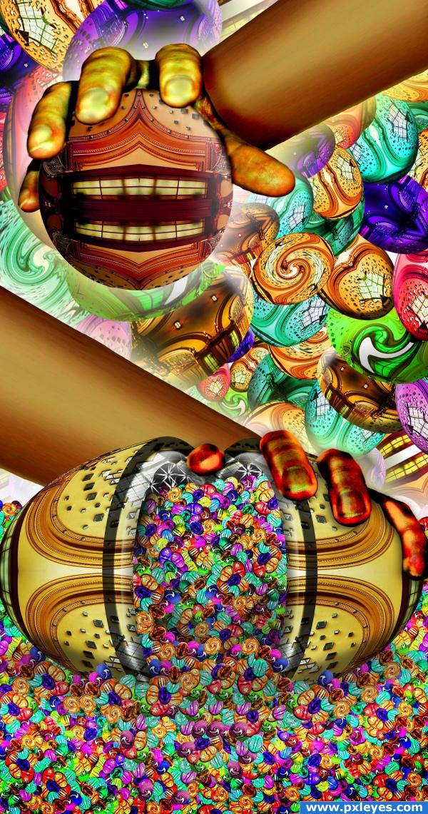
source and lots of egg shapes
and two hand pics (5 years and 3882 days ago)
So...so cool. Excellent use of source.
nice colors! Yummy, the ones at the bottom look like Jelly Belly's. The arms kinda look like my brother's wooden leg though ;o
very cool
 eye candy, nice work Author
Nice use of source. My eyes are exhausted!
god damn you and your entries... they make me laugh right away... lol 
i love the colors... 
Wow, great detail and an EXTREMELY creative use of source.
i love the little eggs!! very good work!!
I could tell who you are by the stylebefore I even voted ,but sorry I have to say.. that I do not like this image, because I just can't see this as a piece of art... the colors and the arrangement of things are not m=pleasing of the eyes... sorry
neverlander.. it's okay to have an opinion... it's yours and that is wonderful (and knowing it's my work is the greatest compliment of all) the original title of the Piece was going to be RACISM... but we are told not to get politcal in the regular contests... hehehe.. but thank you for your honesty (I've never been a fan of color swatches at a paint store.. as you can tell, It's all I ever did when framing art at the gallery or decorating a house)
and never be sorry for an opinion if it comes from an honest heart 
He-he, this one is totally crazy, that's why I love it so much 
Creative
Sure are a lot of egg shapes, all right....
This is a very interesting composition. Mixing the earth tones with the bright colors is a nice touch.
superb job !!colourful,mystic and lively.very unique
Howdie stranger!
If you want to rate this picture or participate in this contest, just:
LOGIN HERE or REGISTER FOR FREE
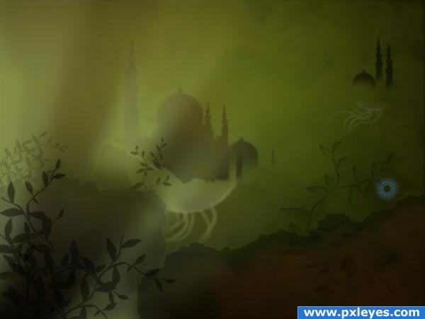
a simple, very less , good-hearted populated place, where words have no power but silence speaks tons. its dedicated for all you guys who jus dont accept "sky is the limit".. for we have built castles with our thoughts beyond that.. (5 years and 3888 days ago)
author.. sbs? sources? Something... don't get this pulled over a stupid tech mistake... please include all what you used to create this (I'm on your side)
Ahh i agree an sbs would be extrmeely helpful.. i'll hold my vote for now 
Ahh the step by step guide cleared up a few things. Well done - high marks from me!
superb....good imagination
Howdie stranger!
If you want to rate this picture or participate in this contest, just:
LOGIN HERE or REGISTER FOR FREE
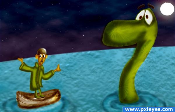
NO OUTSIDE SOURCES USED.... (5 years and 3911 days ago)
Looks pretty cool! Good job!
Why aren't the little guy's hands the same color as his face? What's the rectangular thing in the background?
EDIT: Looks better...good luck! 

I'm sorry, i hadn't seen the sbs when i uploaded the comment! Great job!! A lot of hard work went into this.. very, very nice!! I love the expression on the person's face... really good job!! Good luck!!!
Thanks ponti and CMYK Thanks i didnt notice it...fixed the brown thing is the mountain LOL
 i removed the brown thing.....somehow i did not like it...so i removed it
Just SOOOOO sweet.. 
cool image i like this one author!!!!!! real cool
The only thing that looks out of place to me is the little guy in the boat his legs look as if they are out side the boat...maybe you meant it to look this way, nice work however
good use of source..lucky nessy does not say which way? in my tummy . yummy yummy. i agree legs look out of boat. GL
Thanks for the nice comments Lchappell Thanks have fixed his feet
Congratulations, my dear friend! It was high time to put your drawing skills into action 


Oh congrats Nisha! 
 Here comes a late fav
congrats
Congrats!! well done great stuff
congrats!
Thank you very much for the votes and comments
Congrats!!
Congratulations for 3rd
congrats on 3rd 
Congratulations!
Howdie stranger!
If you want to rate this picture or participate in this contest, just:
LOGIN HERE or REGISTER FOR FREE
wow... a magic?? LoL
Nice use of source image!
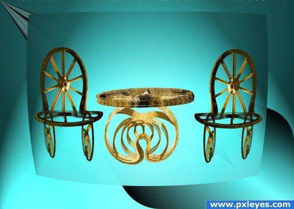
Nice idea, the furniture looks quite good, but not completely sure about the background. Perhaps a bit distracting, imo. Good luck!
could almost be an ad for the home shopping network and next we have a LOVELY set of lawn furniture..hehehe
Try setting these creatively made pieces of furniture on a floor and give them shadows...that will be great!
Boy would not want to set in one of those chairs
Howdie stranger!
If you want to rate this picture or participate in this contest, just:
LOGIN HERE or REGISTER FOR FREE