(5 years and 3436 days ago)
(5 years and 3449 days ago)
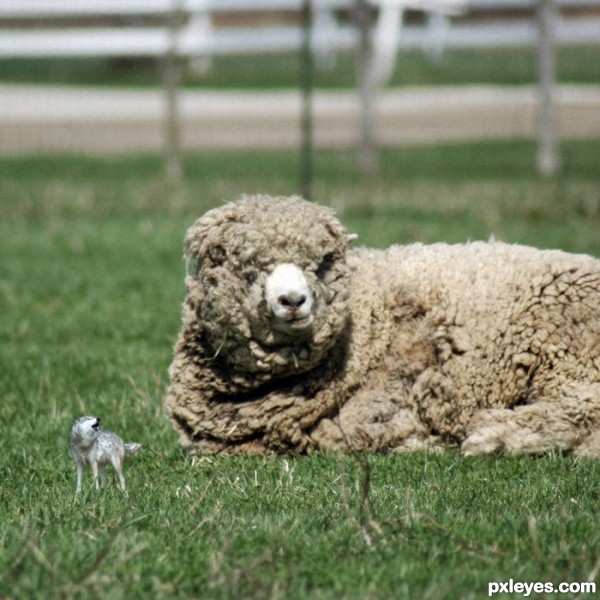
A wolf in sheep clothes 
GL !!
Edit,
Any idea were why this comment has a thumb down?
Because the grass blades are the same proportional size to fit in scene with the "supersized" sheep, your wolf looks miniaturized. Try changing the ground to fit the size of the wolf not the sheep so you get the super sized effect you are going for.
fantastic idea...
Howdie stranger!
If you want to rate this picture or participate in this contest, just:
LOGIN HERE or REGISTER FOR FREE
(5 years and 3504 days ago)
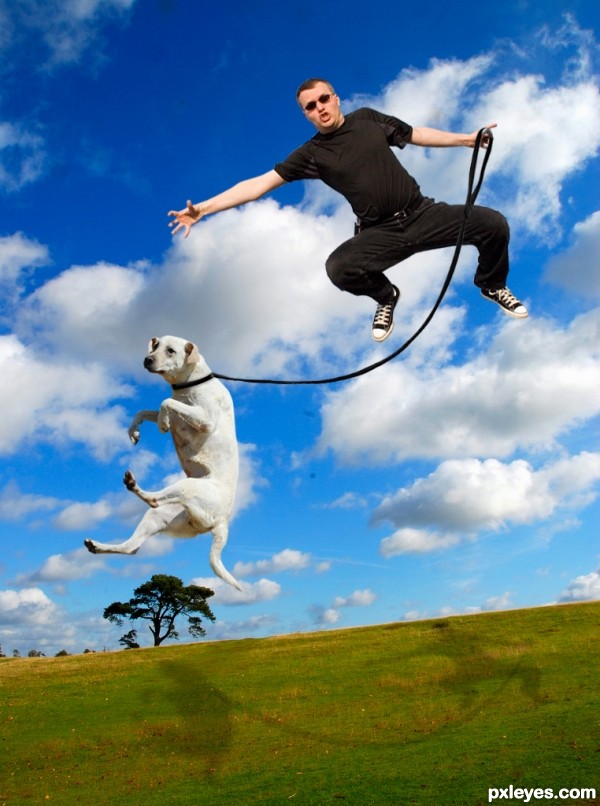
Um the term is "I believe I can fly" Your title doesn't make any sense with A's
I'd suggest removing the shadows, since the light source on the figures is from upper right.
Good idea, shadow perspective need to be reworked.
Very cute and funny, dog's image was well chosen! 
i agree with CMYK
thks
Howdie stranger!
If you want to rate this picture or participate in this contest, just:
LOGIN HERE or REGISTER FOR FREE
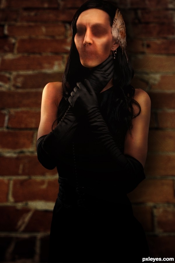
Comfortably Numb
"Hello?
Is there anybody in there?
Just nod if you can hear me.
Is there anyone at home?
Come on, now,
I hear you're feeling down.
Well I can ease your pain
Get you on your feet again.
Relax.
I'll need some information first.
Just the basic facts.
Can you show me where it hurts?"
(these are only part of the lyrics. but the part that inspired this piece.) (5 years and 3507 days ago)
Howdie stranger!
If you want to rate this picture or participate in this contest, just:
LOGIN HERE or REGISTER FOR FREE
(5 years and 3508 days ago)
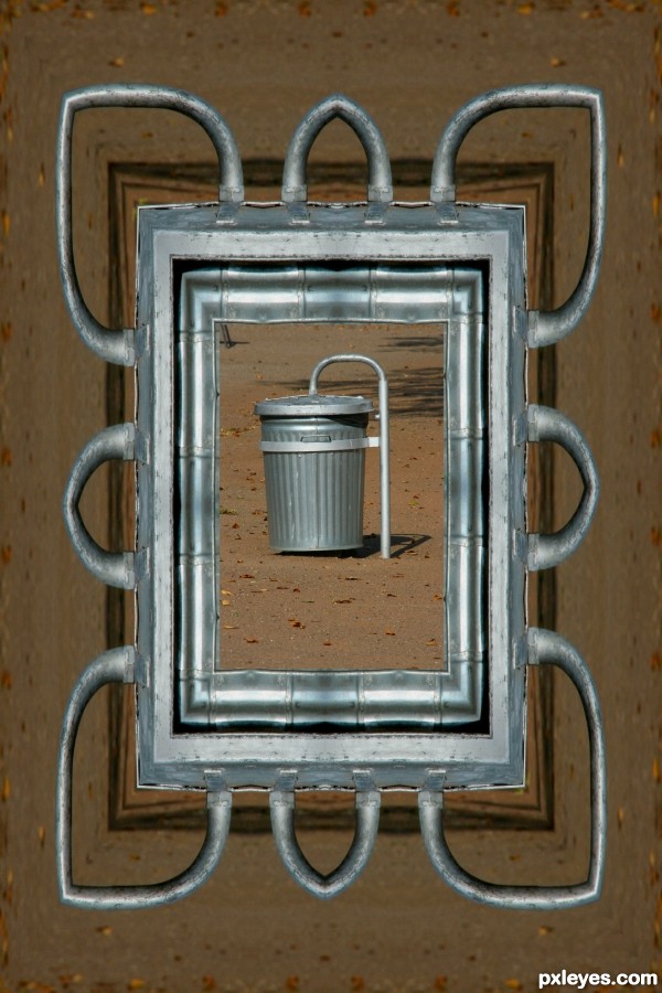
Fun title and cool picture frame. The interior edge where it meets the framed picture needs a softening shadow, however. I don't get why the title needs to be repeated on the wall in the image or what the dark bar across the bottom represents. The subject of the picture inside the frame looks neither particularly big nor fat -- and the picture really blends in with everything else for obvious reasons [it's the source!]. Some distortion of the picture coupled with a hue adjustment might be helpful.
Hey Thanks I did some readjusting ....Better?
Very creative author!
Howdie stranger!
If you want to rate this picture or participate in this contest, just:
LOGIN HERE or REGISTER FOR FREE
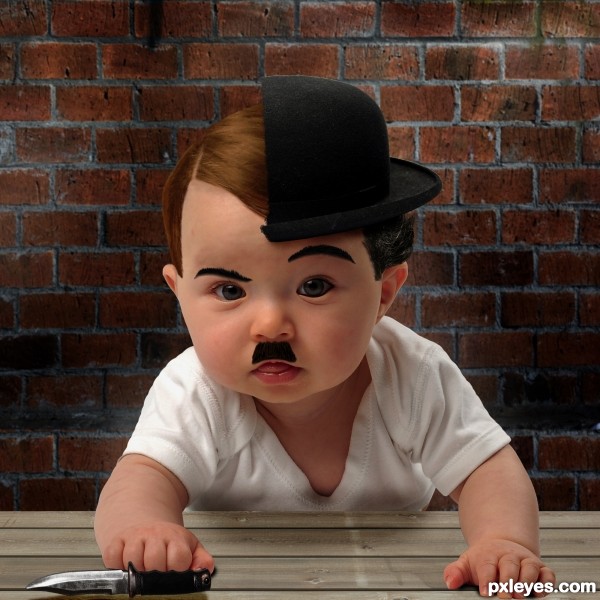
Smart! Chaplin vs Hitler, right?
Ya you guessed it right
Great idea author...just few minor suggestions...there is visible white halo around the hat...also edges of the Adolf/Charlie are to strong and sharp...u could use nice soft blur brush and made them a bit softer.Knife demands different shadow and u could work a bit more on shadows bellow the hands...Sorry for the nit picks author but idea is amazing and would be shame to loose points for minor issues...Best of luck
Excellent idea, but fancy doing that to such a beautiful baby.....
Ya erathion.....you are right. I am soon going to update it. Thanks for suggestions


@ Disco: Sorry for that...
Edited:
@ erathion.....sorry man.... until I made those changes...contest submission time was up. Now how can I update my entry????
Thanks anyway
congrats
Thanks Nick
Thanks Nick
Howdie stranger!
If you want to rate this picture or participate in this contest, just:
LOGIN HERE or REGISTER FOR FREE