They are amazing, attractive, and delicious. No kid can stay away from them.
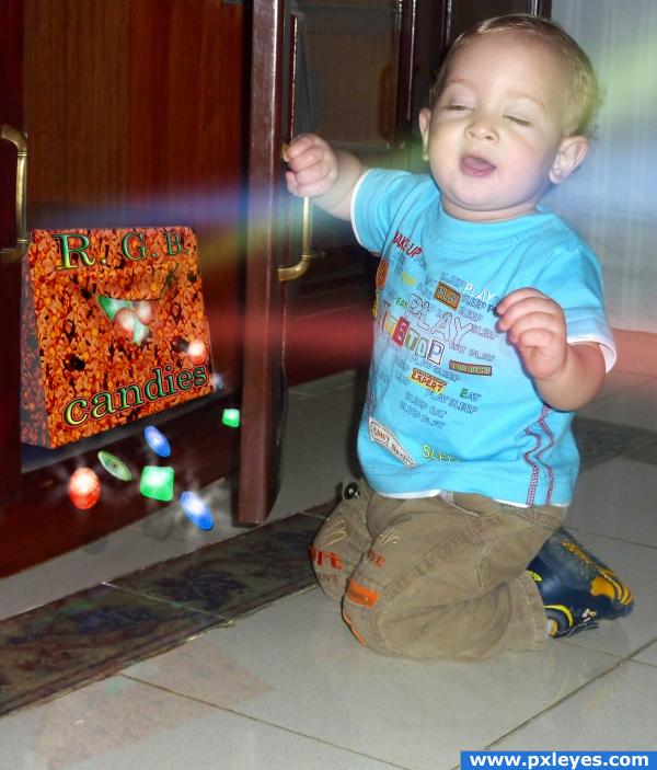
No sources from Internet were used in this entry. Picture of kid is my own. All other stuff made in PS. (5 years and 3931 days ago)

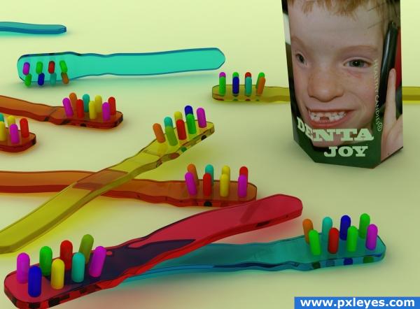
Hope the instructional intention of these candies is obvious. Worried only if children begin to eat the real tooth brushes, LOL.
Edit. According to Pixelkid suggestion and to contest goal added a package.
Thanks to Garry Manning and his adorable son.
3DS max
(5 years and 3935 days ago)
oh my god! what a horrible ironic. Really good idea!!!  (i forgive you 3DS max)

 must be a fav!
SOLARIS's enthusiasm is infectious..LOL.. very good author..the Irony is spell binding
You could start your own business with an idea like this!! I'd buy it!! Great image, wonderful job 
Super idea very nice work on the transparency!
Nice job...but I'm looking for the packaging per contest guidelines. 
EDIT: Not a problem. Good job. I might add your English seems very good.
awesome!
Thanks for comments.Solaris, hope will be a long peace with 3d max.GolemAura, above irony is self-irony. Ponti, deal,50% -50% its OK ? Pixelkid, thanks, see edit.But pls notice that is not fair for a non-english speaker to compete on a marketing slogan with english speakers. Thats why I avoid at first moment the packaging.
lol...
you'd put the toothbrush companies out of business  good work
the idea is great, the packaging not so much... you did a great job on 3Ds Max to create the toothbrush, but such a nice work deserves a better packaging... the type is not the best, as well as the color combination, and the size is deeply wrong... you should work on the package because you have a nice idea in here 
muaahhahhahaa! how to get out from washing the teeth?  cheers!
OK guys, ready to make a joint-venture with you  . Mike, thanks, modified, I have done my best but not enough.Not because of geometry but cause of lights management scene. From the begginning I create the illumination for small objects. a big reflectant object change everything. Humanly speaking have not the patience at this moment to recalculate all settings and made all long trial renders.Thanks again.
Winner!
good job 
Nice idea!!! lol good luck 
Bravo great idea!!
That's for sure something, kids would love  Well... I would have loved these, too

 congrats
Howdie stranger!
If you want to rate this picture or participate in this contest, just:
LOGIN HERE or REGISTER FOR FREE
sorry author.. even though you used all those great lights and whistles and those fantastically made candies..that baby is stealing the show hook line and sinker...LOL..High marks anyway..but you have to be very careful when putting a baby in a pic... all eyes are always on them..especially this little stinker LOL (High marks anyway.. because of the BABE.. woo HOO-
Nice
OMFG what a blissfull face... so C U T E... lol don't care bout candies lol... The baby stealing the limelight lol...
cool
must ... not.... stare... at.... cuteness... concentrate... on the work........ ok, now that i covered the cuteness factor, i think that the box fonts look as if they are floating, not part of the packaging. also, the type colors against the bg make it hard to read. may i suggest designing the packaging first by itself and later adding it to the chop? ok, now back to baby....awwwwwwwwwwwwwww
IMHO the kid's expression is saying: "Get this crap away from me!"...a true organic child!
Thank you guys for your comments. yahidithmonnalisa, 100% agree with you on the box issues. CMYK, child is just blinded by unexpected bright light.
he is stoned with those drugs!!! cheers!
Howdie stranger!
If you want to rate this picture or participate in this contest, just:
LOGIN HERE or REGISTER FOR FREE