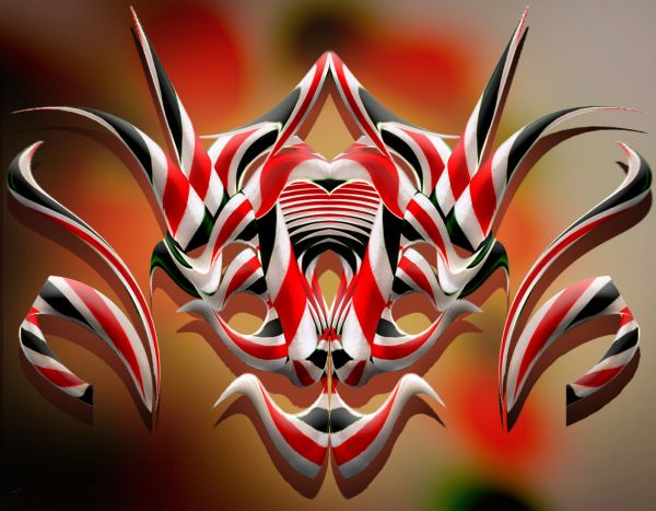
Only source image used.
High Resolution better. (5 years and 3715 days ago)
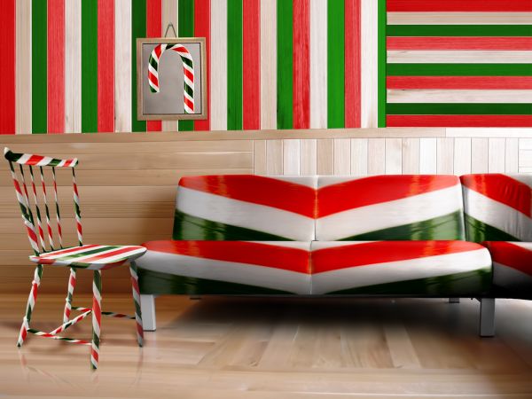
(5 years and 3715 days ago)
my house wouldn't be furnished for long then lol
Stunning. although, the picture on the wall looks too "3D"
my only nitpick would be that the highlights would be more to the middle of the sofa, but that is minor - I really like the textures. GL
beautiful realism
good work done
Congratulations for 3rd
Congrats for your third place, Fatz!
Brilliant work..congratulations!!!
Howdie stranger!
If you want to rate this picture or participate in this contest, just:
LOGIN HERE or REGISTER FOR FREE
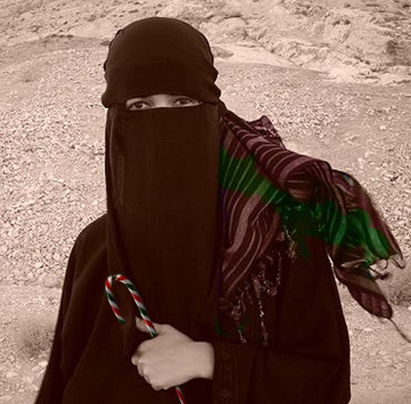
(5 years and 3716 days ago)
?? dont get it??
Kid is anywhere is kid and always loves candy.....
its hard to understand when you can't see any kind of expression in a picture, Just looks like someone holding a candy cane...
Minimal source used and the title needsw work...
"Just looks like someone holding a candy cane...... " it depends how you look.... "Minimal source used " it is the story not the source... But I've changed the title....
i see where youre going with this but the eyes dont look like the kid is smiling, if you could cut another image in there it would help. Also you need to change the colours on the scarf, have a play with blending modes til you get one that looks right.
Thank you ray... I'll try....
Do not see too simple?
Thank you so much.....
Howdie stranger!
If you want to rate this picture or participate in this contest, just:
LOGIN HERE or REGISTER FOR FREE
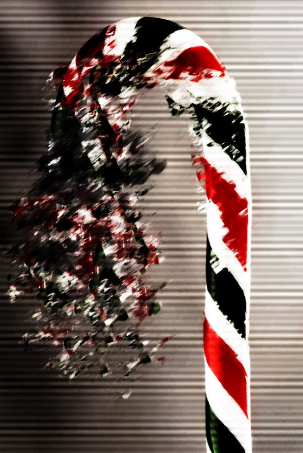
(5 years and 3717 days ago)
Needs SBS...
Cool.
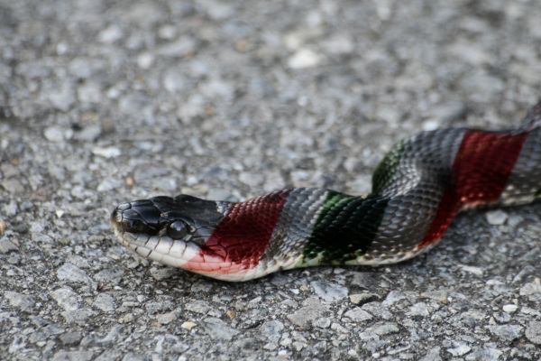
Is more like a cigarette color
Howdie stranger!
If you want to rate this picture or participate in this contest, just:
LOGIN HERE or REGISTER FOR FREE
(5 years and 3717 days ago)
Looks a bit simple to me. Good luck!
instead of jus using the colours of the candy on the snake u cud have made use of the cane properly for example like cud have transformed the cane itself into a snake
Is it "red and yellow kills a fellow?" Simple but you did a good job blending the colors with the snake.
very simple, no?
Howdie stranger!
If you want to rate this picture or participate in this contest, just:
LOGIN HERE or REGISTER FOR FREE
love this one
nice work!
Very good
i know it's probably too late now,but maybe you could use the burn tool and add some depth between the pieces?Just a suggestion. Good luck on your entry author.
WOW!
Perfect shape
like a dragon mask
Awesome....Work....
Howdie stranger!
If you want to rate this picture or participate in this contest, just:
LOGIN HERE or REGISTER FOR FREE