(5 years and 2542 days ago)

"I think he no longer needs"
(5 years and 3347 days ago)
this entry is fantastic...blend is perfect,here is a touch of humor,very important in this contest...well done author
Howdie stranger!
If you want to rate this picture or participate in this contest, just:
LOGIN HERE or REGISTER FOR FREE

only source image used
(5 years and 3743 days ago)
very nice.good luck
Very nice image, GL 
nice done
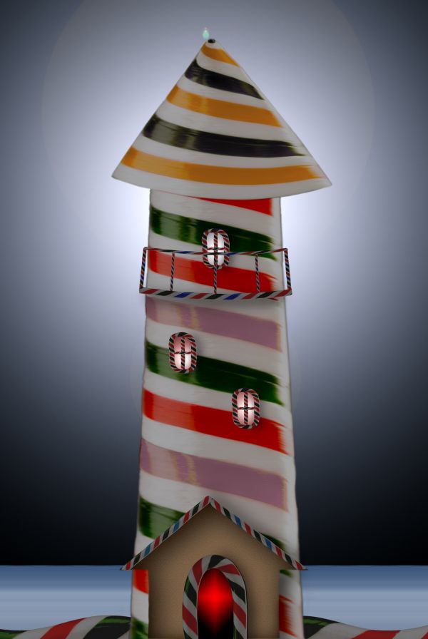
Looks really delicious 
very good the final result, i just would change the background...dont know, put a green field
Good work.
Thank you for the comments.The background is simple but it give depth and motive to the lighthouse.
Good job 
Wonderful....
Howdie stranger!
If you want to rate this picture or participate in this contest, just:
LOGIN HERE or REGISTER FOR FREE

(5 years and 3746 days ago)
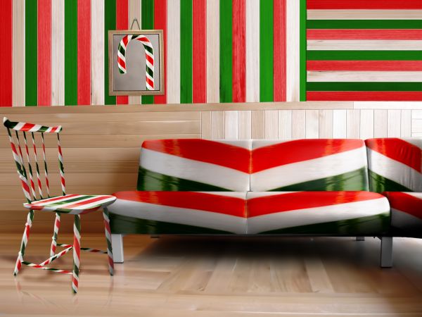
my house wouldn't be furnished for long then lol
Stunning. although, the picture on the wall looks too "3D"
my only nitpick would be that the highlights would be more to the middle of the sofa, but that is minor - I really like the textures. GL
beautiful realism
good work done
Congratulations for 3rd
Congrats for your third place, Fatz!
Brilliant work..congratulations!!!
Howdie stranger!
If you want to rate this picture or participate in this contest, just:
LOGIN HERE or REGISTER FOR FREE

(5 years and 3747 days ago)
?? dont get it??
Kid is anywhere is kid and always loves candy.....
its hard to understand when you can't see any kind of expression in a picture, Just looks like someone holding a candy cane...
Minimal source used and the title needsw work...
"Just looks like someone holding a candy cane...... " it depends how you look.... "Minimal source used " it is the story not the source... But I've changed the title....
i see where youre going with this but the eyes dont look like the kid is smiling, if you could cut another image in there it would help. Also you need to change the colours on the scarf, have a play with blending modes til you get one that looks right.
Thank you ray... I'll try....
Do not see too simple?
Thank you so much.....
Howdie stranger!
If you want to rate this picture or participate in this contest, just:
LOGIN HERE or REGISTER FOR FREE
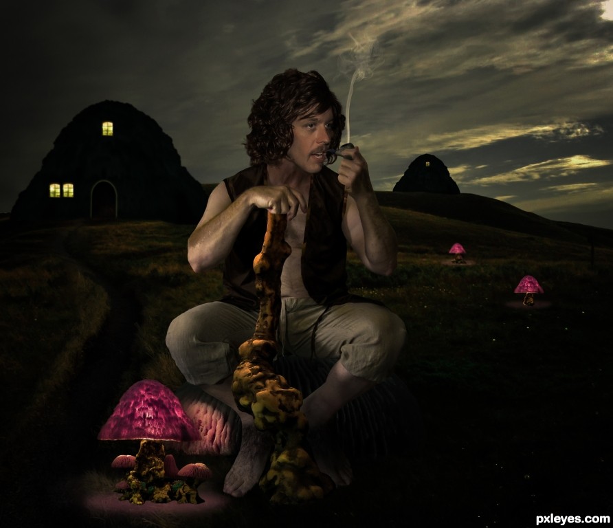
Good image, but try to work on some of the edges on the stick & figure. A soft blur brush will fix most of them. And since it's dark, the upper part of the figure could be less saturated...color fades in the dark. GL author.
Good points, I went back over it and fixed some things. I also, got rid of the pink tint, too problematic. Thanks!
Besides what Bob said, if he's a Hobbit shouldn't he have hairy feet?
Hair added...
Edges of hair on feet ain't hairy, and you haven't done anything to refine the edges mentioned above.
Edges were fixed, I'm happy with the feet.
The light and shadows in this are kind of all over the place, though I can appreciate the difficulty. I really like the concept, but otherwise I'm not quite sure what to make of it.
Maybe you could've moved the model slightly to the right then made the bottom left mushroom bigger, therefore making it cast more light. I find if I'm having trouble lighting a scene it helps to have a dominant light source to fool the eye.
It also helps to selectively blur/sharpen parts of the image to mimic the way humans perceive things i.e. I know the dude is the focus of the image but while I'm looking at him my brain is still noticing how sharp the background and buildings are and therefore it feels as if something is a bit wrong. Hope that makes sense!
Appreciate the input but I've spent all the time I will on this one.
Creating an entry is a lot of work so I understand your decision to stop revising. But for the future, I would note that a Rule-of-Thirds (rather than centering) composition can be more dramatic (and might have yielded a compelling diagonal arrangement here if your hobbit were moved to the right and the little mushrooms were in the middle). [BTW the horizon line of the lamp at his feet doesn't seem to match that of the other elements.]
Congrats Randy!!
Thanks!
Congratulations.....!
Thanks!
Congrats!!!
Thanks!
Howdie stranger!
If you want to rate this picture or participate in this contest, just:
LOGIN HERE or REGISTER FOR FREE