(5 years and 3020 days ago)
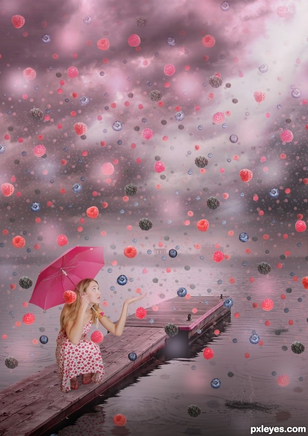
- 1: woman from intergalacticstock
- 2: lake
- 3: water ripples
- 4: splash
- 5: berries
- 6: berries
- 7: berries
- 8: berry

WARNING: MATURE CONTENT ON! O.0
Credits and thanks to:
http://phatpuppy.deviantart.com
http://mjranum-stock.deviantart.com
http://falln-brushes.deviantart.com
http://rl-brushes.deviantart.com (5 years and 3788 days ago)
oooooo wow pretty !! GL 
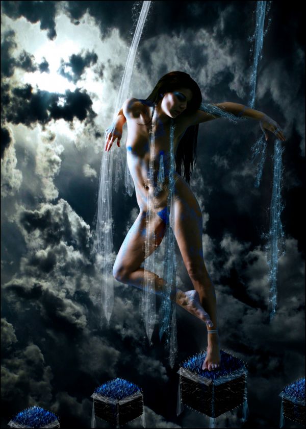
lovely work, but this has explicit nudity...  here we go again...
this is fabulous work, but is it going to get burned..........also, the source image has not been used so much........very little as far as I can see.......
Why is nudity not allowed now? O_o
Edit: I guess so... -.-
not if you can see a womans private parts lol..... apparently that isn't art anymore even though at one time it was the most popular form 
actually in the guidelines artistic nudity is allowed... but it depends on the mod.. evil nipples (roll eyes)
Err i rarely do nude art but as far as i knew it was allowed until this month
I think it should be a contest for a adults only...or...you can post in your entry, that is more nudity than art involved. This entry is, as many of the other entries where the main point of attention is a naked woman, and yes, I agree with Giulia, it has explicit nudity. More controversy in the way.....!
Let's not start another huuuuge nudity discussion. The Entry is great author.. very captivating colours, and a very surreal feel... great job!
I hope we won't see holes in this one too, over the explicit nude areas... Just blur it author...
@Keiley22: nobody said nude art is not art anymore. Just that nudes are not allowed on this site, not yet, at least.
The source is only used incidentally here...
too much nudity  but its nice
i dont think that there is too much nudity at all... the blue throughout the body takes away alot of the focus... unless you are looking to make it more that it is ;p either way author, im sure that majority of people will red flag and get it removed 

i will NOT  this entry
the jewels you put over her nipples would have been better left off, they don't look at all right..imo
Nobody can deny it's a beautiful work, and malice is in people's mind... but I suppose children also see this site, you know what I mean.
You can place a kind of veil, to give a touch of mystery... only a suggestion...
the problem with kids as a reason is simple, this is the net, and i just googled "toy", images, and on page 3 the porn starts, prolly the same with candy or school, the net is not a safe place for kids, so why act like it is????
I always knew nude can be a form of art too and it shouldn't be censored on art websites as this one but oh well... admins make their own rules for their own sites.
I subscribe to CMYK46 comment...Good luck
Minimal source used. Awesome use of imagination and I don't see this as dirty. Anyone who thinks this is not artistic is a prude and should probably just turn off their computer and tv and hide in the closet to escape all the bad stuff in the world. But yeah, it is minimal source used, IMO.
I agree with jawshoewhah's comment on both things...
great use of source 
This is really nice work,but use of the source is to minimal for my taste.I like colors so much,that blue color that u made is fabulous.And about the artistic nudity,i agree guys,this is art and if is work created with a good taste then should be allowed.Good luck author,
Great entry, but in my opinion miniaml source used. Good luck.
Good mood, creative. Too little of source used.
I've used 4 parts of the original source... i don't know how you people say it's miniml use, just because it's not directly recognised it doesn't mean i didn't use it much -.-
you may have used 4 parts of the image, but in the final version all 4 parts probably make less the 10% of all...
Cool...nudity is fine..please it's art guys!!!!!
cool work,nice ambient and colors!  I don´t see nudity in the image
Howdie stranger!
If you want to rate this picture or participate in this contest, just:
LOGIN HERE or REGISTER FOR FREE
Oh, I would like a rain like that for desert...
Wonderful mixture of colors, great idea and fantastic results, I adore it!
Lovely but too organized. feels more like a pattern than a torrential down poor of berries.
Nice detail with the reflection. Nice job, author!
Howdie stranger!
If you want to rate this picture or participate in this contest, just:
LOGIN HERE or REGISTER FOR FREE