My Photos (5 years and 3692 days ago)
Photography and photoshop contests
We are a community of people with
a passion for photography, graphics and art in general.
Every day new photoshop
and photography contests are posted to compete in. We also have one weekly drawing contest
and one weekly 3D contest!
Participation is 100% free!
Just
register and get
started!
Good luck!
© 2015 Pxleyes.com. All rights reserved.

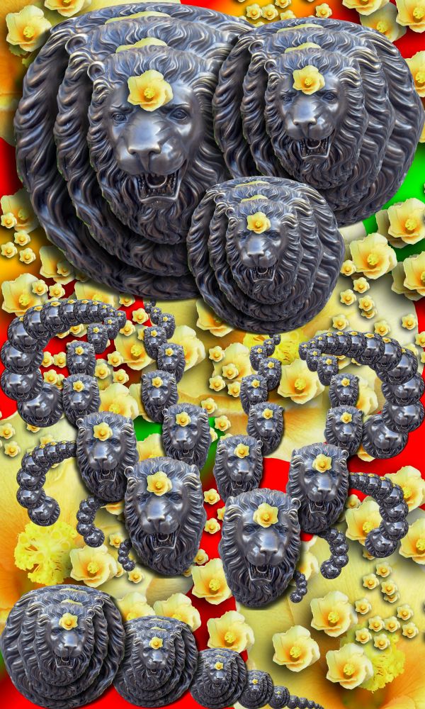
Don't see the Droste effect here...
look harder...it's in the entire piece... I just didn't want it predictible
Sorry, but I agree with CMYK. Even if it IS there, it's extremely hard to see. And I still don't see it.
I think it's stretching the theme, but i believe the droste effect is there.
http://1.bp.blogspot.com/_NpINLHeo8rM/RuaF7vjOUDI/AAAAAAAAGb0/xiwUX-R-RaA/s400/Droste+effect+%2819%29.jpg
http://3.bp.blogspot.com/_fEglkkU__oM/R5z2IZlHTDI/AAAAAAAABWA/VnjHy0yWgKc/s400/Droste.jpg
Even the original Droste took it's liberties (notice the differences in the miniature images and the added on effects)
http://blog.e-lek.nl/wp-content/uploads/2009/09/droste-big.jpg
Taking partial droste effects and then manipulating them into Mobius Strip feels was my goal...
And for those who know my work should understand that the first image I ever made that won a contest was a droste so I HAD to think out of the box... which is where all my work usually resides
I completely agree with you author.. great thinking
i don't agree at all author... those examples you showed to prove your point actually hurt your point... they all have some type of symmetry to them, yours is more chaotic... part of the infinite nature of the effect is it's symmetry...
I see many strips of lion heads that go on infinitely, but that just isn't a very good representation of the droste to me, whether it's correct or not. Sorry, this is in my honest opinion.
Once again I used a droste Mobius combination (you can see I could have easily made it into typical droste as remenants are every where) but my goal was other than that.. the samples I showed are showing the PARTS of the droste effect I used to make the image. (It's quite obvious that I know what droste is as to convert this into typical droste would take a few minutes) granted its more recursive.. but that was my goal to scatter droste not make on whole picture of droste (as I clearly could have done) just my Idea (this is fun)
I used Droste ideas to create a Car-touche image with floating droste as method (if you cropped the picture down, you'd have droste all over the place)
I don't really see it either.... sorry.....

EDIT: still like ya though
Not sure if this fits, not sure if i hate it or disgust it.
Author, if you have to write such a lengthy explanation just to prove people that it's good, then is it really?
Lengthy???.. hehehe.. I once wrote a 20 page term paper on the relative styles of Blake vs. Matisse (spent three whole pages on hands alone.. LOL) and I wasn't trying to PROVE anything.. just explaining my point of view .. and I never ever said it was good.. art just is (the good part is in the eye of the beholder)
Yes I suppose you are right. I suppose my eye is just not fit, then. XD
Nice work...gl
Howdie stranger!
If you want to rate this picture or participate in this contest, just:
LOGIN HERE or REGISTER FOR FREE