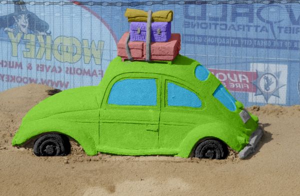
I just made a color layer and then used the color style.. its simple but i thought you guys would like some color (5 years and 3706 days ago)
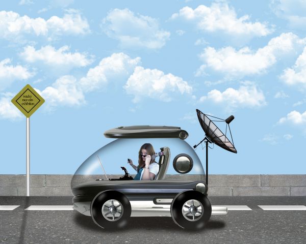
Khalus Ivan-http://www.sxc.hu/profile/khalus
Gabriella Fabbri-http://www.sxc.hu/profile/duchesssa
Manu Mohan-http://www.sxc.hu/profile/leocub
David Ritter-http://www.sxc.hu/profile/dlritter
~General mayhem ensues~http://comfy-bed-stock.deviantart.com/
Art-Photography & Resources-http://tammysue.deviantart.com/
Ashlea-http://ashzstock.deviantart.com/
Mila Vasileva-http://milavasileva.deviantart.com/
Thanks guys for the great resources...
Check High Resolution before voting...thanks (5 years and 3706 days ago)
Pretty cool
Very nice image the tire spots bugged me a little though they seem to down play the rest. ; )
Cute. But the road needs to be scrunched down significantly (probably roughly to the bottom of the tire rims) to make its vanishing point match that of the vehicle (which also needs to be matched by the crease in the vehicle's front bumper thingee). The shadow where the wheels touch the road needs to be much darker to eliminate the floating look (more evident in hi-res). The forward edges of tires are odd and don't seem to match the perspective of the car body.
Thanks guys for the advices.@Dan i made some changes on the road and fence.I think is better now.Thanks again for very resonable suggestion.
It would be better changing the perspective of the road, considering the view of the car...
And congrats for another great third place, Erathion!
Congrats on 3rd!
Howdie stranger!
If you want to rate this picture or participate in this contest, just:
LOGIN HERE or REGISTER FOR FREE
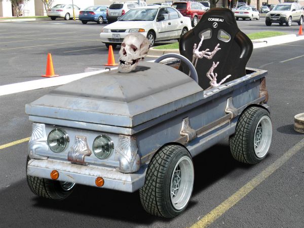
In case of fatal accident, this car will take the pilot straight to the right place... ;p
ps: Thanks for suggestions... (5 years and 3709 days ago)
Ha, Vamp mobile, nice one, GL 
Hey, there! Thank u for the comments... 
nice one...very funny...few minor observation...front tire (car left) dont look good...u have to change perspective there...and would be more funny if u put some skulls and bones to the seat or something like that....good luck author
lol ..cool
Erathion, I'm seriously considering your idea... hahaha! Thanks! XD
looks cool
perfect...

Congrats for your second place, Erikuri!
Congrats on 2nd!
Howdie stranger!
If you want to rate this picture or participate in this contest, just:
LOGIN HERE or REGISTER FOR FREE
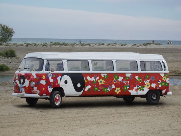
Thanks to Kalilo for the nice stock :-)
"Never have more children than you have car windows".
Erma Bombeck. (5 years and 3725 days ago)
looks like a nice well-executed chop. Well done
Thx 
Good work! just maybe make shadow a tad lighter...or less blur? GL 
Nice stretch! 

loopyluv, i will try to fix it, but it was hell geting this far 
Good job.. sometimes the simple looking images are the best 
Nice.....
Any drive thru at a fast food restaurant would love to see this gargantuan rolling into the lane. 
OMG, Mormon hippies! :LOL2: Well done.
Congrats on 3rd 
Congrats for your third place, Clinge!
Howdie stranger!
If you want to rate this picture or participate in this contest, just:
LOGIN HERE or REGISTER FOR FREE
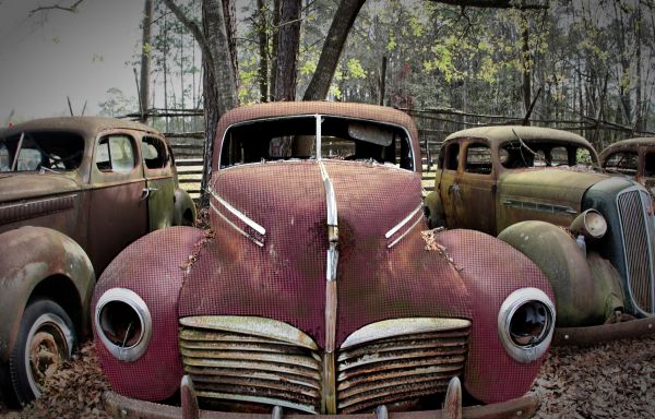
I just took the towel and coverd the car with it. (5 years and 3732 days ago)
not bad idea, but the pattern all runs the same way, surely it would follow the contours of the car!
Geat texturing 
Towel car....Cool idea....
great texture...its look even better in high resolution...
Cool texture!!!
Howdie stranger!
If you want to rate this picture or participate in this contest, just:
LOGIN HERE or REGISTER FOR FREE
Nice and simple :P
agree with kid
very nice !
very good work, simple and nice
Would be fun if you added a charachter like wallace, from wallace and gromit. But it's pretty good as it is.
Edit: and paint the tires black :P
nice colors...good luck
Howdie stranger!
If you want to rate this picture or participate in this contest, just:
LOGIN HERE or REGISTER FOR FREE