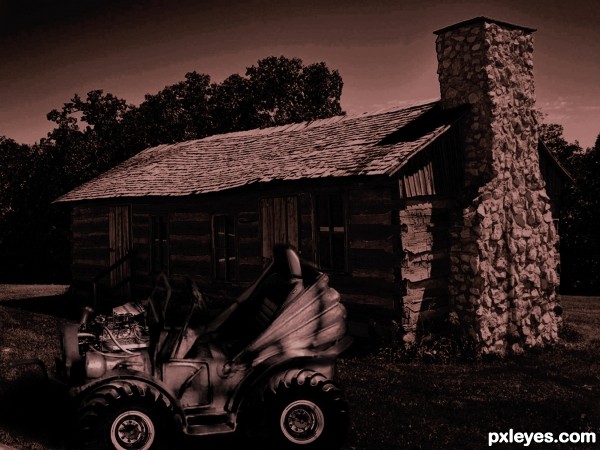
from old toy car, to new toy car (5 years and 3447 days ago)
- 1: Log Cabin
- 2: Seat
- 3: Fire Truck
- 4: Engine block

from old toy car, to new toy car (5 years and 3447 days ago)
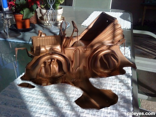
ALL SOURCE and PS! "Never place chocolate in the sun!" (5 years and 3449 days ago)
Mmmmm I feel hungry  great job !!
Cool idea! Looks like someones gonna have a mess to clean up!!! 
hahahahaha...great idea...and very effective work...best of luck
hymmm.. yummy.. Thanks for the treat. Nice one author. 
Ohhhh just great......... now all day at work im gonna want a chocolate hehehe
some people just have no consideration for choc-a-holics 
Excellent idea. Love the extra drips, too, good job. 
All those calories going to waste. What a crime! Nice work author!
Howdie stranger!
If you want to rate this picture or participate in this contest, just:
LOGIN HERE or REGISTER FOR FREE
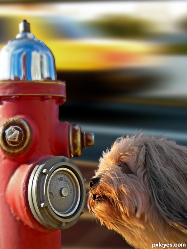
Gave a dog's photo near the hydrant. She smelt a new guy.
(5 years and 3451 days ago)
nice chop but the blur doesn't really work for me...gl..
Author I think you should give the hydrant the same blur as the dog, they are about at the same depth in the image. Another tip for the dogs hair: they look a bit hard edged... maybe try if this works: open a new layer on top, select a small blur brush (3 or 4 pixels) then check "select all layers" on top in PS and go over the edges of the hair. You'll see they'll blend much nicer that way, it's worth the time you put in it.
But it's up to you, it's your image. 
Thanks Toothpick134 for the suggestion.
I think you are mentioning hydrant cause the car with road and footpath without blur grabs away attention from dog. I tried hydrant mouth without blur, the prespective wr2 dog goes bizarre. Moreover that mouth becomes too prominent.
Suggestions are most welcome.
Don't blur the hydrant, blur the dog just a bit.
Thanks robvdn for a good suggestion on dog hair. I did changes using select-modify- contract and inversed it, then gave it a blur. It blended nice as you suggested. Toothpick134 intended depth correction, yet perspective remained same, out of match with hydrant. I tried to give hydrant's shadow on dog, then dog no longer looked the hero of image. Enlarged hydrant and perspective changed for worse.
Changed shadow angle of hydrant and dog using soft brush, then car source image had to be changed because of its shadow angle. As CMYK46 suggested, I tried to keep hydrant as it is and blurred the dog a bit, it seemed the dog is looking at somewhere else and not at hydrant. also the hydrant becomes too prominent. Thanks CMYK46.
I couldn't find a good background better than this car at such angle as hydrants used to be adjacent to road and regrets, couldn't find a better angled dog smelling intelligently.
Finally, I think, oopps, was it wrong compilation  (
(
dog hair edges have green color no need that, beter same background color.
[only edges]
Idea is nice and images fits together but u could make it even better...Blur is still to big IMHO, and u should work on that a bit more...As for the dog,use small smudge brush ,strength around 80 to create basic fur on hard edges part...be free and loos your hand when u do that...then u will get the best result. After basic fur play a bit with the size of the brush to make fur even more realistic. Now is good but with few adjustments this could be very very good entry...best of luck
I am with CMYK on this one 
If it was up to me I would scrap the background and use the original background of the dog. I would expand the background a bit horizontally and finish the base of the hydrant and place it in the background. Making sure to match the depth of field to the surrounding area where the hydrant is placed. Good luck!
Thanks Chalty for the suggestion. I appreciate that.
@robvdn. I saw and realized, then decided.Thank you very much, I done the changes as you suggested.
@Toothpick134, hope the reduced blur confirms your comment. Thanks for pointing it out first.
@CMYK46, you suggested an altenative, thinking I may accept any one. Thanks. I did changes with first and for me, it came out nice. Thanks CMYK46.
@Sanjugs, Thanks for the minute observation on hair. I did the work as you and robvdn suggested. Hope the changes are satisfactory.
Hi! erathion, thanks very much for your ideas. Best was your 80 with smudge. robvdn, I think it is about version.
@Mario, Thankss for pointing out.
@Chalty669, Thanks. I wanted to put my hydrant on roadside. So I didn't try the grass.

Howdie stranger!
If you want to rate this picture or participate in this contest, just:
LOGIN HERE or REGISTER FOR FREE
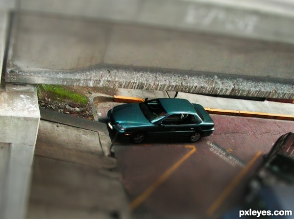
cloned out the people and followed the Tute (5 years and 3455 days ago)
great work author...car really look like a toy...GL
Howdie stranger!
If you want to rate this picture or participate in this contest, just:
LOGIN HERE or REGISTER FOR FREE
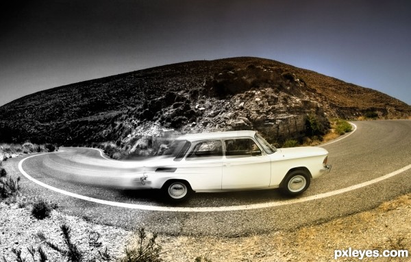
(5 years and 3531 days ago)
So cool idea author...i like your playing with the colors...best of luck
This is very eye catching! I love it. 
Love the title and thought it worked well with the image THEN I looked at it in Hi Res and really loved it ... there is no driver ... how appropriately ghostish is that!!! Wonderful work on the curved blur and the overall image. Bravo ... high points from me!
Whoa, the car is from the Twilight Zone! Nice warp on the trail, author, and color transition. ;-D
Howdie stranger!
If you want to rate this picture or participate in this contest, just:
LOGIN HERE or REGISTER FOR FREE
Good idea, but too dark. Change the shadow to match the shadows on the cabin.
I lighten the car up some, I'm not sure how to change the shadows to look better - to me they seem like they are going in the right direction except the shadow from the head lamp on the front of the car...

Thanks for the advice though
I'm still a newbee to photoshop...
Way too dark, hardly any ambient lighting, which is really weird for an outdoor image.
Howdie stranger!
If you want to rate this picture or participate in this contest, just:
LOGIN HERE or REGISTER FOR FREE