Thanks to Daboss-Stock.
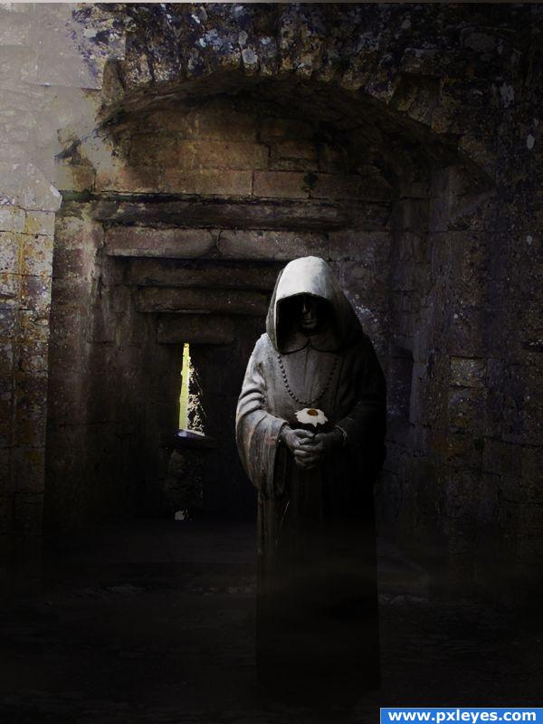
I'm afraid the author of the abandoned railway station stock did not reply in time to give me permission to use his stock, so i have replaced it with this beautiful castle ruin stock. (5 years and 3858 days ago)
- 1: Statue
- 2: Castle ruins


Just to notice you, i think you need the stock owner permission (his answer) and not your request. I like your chop but you nearly didn't use the source image.
Thank you for the comment, if you're usnure of how i used the tock view my step by step guide, i know it's a minimal part of the finished image, but i really wanted to create that contrast between a dark looking statue (almost like death) and something as positive as a flower.
lovely work but the flower seems out of place its lost shape somehow and the contrast/brightness seems far different then from the rest of the piece, thats perhaps why the shape of the flower seems lost maybe o.o; also i think the monk should stand much further back to catch that much light on him.. hes too far from the window.
I don't see how the title relates to the image, which IMHO isn't a great use of the source pic...
Again, the title is to show contrast between the flower and the dark statue and rustic background. I apologise that you don't think it's a good enough use of the source, but it's the only idea i had. I won;t be adding random patches of the flower just to try and make the source more obvious, because i created this image to show contrast.
i get the entry. nice colours. like how you used the source. i think that it would be hard to use in many ways. GL
The flower is there... I can see it... Works for me... It's like seeing a small dot on a white wall, but it helps in improving concentration( it is a compliment author
  )...
)...
Great idea and mood.
Love it! I think if the source image is used as the focus of the image no matter how small, it is used in a big way. As for the title, it makes you think there is a story behind it, which makes it so much more intruiging.
Very Good..I like Dark Artwork without blood and gore......and it has got that feeling......................Good Luck...
oooh nice one great atmosphere
Howdie stranger!
If you want to rate this picture or participate in this contest, just:
LOGIN HERE or REGISTER FOR FREE