my photos combined with source (5 years and 3293 days ago)
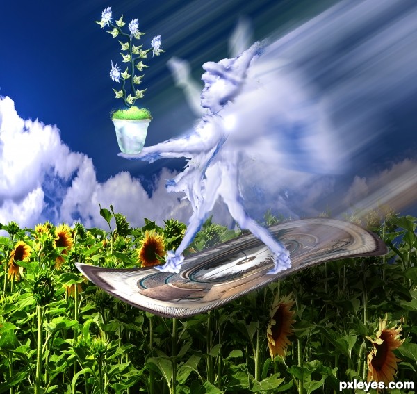
Background image thanks to http://www.sxc.hu/photo/1340045
Author: Chemtec
(5 years and 3301 days ago)
ha...ha.., very nice..... never expected its you man...
 thanks anoop
Howdie stranger!
If you want to rate this picture or participate in this contest, just:
LOGIN HERE or REGISTER FOR FREE
(5 years and 3452 days ago)
idea is good....need more finishing
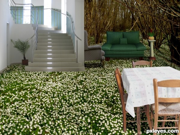
idea is perfect author as Gopan sad but need bit more works...u could made better transition between stairs and the grass,also perspective of the grass don't fits 100% with the furniture...to bad for that details this could be amazing entry...still i like it and i wish u best of luck
Good idea. Stairs definitely need some shadows.
Howdie stranger!
If you want to rate this picture or participate in this contest, just:
LOGIN HERE or REGISTER FOR FREE
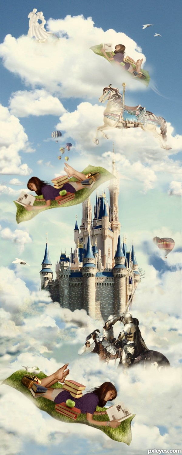
Reading is a great adventure. Thanks to the following at morguefile.com for use of their photos: ronnieb for knights;dave for clouds; peachyqueen for carousel horse;jfelias for the castle; pdigital for 2 books photos; jeltovski for books w markers; taliesin for ringneck doves; lcg for flying dove; beglib for balloons; and earl53 for cake. (5 years and 3578 days ago)
I totally agree with you, author! Reading makes us travel to many places through the time... sometimes you can feel like you are the character of a story! Feel romance, adventure, mystery, fear... 
Fantastic work! 
Nice mood. I just don't like that she's in there 3 times. I would go for the one at the bottom, the others are just distracting. Good luck!
Great idea author,and fabulous imagination...good luck
very different

Wow.. Really "tall" picture 
I like it.
Nice to have some different stuff sometimes.
Great fairy tail picture! 
Howdie stranger!
If you want to rate this picture or participate in this contest, just:
LOGIN HERE or REGISTER FOR FREE
source... (5 years and 3808 days ago)
Howdie stranger!
If you want to rate this picture or participate in this contest, just:
LOGIN HERE or REGISTER FOR FREE
this is a great image!
little nic pic's...
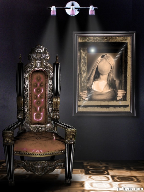
that random line on the 'seat' of the chair is distracting - doesn't make since to me.
I like the lighting on the chair but if the lights are on the wall then the front of the lege should have the same brightness?
Only giving those nic pics because this is a great image
Another awesome job author!!!!
great imagination
i can't get the point of this........sorry!
Very interesting concept in the way you used the image of the girl and the frames. I don't like the carpet either, but I like the chair, clever way you updated it.
Howdie stranger!
If you want to rate this picture or participate in this contest, just:
LOGIN HERE or REGISTER FOR FREE