(5 years and 3019 days ago)

With thanks to olga and ell-r-brown for the images used. (5 years and 3449 days ago)
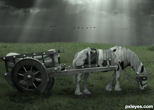
The selective desaturation doesn't really work well for this image. You've emphasized the grass, rather than your subject.
Good point - will remember for future work. Thanks!
Great shading on this! Very nice. :0
yes this looks good to me too
I sort of like the desaturation ... It gives the image an almost surreal look. And the horse looks tired. This image has quite a mood to it. Good work!
Love the mood to this image. GL Author
Thanks for the kind comments!
Amazing entry, very good work on adding shadows and highlights 
Great job, author! Love the look and feel of this 
Really like the feel here!
I really like the mood here, well done.
I love this one !
I love this one !
Howdie stranger!
If you want to rate this picture or participate in this contest, just:
LOGIN HERE or REGISTER FOR FREE

(5 years and 3572 days ago)
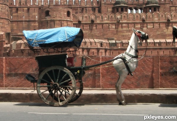
Should it have a tail?
i agree. it would look better with a tail. nice job
Pretty well done. Two tiny nitpicks, the top of the wall behind the horse doesnt fit well together (first it goes up, then right of the horse it's lower again and horizontal), maybe you can fix it with transform. Other thing is that I'm not that fond of the shadow for the horse, it looks a bit dirty. Compare it to the original shadow and see how it should look like. Good luck!
pretty cool!! good luck author
> all,...thanks,....
>wazowski,.....I have tried to correct it, hope it looks better now....
Howdie stranger!
If you want to rate this picture or participate in this contest, just:
LOGIN HERE or REGISTER FOR FREE

(5 years and 3903 days ago)
very beautiful image... tip top!
I don't want to know, how expensive that one is  Very nice work and a great idea
  Good luck
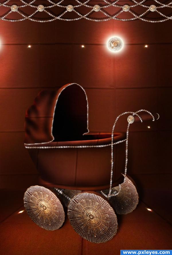
in my opinion the image loses some depth on top of the carriage but i wouldnt know how to fix that.. nice work by the way 
great job, maybe use the dodge tool around top edge of canopy on the stroller
now that's what i call a ride 
Wow that looks amazing, totally new style! Maybe soem brand will make that one day, it's a good idea ahah  very nice author.
whoah! thats stunning! im lovin this entry author!
wonderfull
Creative thinking! I'd maybe work a bit more on the canopy material...but nice!
i wanted to be in this as i was a baby... but my folks told me: no no...  very nice
gives a gucci versace feeling.very cool
awesome!!
All is missing is a Swarowsky baby, LOL, good and original, love it, good luck.
neat
Congrats Chakra! Now you can start to produce them 
Congratulations for 3rd
Congratulations, Chakra! What a cute jewelry like baby-pram  To my regret both my daughters are too old for such present

Congrats!
congrats
Congrats!!
Congrats!
Howdie stranger!
If you want to rate this picture or participate in this contest, just:
LOGIN HERE or REGISTER FOR FREE
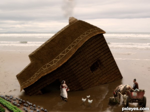
I like your reflections.
Howdie stranger!
If you want to rate this picture or participate in this contest, just:
LOGIN HERE or REGISTER FOR FREE