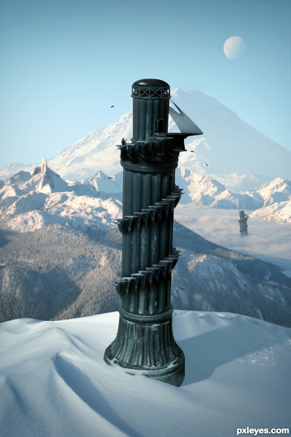
Edit:
- Fixed some masking problems.
- Decided to go with a colder climate than the last image. (5 years and 3604 days ago)
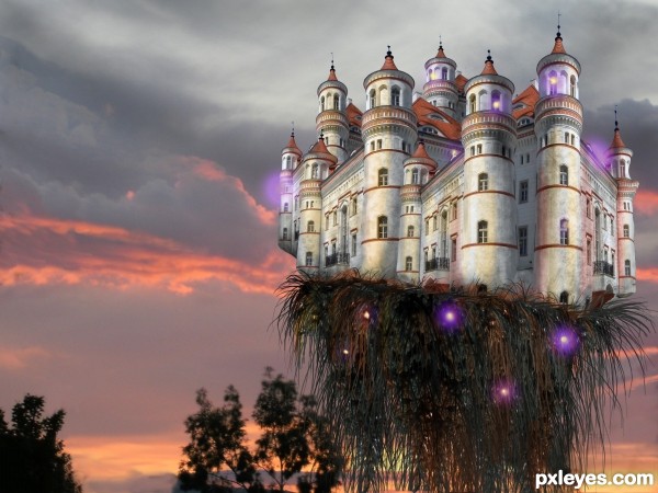
The evil castle dominates.
For the background I used one of my own photos. (5 years and 3611 days ago)
nice job
Nice work.
In high resolution, there are some strip lines going from top to bottom, also near castle left tower, IMO these are border from source, which need to be delete or mask. Also little black cut on the left 2 tower near window. Some black small strips at right and left tower edge.
Hide your background image and add new layer at the bottom and fill it with color to view all these remains of source.
and Author why only right tower is distorted?
Good Luck
nasirkhan, you are absolutely right!
I did this late last night and although I had the intention to distort every tower, in the end I was too tired to do it and forgot to fix the distorted one to resemble the other towers.
excellent
happy fun.. reminds me of the everglades for some reason
It's so beautiful that it doesn't seem an evil castle... I like those... er... spirits? 
Very nicely done....Love the whole thing best of luck
stunning!
Howdie stranger!
If you want to rate this picture or participate in this contest, just:
LOGIN HERE or REGISTER FOR FREE
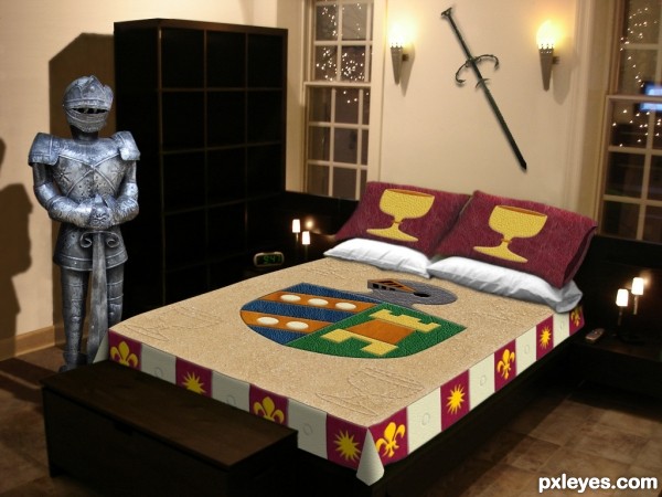
(See SBS for specific leather textures used.)
UPDATE: new knight (5 years and 3611 days ago)
This room is so Male I can smell the testosterone from here.. LOL
great job!!!
would help to center chest with bed

You know, I never noticed the chest wasn't centered on the bed! I just left it where it was in my bedroom source while my attention was concentrated on the bed itself. Unfortunately, my knight doesn't have any feet, so it's critical that the chest not be moved.  I suppose it could be stretched to be as wide as the bed, but that would yield an oddly proportioned chest IMO.
very nice...... all the best......... 
very nice work and great idea author...good luck
GL
chest could go the width of the bed np. it would look better imo 
good luck 
This time I completely disagree with Drivenslush  This abode has nothing to do with males, this is the right bedroom for me. I adore armours, swords, shields, crests, chalices and more heavy metal, please


really nice
congartulations!!!... for for 5th place...
Howdie stranger!
If you want to rate this picture or participate in this contest, just:
LOGIN HERE or REGISTER FOR FREE
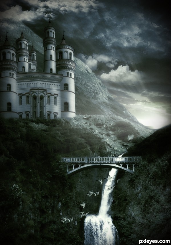
Castle created with source.
Thanks to Lelaina, maf5002, bertvthul and costi
Also thanks to javierzhx.deviantart.com/ for cloud brushes. (5 years and 3614 days ago)
trademark entry...wink!..nice job as usual..good luck
Wonderful mood ! Great job , well done 
excellent manipulation.... good luck author 


Very nice mood! Just a few suggestions; Rotate the sky, so that its parallel to the horizon. The castle has a strange corner in the middle, is it supposed to be straight or a real corner? The border of trees and stones on the lower part of the castle is to much blurred. Try to make that sharper. IMO that would make it really nice!
my favorite
Fantastic work author,really really fabulous mood.I have one nit pick,if u look at the bridge,castle is huge...Maybe u have to work just bit more on the proportions...any how i love this work and high votes from me...good luck
What a great scene! That's impressive at the first sign, nice mood and composition. However, after looking carefully to your image, I found out some parts are not correct. Comparing the waterfall in the first source and this one, you can see that the view angle in the source lower than the waterfall, so you can't see the top of the waterfall, but in your image, the view angle changed, now it's on the top of the waterfall, but still no water or stream on top of it can be seen (the waterfall in the bottom). The same problem with the higher waterfall, I found it suddenly appears from the land. Moreover, the light beam under the bridge should have a light source (the bridge itself can't emit the light, right, if it's not the mystical one). Hope that my suggestion can help. Good luck author 
Thanks to all for your comments and specially Ressiv, erathion and langstrum for your great suggesstion and nitpicks. I will try my best to fixed them.
Blur trees/leaves below castle to blend with rest, reduce the size of castle slightly, remove top waterfall, added flying birds, rotate sky and placed horizontally, fixed lights rays. Thanks for observing very closely and pointing out problems. 
Looking better now! But now I don't know where the waterfall is coming from, there's no river. Maybe a photo taken over a river, and place this above the waterfall? Try a river thats between two high cliffs, it will fit very good and fill up the hole thats under the bridge now. It would make the image complete for me. But now I'll stop nitpicking
Ah, I could bet it was your work, author! It has your touch, your style... Very beautiful, and after all corrections you made, the only thing I can say it's P-E-R-F-E-C-T!!! 

Thanks Ressiv for great advice. It looks much better, once again thanks to all.
erikuri, now I have to change my style to make me anonymous , 
Nicely done ! Should be in Top 3 
Very nice! Executed very well, no further comment 
I could tell who made this as soon as i saw it. The only nitpick I have is the bridge. I don't think you would be able to see as much of the bottom of it from the angle your looking at it from. The angle should be from the top not the bottom.
wow........ this is really great.... advanced congrats......... 
Beautifully composed and executed.......Keep up the beautiful work. GL
nice color scheme, some small perspective issues, nothing major, good job
Thanks to all my friends for your comments, nitpicks, votes and fav.
Thanks Gopan, glad to see you back, where have been you?, why are you not participating? Really miss your great work
sweet work
And I'm happy again, that one of my images is part again of one of your lovely entries! Thank you very much for using it and good luck! 
ha! and you commented my mistakes from my entry.....but yours is full option!!!... 
So dreamy and picturesque image 
OK!.
Howdie stranger!
If you want to rate this picture or participate in this contest, just:
LOGIN HERE or REGISTER FOR FREE
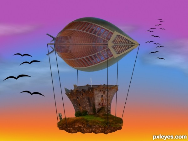
Thanks to Bluestardrop at Flickr.
SBS coming soon... (5 years and 3640 days ago)
It's a balloony Loonie... hehehe.. great job
Very good image...gl author
good entry!
Nice idea. I would like to change background to some light color.  .
.
GL with this entry
nice job Author good luck
Howdie stranger!
If you want to rate this picture or participate in this contest, just:
LOGIN HERE or REGISTER FOR FREE
Beautiful work...
great great work
Pretty fast submitted entry! I like the idea, you may want to mask the top of the pawn a bit better (some white edges here and there). Good luck!
Pretty good, but room for improvement!
Im not entirely certain, but wouldn't the shadow be bent outwards over the slope rather than inwards? - the shadow from the furthest tower is too dark in relation to the closest - and - maybe a little addition to some shadows from the terrain would help place everything better - especially from the mound covering the foreground tower as it's casting nothing...
Oh and the glare fom the bottom of the 'tower' it's not true to where you're placing your shadows from, so maybe get rid of it and add some highlights to the relevant side
Thanks for the comments.
Cool over all. I personally don't think the duplicate background towers add anything, however. Also, the palm trees look fake. And the hi-res version highlights the white edge around the tower's top and the fakiness of the tower-bottom and sand-dune edges.
The top of the tower still remains sharp and white spots are there . but this is a good image... you have to make some touches there... good luck...
Great but as above you could just try the matting controls, use the "layer" / "matting" from the top drop down menus and remove white matt or defringe to get rid of them, Then quick select and feather those edages slightly.
nice creation ................ i like it ........ Gl to u ..........
Thanks for the helpful feedback. Image is now complete.
Very nice, like the Pizatower, but in the mountains
I like it! GL!
yeah a much better image!?!... GL
i like the colder climate version!! great job!
This is why I don't participate in this contest
Nice work, and well done, gl
Very nice, good luck
Fantastic work author...IMHO u don't need other tower...any how this is great,high marks from me...best of luck
nice
Good.
GL
Thank you.
Super! It looks like the tower will fall out of the image at any moment
Howdie stranger!
If you want to rate this picture or participate in this contest, just:
LOGIN HERE or REGISTER FOR FREE