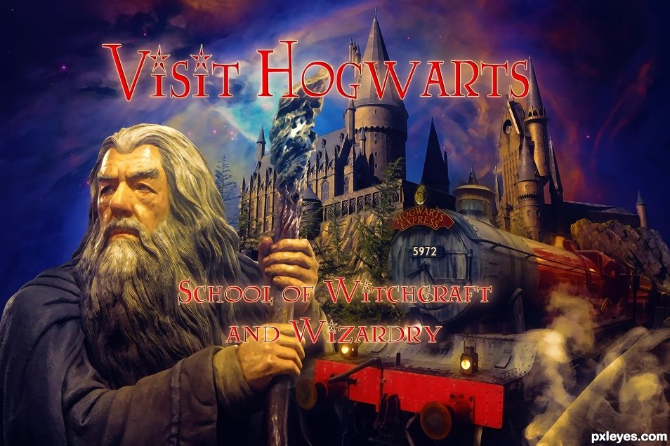
A magical place where anything is possible if you know the spells, so hurry to school and learn to spell. ;-) (5 years and 1201 days ago)
- 1: Castle
- 2: Nebula
- 3: Train
- 4: Wizard Statue
- 5: Lumos Font

A magical place where anything is possible if you know the spells, so hurry to school and learn to spell. ;-) (5 years and 1201 days ago)
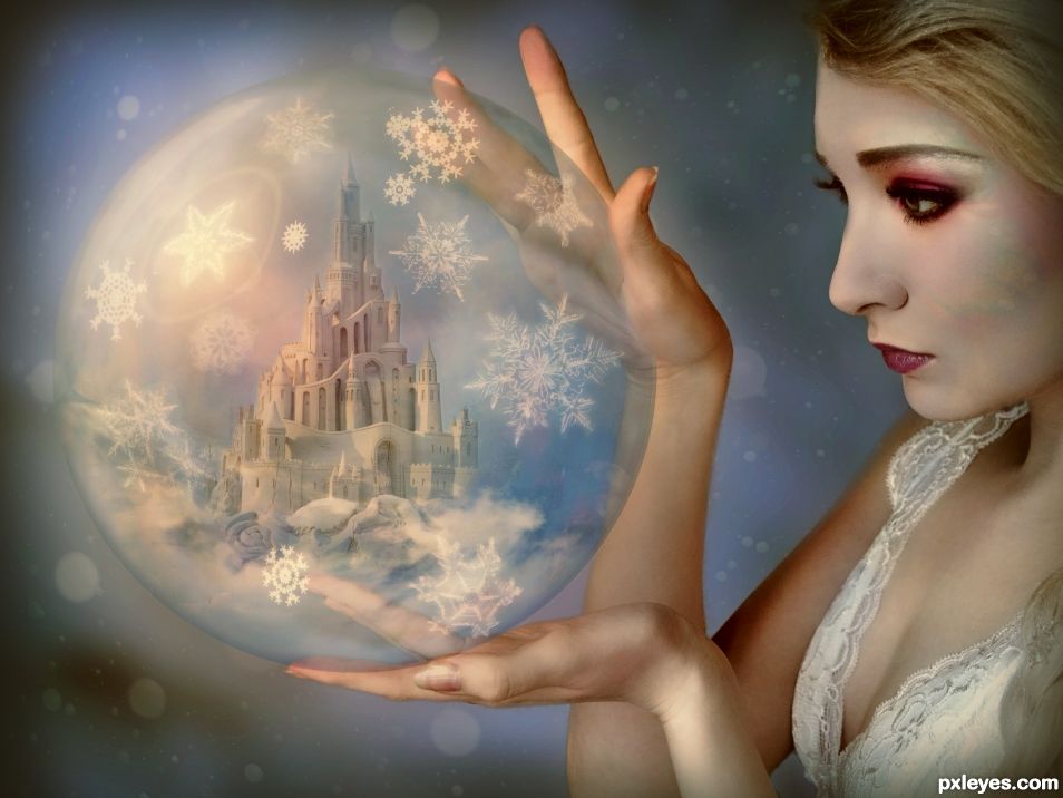
(5 years and 1297 days ago)
Beautiful and magical!
Thank you.
wonderful entry author. straight to the pool room with this one. ( an Australian saying meaning it is special and worth putting on display for the world to see)
Thanks mate. 
Just awesome!
Thank you
Lovely work indeed! 
Thank you
Beautiful image...
Thank you
wow! excellent!
Thank you.
do not trust her ...she is the evil queen ..lol ... very nice work author
Thank you.
Congrats...
Thank you
Congrats Angel 
Thank you
Congrats!
Congrats!
Congrats Angel, Well done!!
Congrats!
Congrats, beautiful entry!
Thank you everyone
Howdie stranger!
If you want to rate this picture or participate in this contest, just:
LOGIN HERE or REGISTER FOR FREE
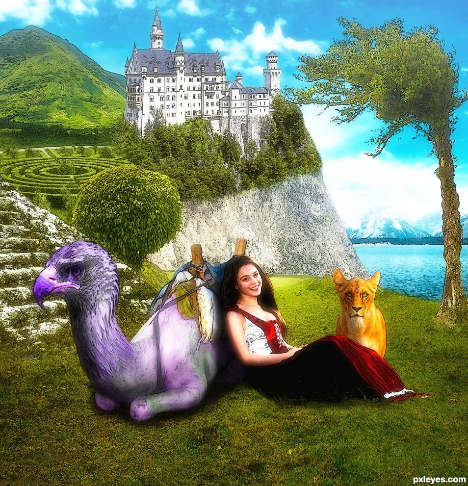
This one I started with the girl, not really knowing where I was going. I have worked on it for too much time and now I think I can't see it clearly. Maybe you can help me with some criticism. (5 years and 1528 days ago)
Lighten the shadows and make them less opaque. I'd remove the pink blob. I know it's supposed to be flowers, but it looks like a pink blob.
Also, the filter makes the castle look like a drawing. The basic concept is good, if a bit too saturated. The eagle/camel is well blended & believable.
Kind of looks like an illustration from an old Fairy Tale Book, after smoking crack. I'M JUST KIDDING.. but seriously, it looks really sharp.
If you have the original images (before the filter effect) place it under this layer and experiment with blending options to see what happens.
This is a mixed media contest, so this image is fine. Though I think the Lioness could be just a tad bit bigger so her ears break the cliff edge. She's looking more cat like instead of lion like. More little mushrooms might help to give them some purpose. They kind of look like the just plopped into the picture. Not a bad thing, but they are curious.
Good luck author.
Thanks for your criticism.
I removed the mushrooms but not because of placement but because I want to find different looking mushrooms. For the flowers, I wasn't really happy with it either. And yes I want it to be very bright and saturated like a bright sunny day, and sharp like a drawing.
I have some more source to add
- round bush: https://pixabay.com/fr/arbre-jardin-bungalow-couper-893287/
- labyrinth : https://pixabay.com/fr/parc-labyrinthe-vert-748339/
- stone stairs : https://pixabay.com/en/albania-castle-ruin-shkod%C3%ABr-balkan-1036793/
- tree : https://pixabay.com/en/tree-landscape-costa-rica-mountain-692918/
Much improved author,the lioness is much more Panthera leo and less Felis silvestris catus. That little tweak made a world of difference (IMHO). Smart move on the on the flowers as well. The labyrinth was a solid choice and adds a lot of interest to the chop. Once again IMHO. Good luck.
A better technique for sharpening an image is to duplicate the layer then use a high pass filter on the upper layer. Set the blending on that layer to overlay. That can sharpen up an image nicely without adding the black lines. Coincidentally, if you invert the top layer it gives the pic a nice soft effect and can hide sharper imperfections.
Much improved, author! 
Just try to lighten the shadows under the girl & beast, along with less opacity.
Beautiful and dreamy 
Howdie stranger!
If you want to rate this picture or participate in this contest, just:
LOGIN HERE or REGISTER FOR FREE
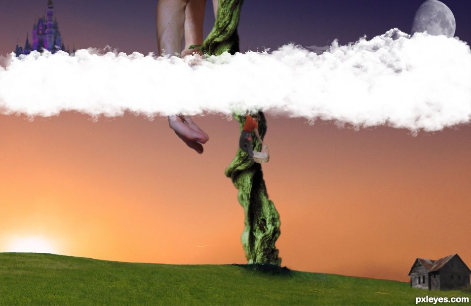
Who doesn't love a story about the little guy winning in the end. Anybody know how to add more spaces for sources? Going to place the others here for now. Hand. http://www.morguefile.com/archive/#/?q=grabbing&sort=pop&photo_lib=morgueFile\nBackground Sky and Sun. https://pixabay.com/en/sunrise-sun-fog-morgenrot-nature-1038338/ (5 years and 1562 days ago)
The clouds are too opaque. The skin tones & light sources are different on the arms. I'd recommend just keeping the one in front and the image would be less confusing. Otherwise this is a good effort.
Placing sources in the description works fine when you have more than 10 images.
I think if you made the image more Vertical than Horizontal it would lock in your diagonal design of Castle/Jack/Cabin. Placing the Moon behind the Castle and adding a glow would give the moon more purpose instead of loitering in the dark part of the sky. (IMHO of Course) Reducing the opacity of the cloud might help let the second hand of the giant shine through as well. Good luck, and great job
Howdie stranger!
If you want to rate this picture or participate in this contest, just:
LOGIN HERE or REGISTER FOR FREE
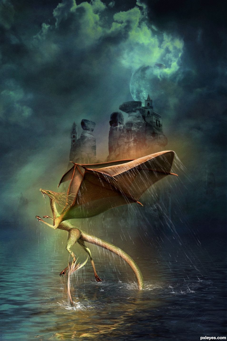
This image is created from almost completely from my own stock and drawing. I did use a texture by Marqoni - http://fav.me/d4allfs but everything else was from my own photographs and digital drawing. See SBS for in depth and original photo etc. (5 years and 1649 days ago)
Great fantasy image. 
Thank you so much!
Very well done! Great to see you again! 
Great to be back ...
Fun! Refraction reflection is AWESOME!
 big grin and hugs!
Beautiful image. !!
Thank you so much ... I have been away and no internet so a little slow but really appreciate the comment and all 
Wonderful work 
Thank you, thank you and thank you ;D
I have been away and no internet so a little slow but really appreciate the comment and all 
What a magical image.. definite fav in my gallery and personal collection. Truly inspiring..  Welcome back author
You say the kindest things! Thank you so much anoop ... Sorry it has taken so long to reply, out of town and no internet! Had fun but missed my computer ;D.
Amazing image. Love the sweet dragon and the spooky background. And don't know why the fav button does not work...
Glad you found that button!!! Hugs!
I have been away and no internet so a little slow but really appreciate the comment and all 
Aha, it worked 
Tee hee ... see other message!!!
Congrats for your second place, Arca 
Thank you so much!!! I was so pleased ... I had been away and no internet so it was a wonderful surprise!!!
Congratulations... beautiful image...!
Thanks! I was thrilled!!!
WOOT WOOT
At the risk of repeating myself ... I was so pleased ... I had been away and no internet so it was a wonderful surprise!!!
congrats! very nice water 
Thanks you so much!
Congrats! You just keep getting better!
Or more determined ... took a lot of trial and error ... I didn't want a vicious dragon but something more ethereal and sea serpenty ... think I came close! Thank you so much  I was away (camping) and no internet ...the 2nd place was thrilling to come home to!
Congrats Arca..,
Hugs and thanks!
Congrats for 2nd place.
Thank you so much!!!
congrats on your placement..
 Thanks!!!
Congrats!! 
 Thanks!!!
Howdie stranger!
If you want to rate this picture or participate in this contest, just:
LOGIN HERE or REGISTER FOR FREE
Howdie stranger!
If you want to rate this picture or participate in this contest, just:
LOGIN HERE or REGISTER FOR FREE