Photoshop Pictures: Castle (page 5)


results 21 - 25 of 94

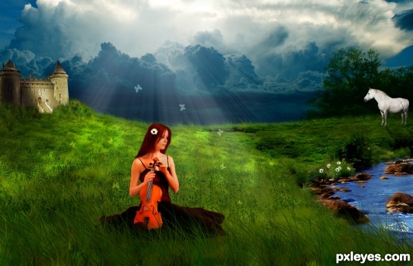
Melancholy - created by KlaudiaBurczyk


Melancholy
Favs: 0SBS: 6Hi-resRank: 8/12Score: 62.4% (0)15901 views

Daisies in fantasy land :)

Thanks to: mmisgen from sxc.hu for lake photo (http://www.sxc.hu/photo/1371598)

and to liam-stock from deviantart (http://liam-stock.deviantart.com/gallery/25189766?offset=24#/dtb683) (5 years and 2837 days ago)

8 Sources:

avatar albevolution

nice colors , such a great work..

avatar bjaockx
bjaockx says:

I like the idea author, but you may wish to take a look through some tutorials on lighting. it can be tricky to get the lighting right in such a large scene, but getting it right can make for a hugely better look. Also i am sad to see the flowers be placed so far from the main focus that it is a wonder why even include them, other than the fact that they were the source for the contest. Keep practicing and have fun!

Howdie stranger!
If you want to rate this picture or participate in this contest, just:

LOGIN HERE or REGISTER FOR FREE


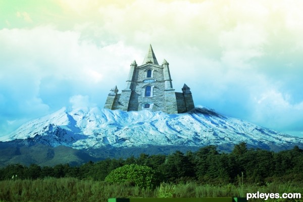
iCe CasTle - created by ReDZN


iCe CasTle
Favs: 0SBS: 1Hi-resRank: 12/12Score: 60.4% (0)8648 views

(5 years and 2859 days ago)

2 Sources:

avatar Eladine
Eladine says:

author your linking to sources is not correct, you need to link to the page where the author and the image both are vissible. This would be the correct link . http://www.sxc.hu/browse.phtml?f=view&id=1376571.
Also please upload a step by step because I have no idea how the original given source has been used.

author says:

ok

author says:

Step By Step Added

avatar Eladine
Eladine says:

ooooh the clouds!!! allright author thnx much btw i thinkk the castle is a tat too big seriously you dont want to have to wash those windows.. One little thing, id crop out that lil bar at the bottom front of the image, its kinda distracting

author says:

lol it distracted me too but i was lazy to crap it XD

author says:

crop*

avatar CMYK46
CMYK46 says:

You just used some clouds from the source pic? Your image could have been made from any cloud source. The perspective on the building is wrong.

no avatar

The author used the clouds, and hes not the ony one. There are multiple entries with just using the clouds. Or just using the tree. There is no difference in using the tree the grass or in this case the clouds.
In the original image the tree was the main character. Doesn't mean it has to be the same way in the entry made by the author.

GOAL: Download the photo on the left and manipulate it in any way you want.

Goal Archived!

no avatar

If you start your comment with something negative like this... while others defnitly did the same. It will defnitly not make people say thank you for pointing out my mistake.

Since you start to attack one person; (since you have not said it to the others) I would defnitly negate your comment completly.

Howdie stranger!
If you want to rate this picture or participate in this contest, just:

LOGIN HERE or REGISTER FOR FREE


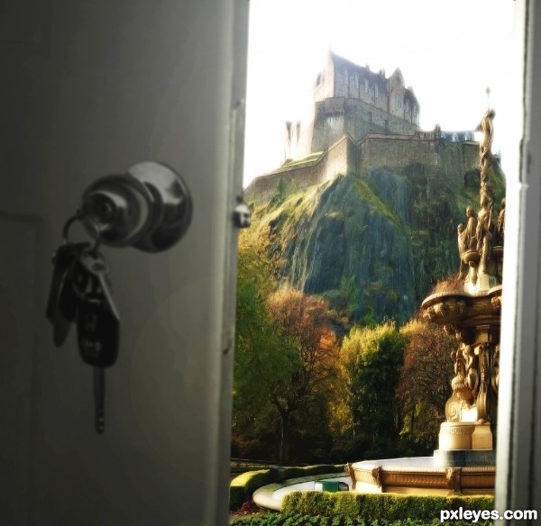
This Is Not My Living Room - created by SaEllisson


This Is Not My Living Room
Favs: 0SBS: 4Hi-resRank: 4/12Score: 62.3% (20)15059 views

Although the decor is an improvement. (5 years and 2865 days ago)

2 Sources:

avatar CMYK46
CMYK46 says:

Great thinking and good use of the source.

Edit: Reminds me of the great Talking Heads song, Once in a lifetime:

"And you may tell yourself, "This is not my beautiful house"
And you may tell yourself, "This is not my beautiful wife"

Letting the days go by, let the water hold me down
Letting the days go by, water flowing underground
Into the blue again, after the money's gone
Once in a lifetime, water flowing underground

Same as it ever was, same as it ever was, same as it ever was
Same as it ever was, same as it ever was."

author says:

Oh you devil, you've gotten that song stuck in my head now!

Howdie stranger!
If you want to rate this picture or participate in this contest, just:

LOGIN HERE or REGISTER FOR FREE


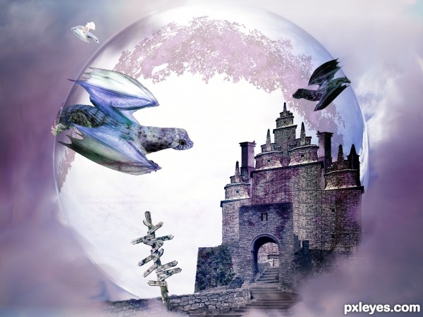
Dragon Castle - created by Rushcat


Dragon Castle
Favs: 2SBS: 3Hi-resRank: 7/12Score: 59.8% (0)11011 views

(5 years and 2913 days ago)

5 Sources:

avatar pixelkid
pixelkid says:

This has a real dreamy feel too it. I really like the smoky edges of the ball at the bottom.

Howdie stranger!
If you want to rate this picture or participate in this contest, just:

LOGIN HERE or REGISTER FOR FREE


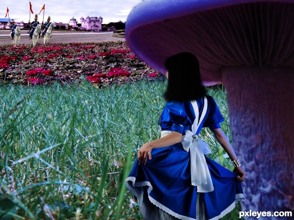
Find Her! - created by SaEllisson


Find Her!
Favs: 0SBS: 5Hi-resRank: 12/12Score: 59% (0)14001 views

"http://www.morguefile.com/archive/display/745306" Used but didn't make the final pic. (5 years and 2924 days ago)

6 Sources:

no avatar
ps.robgd says:

Nice idea. I think the perspective is too distorted. The castle has unreal height. The roses seem flat ( are stretched a little to much). This is only an oppinion. Good luck!

avatar Gransbergis

smooth brush it's bad don't use smooth brush while deleting backgrounds.

avatar Akassa
Akassa says:

The hair looks too plain, you should increase the detail. Good luck.

avatar rsguetre
rsguetre says:

this one had potential, but what was said before I'd only be repeating...

Howdie stranger!
If you want to rate this picture or participate in this contest, just:

LOGIN HERE or REGISTER FOR FREE