(5 years and 3411 days ago)
Please view full if you have time. Thanks.
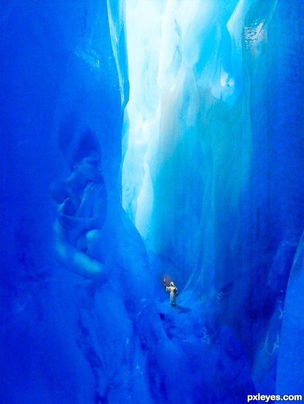
For eons She has watched civilizations come and go waiting for someone to set Her free.
Thanks to bgraphic at sxc.hu for the Glacier Tunnel
And to Marcus Ranum for my Ice Goddess (www.ranum.com)
Cracks texture and castle image are my own. See SBS.
(5 years and 3414 days ago)
Fantastic concept.. good luck 
good imagination..  All de best..
The castle is not that visible, I only saw it when I looked at the SBS, still this creation is one of my faves here, well done.
Emik - I know what you mean. Although I can see it fine on my home monitor once I had it uploaded I realized it was not that visible in small res/small monitor. I considered removing it but I was so late uploading that I did not have time. It was either get 4 hours sleep or fix it, I chose sleep!
Thanks for the great comments! 
Wow,what a great entry...Idea is top notch,execution perfect and mood fabulous...well done author and instant fav from me...
This is really nice and creative. She really looks frozen, and this icy land is awesome. 
Congrats...This entry is amazing and i was disappointed when was not finished in top 3...keep going with creating great entry's...
Congrats...This entry is amazing and i was disappointed when was not finished in top 3...keep going with creating great entry's...
Congrats ! very nice 
Howdie stranger!
If you want to rate this picture or participate in this contest, just:
LOGIN HERE or REGISTER FOR FREE
(5 years and 3432 days ago)
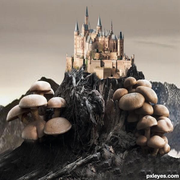
The lighting on the castle does not match the lighting on the mushrooms. You can adjust it a bit with Selective Color, and then using the Lighting Effects Filter on the castle as a separate image and then importing it back into your mushroom image.
You don't need the drop shadow against the background.
Howdie stranger!
If you want to rate this picture or participate in this contest, just:
LOGIN HERE or REGISTER FOR FREE
PLZ DO WATCH HIGH RESOLUTION IMAGE...HOPE YOU LIKE IT (5 years and 3448 days ago)
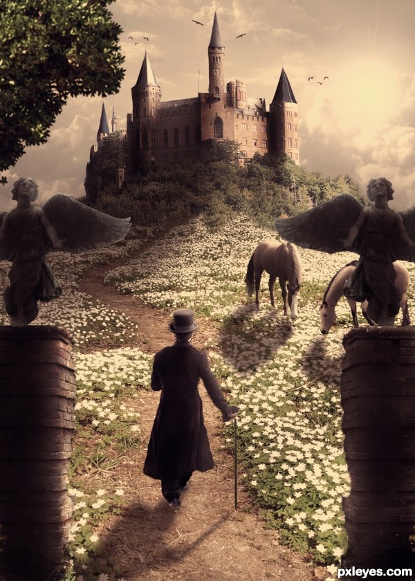
Very nice! My only nit pick would be, the shadows behind the entry pillars, could be a little darker to define them a little more. Theres one spot that it looks like it blends in with the flowers. Otherwise, keep up the good work! 
i like it a lot, good luck !
Try to fix the horse shadows...light is from right, shadows would be toward the left. Also darken the edge of the pillar at right, since it would be in shadow.
I think you did a fantastic job blending the flowers together, and i can only reiterate the advice the others gave you.
Really good image. 
Very beautiful image, I love the coloring... 
CMYK46 thanks a lot for helping me out with the shadows...i hope its ok now....
thefinalcut i have added darkened the pillars as u said...
and thank u erikuri, nanaris and ponti55 for ur precious appreciation...
god bless
Nice lighting and coloring...dreamy photo effect
I like it!! but my advice would be this  -
-
the harsh light from the sun, (right of the castle)... would mean that it have more shade than the objects in front due to the fall off of the sun.... the objects in the foreground would benefit from ambient and bounced light... so you would see more detail. Of course moving the sun more to the right would justify the illumination of the right hand side of the castle.
I think you could construct a base for the angels to sit on, as they still look cut out... and redifine where the highlight and shadows are especially as they look they have just been copied and mirrored across...
drawing a triangle out from the sun should help you roughly determine where the light would most likely hit the other objects...
front pillars are feathered a little more than they need to be (inside edges) and are far too dark compared to everything else re the suns fall-off
The man also needs to look more 'grounded' as he too looks pasted into the scene.
But even still I think it's one of the best entries thus far so GL whatever you decide to do... 
since the angels r upshot the man wud b downshot wrt the angels imho
pillars esp the right one needz polishin.. everythin else ditto with all d kind experts above 
i just love d mood n hue of the work
just brilliant..gud one..my fav 
was that guy there the last time i looked? hmm... well I must say it was a good addition 
beautiful image author, goodluck 
amazing one
You did almost a perfect job. The only point in this picture that i dont like are the angels. You can see the cut outs and i can see that you duplicated the second one. But if i take a look at the whole picture, i only can say that you did a wonderfull job. For now you are my favorite to win this contest.
lovely composition..good luck
wow!!! Great work! 
great job - I love the mood and the blending and shadows are very well done 
the better the work, the more the critique..... remember that  ... well done
very well executed.....shadow of horses are not ok.....still a good job
i agree with Geexman 100% author....this is fantastic work,great compilation,amazing colors and fabulous colors and mood...
THANKS TO EACH AND EVERYONE FOR ALL UR FAVOURITES AND COMMENTS>>>LOVE YOU ALL AND TRUELY EACH AND EVERY COMMENTS ARE REALLY SO SO INSPIRING>>>>>AND GEEXMAN WELL SAID

 ..... god bless all
It's like looking into a fairytale!! Lovely image  Best of Luck
congrats :]
congrats
Wonderful.. congrats!!
Congrats!!!
Congrats....very unlucky not to win with this...excellent entry 
Howdie stranger!
If you want to rate this picture or participate in this contest, just:
LOGIN HERE or REGISTER FOR FREE
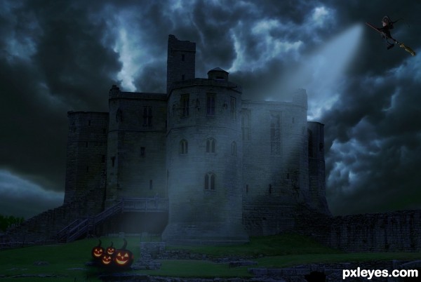
Thanks to Obsidian dawn.com for the light brush (5 years and 3450 days ago)
Nice to see this author... 
top of the castle is missing....and whats that blue patch in the sky.....work on masking.....gud luck
Thank you Siddhartha...have made changes....the blue one on the sky was the flag of the building...removed it...
Beautiful 
Wondeful atmosphere.
yup its perfect for me now author...very nice composition...all the best 
thank you Siddhartha 
perfect mood author...good luck
Howdie stranger!
If you want to rate this picture or participate in this contest, just:
LOGIN HERE or REGISTER FOR FREE
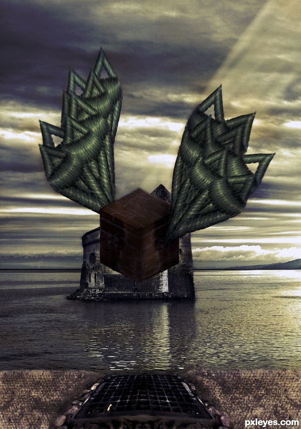
Motion effect should be on the entire object, (wings too) not just one part.. Interesting use of source.
Very interesting approach...maybe u could use some color adjustment layers to achieve more dramatic result...with colors like this i suggest dark blue overlay layer,dark brown color layer, maybe gold-ish color layer and at the end blue/gray soft light layer...Of course all layers must have adjusted opacity...just an idea author...best of luck ...
Howdie stranger!
If you want to rate this picture or participate in this contest, just:
LOGIN HERE or REGISTER FOR FREE