Tools:
Noise, gaussian blur, burn/dodge tool
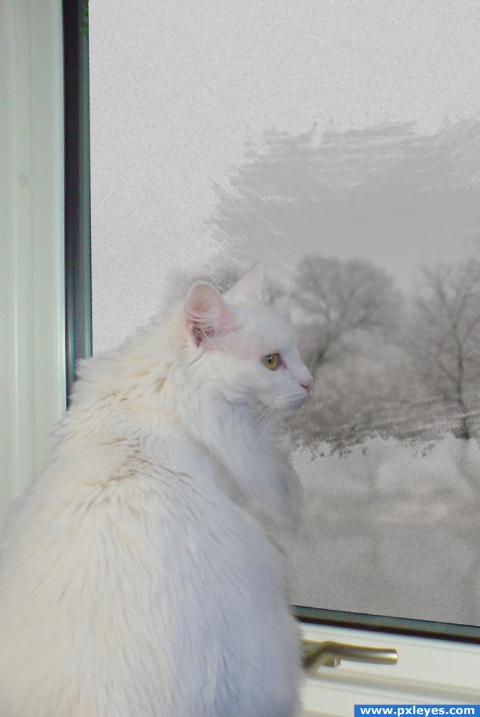
Thanks to Klearchos Kapoutsis for the "Struma River in Winter" picture at Flickr.com.
The rest is the source + my own pictures. (5 years and 3997 days ago)
1 Source:
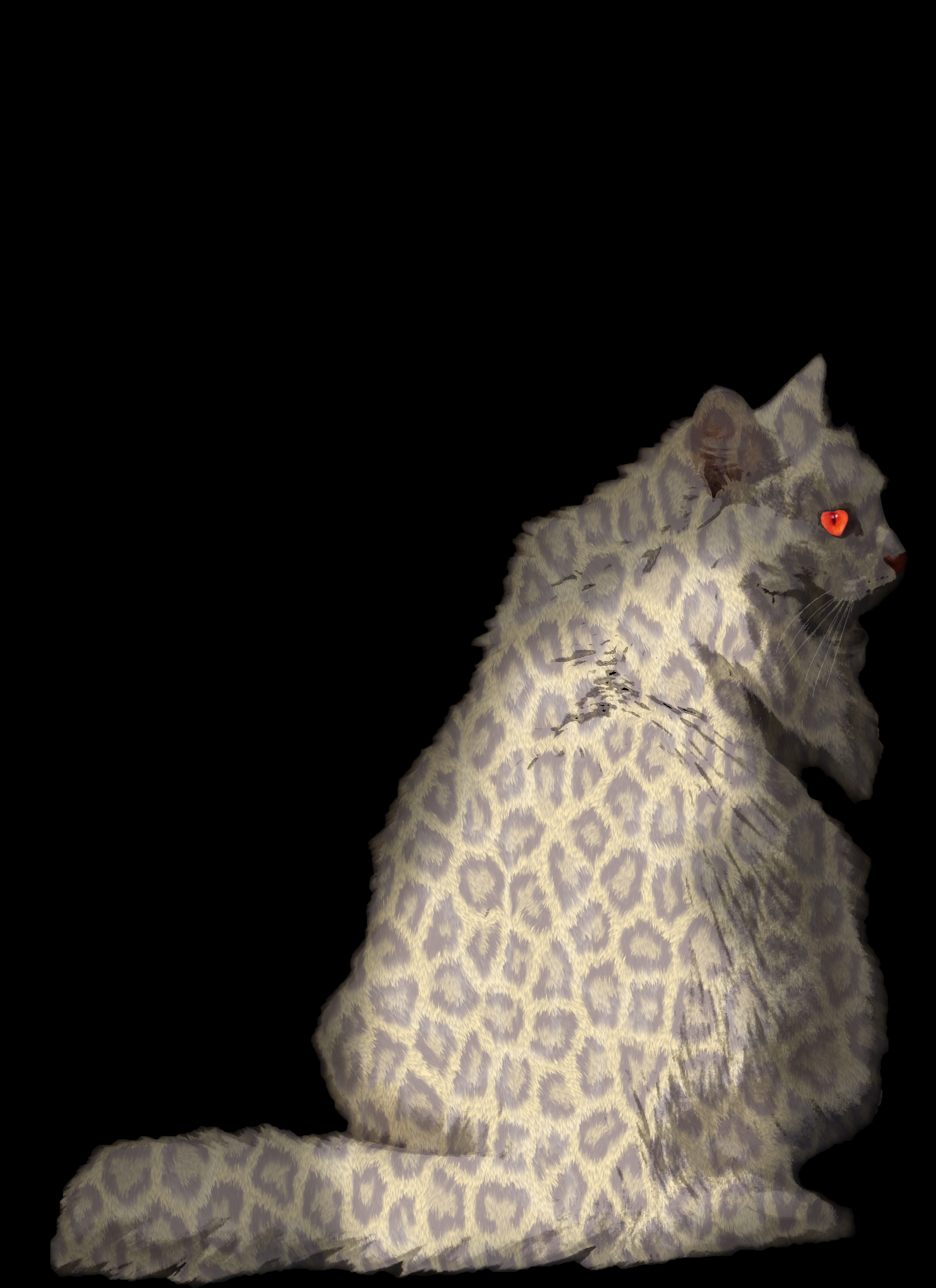
simple displacement map, but with a lot of work (5 years and 3998 days ago)
great image but you need to clean up around the edges of the fur or youll be gettin some bad votes but not from me!!
thanks Tuckinator
Nice idea shading still needs a little work tho bit patchy & transparent in places
good work!
Try working on the fir, especially around the edges. Also the color of the pattern, maybe if it were a little more vibrant and the blending mode that you used you might want to reconsider. Good idea, but maybe work on it a bit.
predator... mouses be aware...
love the eyes!
Howdie stranger!
If you want to rate this picture or participate in this contest, just:
LOGIN HERE or REGISTER FOR FREE
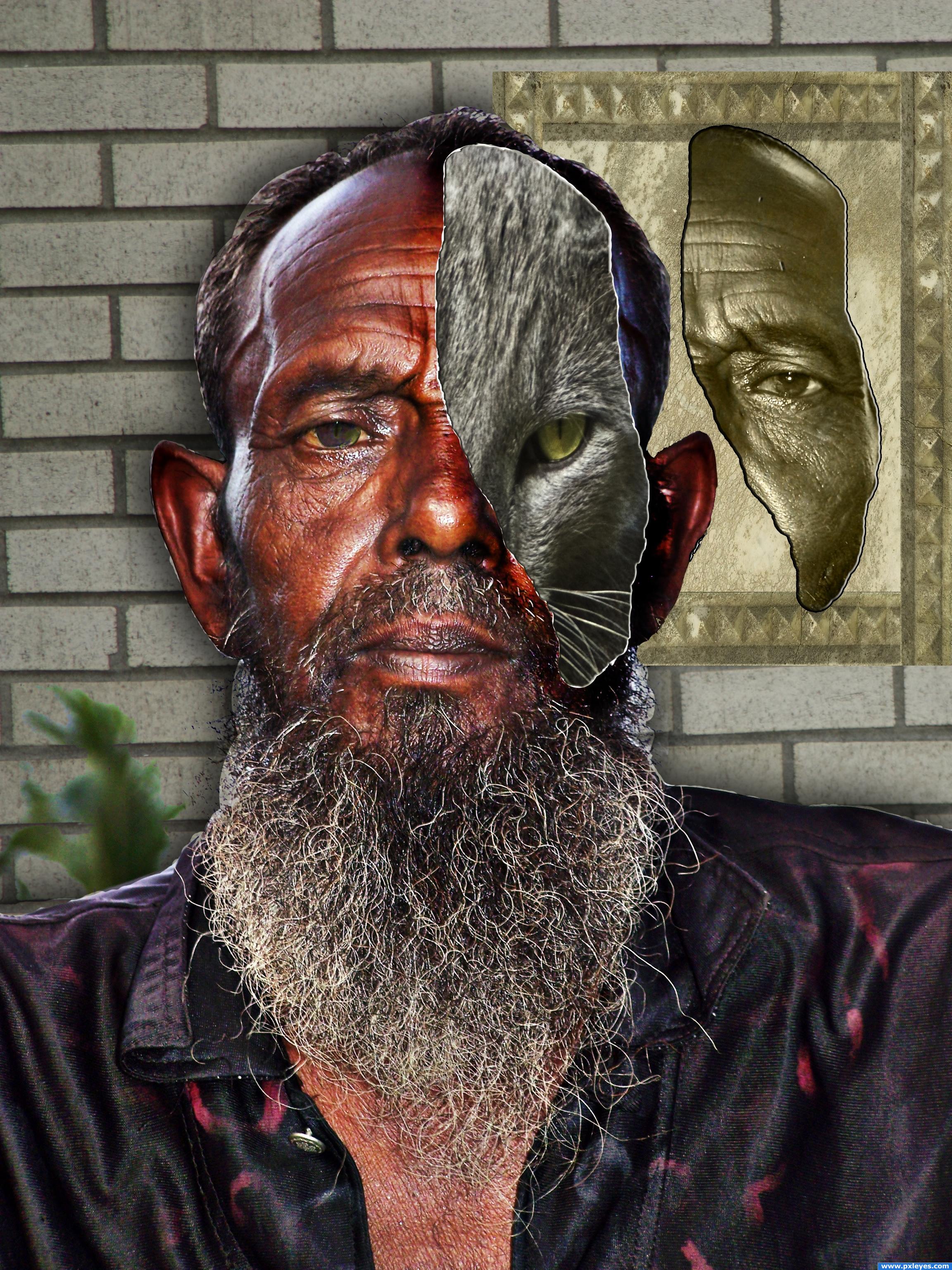
Here, the old man has part of his face ripped away to reveal that underneath he is a cat. An animorph.
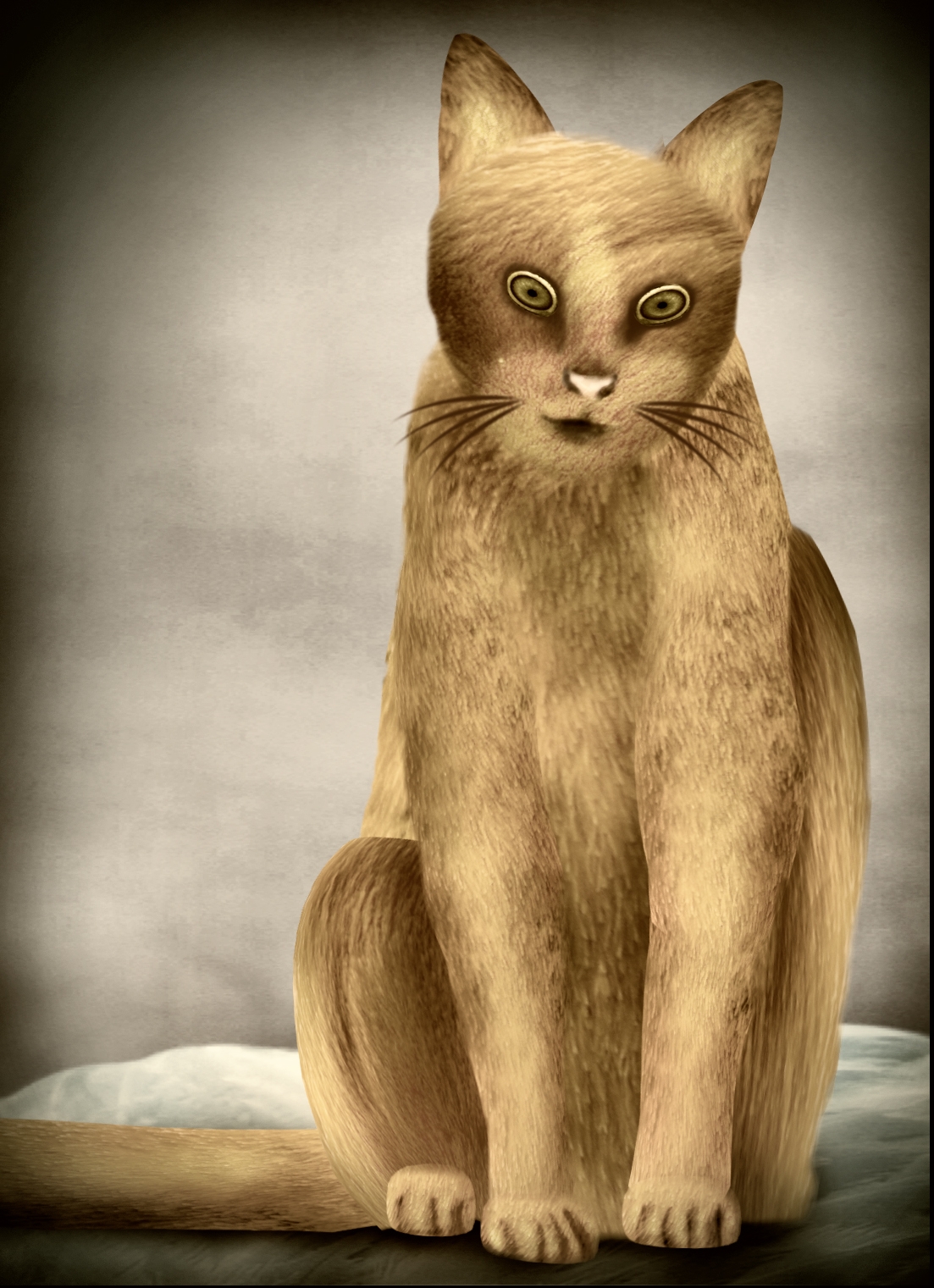
I have 3 grey cats. This is Alvin. He is not the Alpha male of the bunch. But he is very kind and loving. His face looks angry all of the time, but he is sweet. I call him the diplomat. (5 years and 3999 days ago)
nice
huge marks for composition and clarity.. I'm not sure I understand the cat face properly.. if it's a mask it should have a shadow and the eye should be over the eye socket... IMHO.. it's very wonderfully well done.. it just seems that the two masks are floating in space.. if that was your goal then CONGRATS! (the white line of damage goes all the way round the cat face.. just thought I'd mention that).. good LUCK
Thank you for the comments. No, the cat is not supposed to be a mask. The man is actually the mask! When a piece of the man's face was torn away, the cat is revealed inside. That is why the tear goes all the way around.
Would've been a better look to just blend the fave with the cat...but good job all the same!
Howdie stranger!
If you want to rate this picture or participate in this contest, just:
LOGIN HERE or REGISTER FOR FREE
Created with source only
Thanks to betacam for cat reference pic. He has been notified. (5 years and 4004 days ago)
Very nice!!
very nice 
This is not bad...and very original to come up with a cat from a.....flamingo....lol! But I think it would look even better if you added some shadows..! I would recommend using a new layer with a soft brush of different tones of grey, and then change blending mode to overlay or hard light, rather than use the burn tool...as your base color is brown and it might alter it into too much redness! Hope I helped! best of luck!
Cornelia, thanks for suggestion, I have already added some shadow layer in multiply mode but set their opacity to around 65-70, Anyway I will work on contrast and shadow further
EDIT : Fixed and updated
Original thinking! I like the result!
great job
Miauuu so cute! Nice soft fur
Good looking image very nice work!
real cool
good and additional points for cat theme.
very nice job 
Howdie stranger!
If you want to rate this picture or participate in this contest, just:
LOGIN HERE or REGISTER FOR FREE
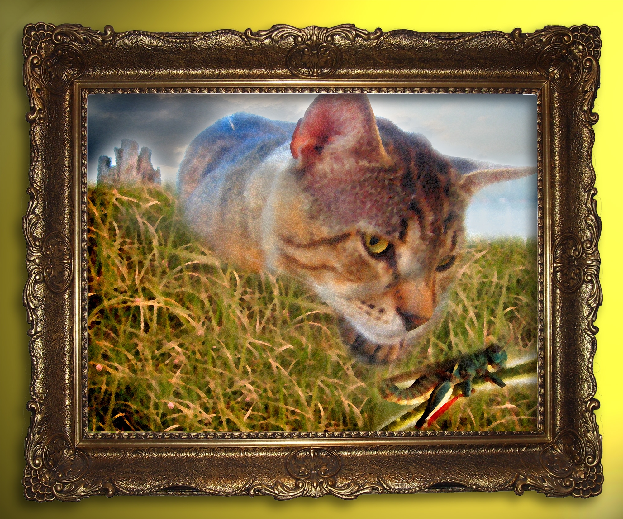
See the high resolution for the painting details (5 years and 4029 days ago)
cool
very nice idea.. a light burn along the edge of the painting might be in order to give it more of a mounted look instead of dropped in.. but try it first to see if that is something you'd be happy with... good luck
edge darkening really helped author.. good luck
the picture is floating in the frame, use the burn tool very lightly on the outer part of the picture along the frame connecting them, even if you only decide to only do two sides, a frame leaves a small shadow on the picture with it's greater width. Very nice idea and good luck =)
Love the image!! I'm not a fan of the burn tool...I create new layer and use a soft paintbrush with the opacity set to 10% so I can control how much or how little I want. Use white or black depending on whether you want a highlight or a shadow...Hope that helps and Good Luck 
good idea, but cut & paste feel is there(insect) correct it
Nicely done. In high resolution I appreciated all the details because in low resolution it does not look like a painting.
should not sign you'r work - for better or for worse it is something to be considered
ok 
nice!
Nice idea but the cut outs are very poor. Work on the edges to greatly improve this image. Also the painting details are just a filter so its not really details.
I like this idea...the cat looks low res. Otherwise...
lol..
Edge of the whole cat has too much blur Gl!
MMM crunch good luck author. There's a little bit of a white background behind each image other than that cool idea
the edges of the cat are transparent, grasshopper too and the stem kinda looks like it's glowing but nice concept!
yum 
Howdie stranger!
If you want to rate this picture or participate in this contest, just:
LOGIN HERE or REGISTER FOR FREE
Photography and photoshop contests
We are a community of people with
a passion for photography, graphics and art in general.
Every day new photoshop
and photography contests are posted to compete in. We also have one weekly drawing contest
and one weekly 3D contest!
Participation is 100% free!
Just
register and get
started!
Good luck!
© 2015 Pxleyes.com. All rights reserved.


I love this image. Very serene and beautiful. Well done! Good luck!
awwwwwwww
I love the frost on the window.
great work
reminds me on long winter nights and long sleeping and not so urly getting up days...
very nice idea; I would add more contrast between the cat and the window
Howdie stranger!
If you want to rate this picture or participate in this contest, just:
LOGIN HERE or REGISTER FOR FREE