(5 years and 3173 days ago)
(5 years and 3244 days ago)
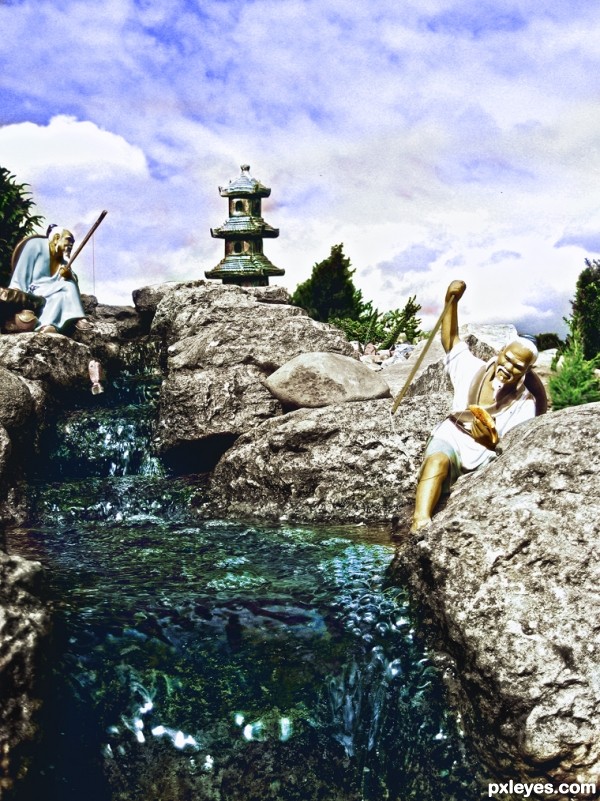
What a cool little garden you have! Nice change in color intensity and texture here.
Howdie stranger!
If you want to rate this picture or participate in this contest, just:
LOGIN HERE or REGISTER FOR FREE
credits and thanks:
http://montague.deviantart.com
http://mourge-stawk.deviantart.com
http://night-fate-stock.deviantart.com
http://intergalacticstock.deviantart.com (5 years and 3286 days ago)
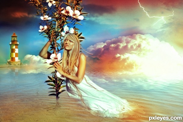
No source for the woman? No land under the lighthouse? Do flowering plants grow out of the ocean? No reflection for the woman?
The reflecftions in this entry need a LOT of work.
The water is choppy, yet the reflections in the background are smooth, and the woman and plant have no reflections at all...
The light house is supposedly some distance from the vampire woman with no reflection, yet the reflection from it extends forwards all the way to the woman and her free-floating (yet unreflective) plant, which she is leaning on far too hard, considering it is not secure in the ground. She'll be falling over at any moment.
Maybe that's where the hope comes into play, she's hoping to get some support from that plant. :P
well, 1st of all there's no vampire woman in there, however, the lighthouse and the plant have just a little reflection, cause I didn't want them to be so realistic. On the other hand the lower part of the woman's dress it is supposed to melt in the water, as there is a a hot athmoshpere shown as well by the red and yellow hues around the clouds. Thanks all the way for the tips and I'll try to work harder on the reflections.
Your explanation helps, but it also points out how ineffective the image is in conveying your concept...
"...the lighthouse and the plant have just a little reflection, cause I didn't want them to be so realistic." - It's very difficult to have portions of a photographic image not look realistic, while other portions in the foreground and background do...Consistency is important.
"...the lower part of the woman's dress it is supposed to melt in the water" - this would have her dress either "dissolving," by increasing the translucence until it totally fades away, or "melting," by distorting the shape that is in the water.
"there is a a hot athmoshpere shown as well by the red and yellow hues around the clouds" - If that is so, the "glow would thoroughly permeate the clouds. Just a small spot of "heat" such as you have illustrated, does not give the atmosphere a sense of heat, so much as it looks like a bright light shining from within the cloud. Again, consistency is important, and "hot atmosphere" on top of cool water, and beneath cool sky does convey an unrealistic scene, but again, it is in contrast with too many other visual elements that oppose it.
suggestions:
1) move the horizon further (rules of the third) to the top one-third
2) smaller clouds n light house
3) bring the girl and plant closer to the scene (bigger)
Thanks, aheman! I'll try as soon as possible! 
After all is said and done ... lovely concept!
Howdie stranger!
If you want to rate this picture or participate in this contest, just:
LOGIN HERE or REGISTER FOR FREE
Thanks to mqtrf & Thanks to Emik. (5 years and 3475 days ago)
Oh cute, and your welcome, glad you found a picture you could use. = )
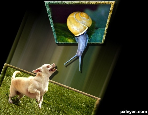
cool work author...maybe would be better if u use cat instead of snail...just an idea...
Why are there drop shadows on a motion effect that has no substance?
Howdie stranger!
If you want to rate this picture or participate in this contest, just:
LOGIN HERE or REGISTER FOR FREE
Only source used (5 years and 3727 days ago)
Good work and composition. Good luck.
Perfect!
Fantastic work author...Facial expression's on them are priceless...best of luck
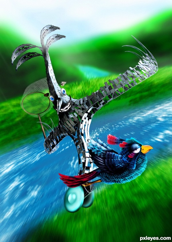
Poor bird... He hardly knows what it's about to happen to him... 
Aha amazing entry, love the mood and the motion effect!
Great work
Nice and funny image. I do think that you should look at the composition. Right now both characters are (more or less) under in the image, while it might be even more interesting if for example you lift the bird catcher a bit. his way the top of his head will be in the white light area so it will be more part of the whole. At the same time you can lower the bird a bit so that the green field under will be involved too. Make sure that the red tail from the bird will be overlapping the catcher, so there's still connection between the 2. If you'd make these small changes, your eye will get more invited to look from left up going down (the catcher behind) and the from down left going to right (the bird in front). Just an idea. Good luck!
pretty birdy going DOWN!!
Amazing entry. Good luck
Thank you for your kind words, my friends. Special thanks to Mr. Waz, you're genius. I do see the trouble in the composition but I didn't figure out how to fix that and your suggestion can't be better for me. I changed their position (also the size), maybe this is much better than before.
Very nice total image without using external sources!
Maybe a dark gray road instead of the water in the foreground would make it cooler. And than the road from the left top to the right bottom so that the creature is really riding on it 
This is great  got my eyes right now!
Haha, funny!  Good job!
talented work... GL... 
poor birdy hope he is not planning to eat it
Amazing face expressions 
hahah.. bird looks bored of that thing chasing him.. lol  Love this entry, gl
  ))
))
fantastic
i like the creatures very much and a very nice idea....gud luck
this is impressive ! very well done author ! 
Super.
Your comments and favorites encourage me much, my friends, I highly appreciate that!
Good luck with this entry........
Fantastic work, super job.
Fantastic work, super job.
Amazing ............Good Luck Author.
Congrats for your first place, Langstrum! 
Congratulations on the first! 
Congratulations for 1st
Congrats, lovely work 
congrats on 1st place 
congrats
congrats on your win
Congrats! for 1st. place 

Thank you very much for your votes, comments and favorites 
Congrats!!
Congratulations!!! 
Howdie stranger!
If you want to rate this picture or participate in this contest, just:
LOGIN HERE or REGISTER FOR FREE
very believable
I agree!
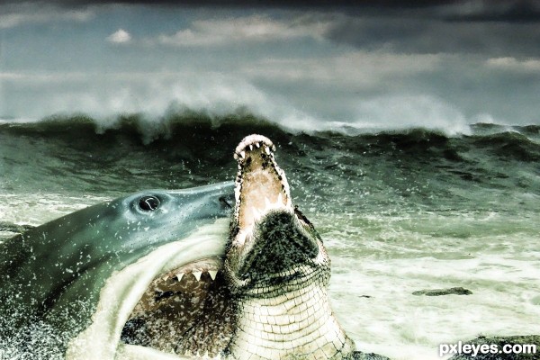
I would have wanted to see the crocodile eating the shark. Would have been more original.
And this isn't actually very believable, since it looks like the shark missed the crocodile.
I think you are wrong CMYK46 i wasnt trying to be original,just making a good idea..
but now that u mentioned,,this is original!..about the believable part,if you look closely
the bottom teeth are above the croc's,at least two are above!,..and that to me makes it believable.
Thanks for commenting
Wow - very good blending between the main objects and the background - well done
Thanks a lot Drivenslush ,DanielaOwergoor ,and riady for your comments i appreciate it.
It's looks like a real shot..Great work
Nicely blended, good final colors and texture.
Howdie stranger!
If you want to rate this picture or participate in this contest, just:
LOGIN HERE or REGISTER FOR FREE