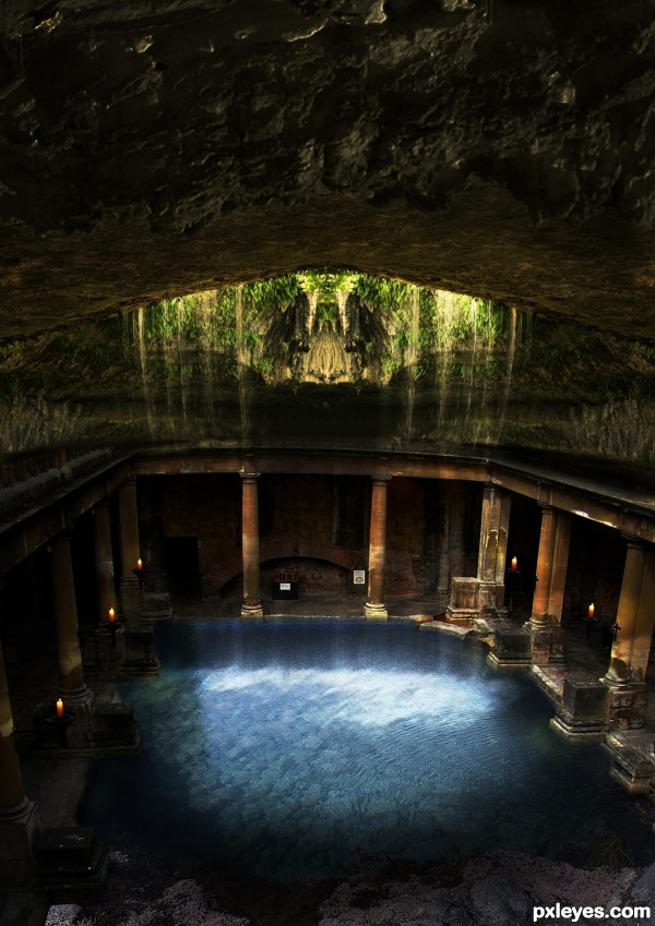
if you see it you are blessed 2 (5 years and 3184 days ago)
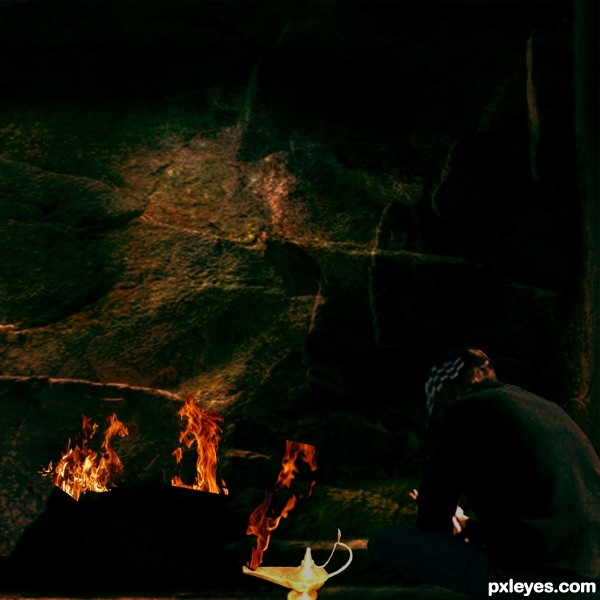
As the boy reads his book the lamps flame makes a face to tell a story of a dragon and a magic user in an epic battle. (5 years and 3200 days ago)
Try to use Channels to cut out the fire:
Select the picture layer of the fire, and click channels ( if it's not active near the layer tab , go to Window -channels)
Choose the channel with most contrast and use select color range to select the fire. Use the fuziness bar to adjust the selection. after you click ok and have the selection press Ctrl J to make a new layer out of the selection. Try it multiple times until you like what you get.
Selectiv via channel gives you a more transparent look which blends better in background.
Thank you so much.
Howdie stranger!
If you want to rate this picture or participate in this contest, just:
LOGIN HERE or REGISTER FOR FREE
(5 years and 3220 days ago)
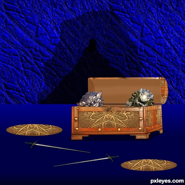
Try a bit of dodge and burn in the lid to give it some depth -- looks a bit flat the way it is
Thanks Alan2641 I played with it trying to show dept I don't know if I got it what do you think?

much better! (sorry to answer for him...but I had the same thought) and this is definitely better!
Nice idea. Good masking on the treasures. To my eyes, the perspective of the box is not right. To see so much of that side, the front should either be angled, or the entire box moved far left within the setting.
Thanks happyme27
Thanks elemare I looked at it I thought the angle was right the chest is at an angle 
is it just me or your works are just obvious..hehe..nice work..goodluck
Howdie stranger!
If you want to rate this picture or participate in this contest, just:
LOGIN HERE or REGISTER FOR FREE
(5 years and 3236 days ago)
like it
thx neo
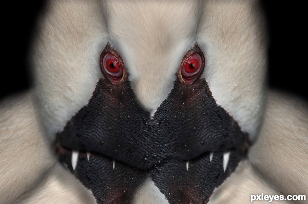
like the monster.gl
Swan-Kong is coming! 
cheers!
Ha-ha-ha, this guy could win some Ugly Toys contest 
Howdie stranger!
If you want to rate this picture or participate in this contest, just:
LOGIN HERE or REGISTER FOR FREE
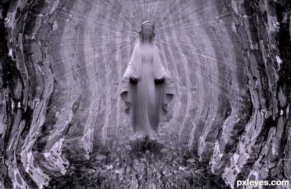
thanks to pix for the virgin pic (5 years and 3260 days ago)
The radiant effect behind the virgin looks nice. Good luck author.
very Catholic, I'll show you my scars (very well done 
Howdie stranger!
If you want to rate this picture or participate in this contest, just:
LOGIN HERE or REGISTER FOR FREE
Looks amazing, i like the view, perhaps too much roof?
thanks akassa im going to make this big and look for a nice place in mine house to put it
l like this
just a suggestion, please make a blending of the wall towards the ceiling, now looks like two separate items pieced together....then, it's PERFECT!
CONGRATS!!!
Congrats on 2nd, well done.... : )
very good effects! Congrats!
Howdie stranger!
If you want to rate this picture or participate in this contest, just:
LOGIN HERE or REGISTER FOR FREE