(5 years and 3130 days ago)

Thanks a lot to:
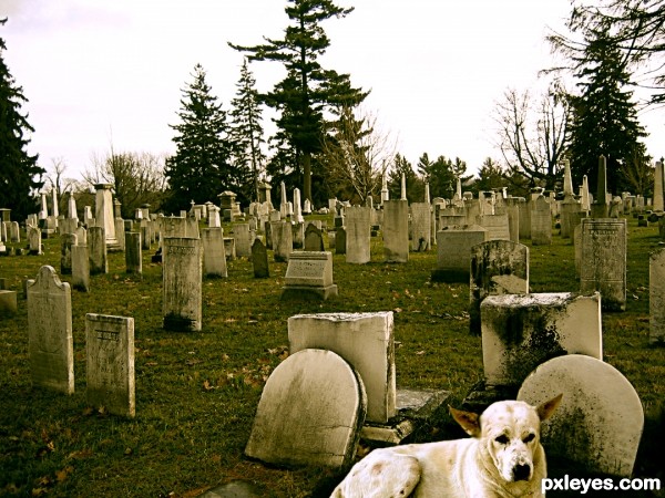
the dog - http://2000lightyearsaway.deviantart.com/
the cemetery - http://circusspider-stock.deviantart.com/art/cemetery-4-31991095 (5 years and 3562 days ago)
i think you should lower the exposure of the dog by a few points. maybe play a bit with the lens blur for the background
It's sad...
Thanks a lot eficho and erikuri.... I did !!!
i like the image even though its a little simple its put together well
Thanks tuckinator...

Howdie stranger!
If you want to rate this picture or participate in this contest, just:
LOGIN HERE or REGISTER FOR FREE
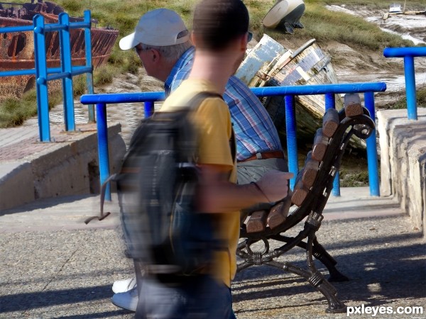
The perspective is off all around.
The man with the backpack is walking below ground, The ships in the background are very small for as close as they are to the man on the bench, and the blue railing shows no distance perspective, they are all the same width, front to back and side to side.
Interesting concept, but somewhat sloppy execution.
PS: Straighten the horizon.
@ MossyB: OK, will try to correct and upload later. Thanks again for advice.
Interesting concept. Good luck !
work on blending colors.. the blue poles are distracting
Howdie stranger!
If you want to rate this picture or participate in this contest, just:
LOGIN HERE or REGISTER FOR FREE