(5 years and 3181 days ago)
Photography and photoshop contests
We are a community of people with
a passion for photography, graphics and art in general.
Every day new photoshop
and photography contests are posted to compete in. We also have one weekly drawing contest
and one weekly 3D contest!
Participation is 100% free!
Just
register and get
started!
Good luck!
© 2015 Pxleyes.com. All rights reserved.

sbs??
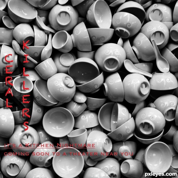
C-E-R-E-A-L.
lol
Yes I know. I wanted it that way serial /cereal..I kind of hybridized into ceral to give impression to both meanings...might of failed but I'll chalk it up to artistic license...thanks!
The text is almost impossible to read.
The misspelling of "cereal," looks illiterate and unprofessional, rather than "artistic license..."
Since this is a competition, these are the kind of things that can (and probably will) hurt your vote ranking.
ouch
I beg to differ the text is easy to read..sorry you have a problem with it. Have a swell day!
Love the WHOLE CONCEPT.. and yes.. in HIGH RES you can see the text perfectly (you could add just a touch of outer or inner glow or stroke to give the lower letters a little bit of punch in the lower res view) very nice work author, and good luck, very neat thinking

Interesting concept with the movie poster idea, nicely done author.
Let a third voice chime in on the misspelling. It detracts / distracts from a creative concept.
*shakes head in disapproval*
*crinkles eyes and raises eyebrow at author's excuse for keeping it*
dictionary.babylon.com
Pursuit of Happyness
Kalifornia
Inglourious Basterds
All misspelled all Actual movies.
I appreciate your comments,
Thanks!
that was an interesting read lol..
At least the purposely misspelled movies are pronounced the same...
How does "ceral" pronounce as "seer-ee-al?" There's an "ee" vocalization missing, no matter how you look at it. None of the other examples you gave have that problem.
I get it ...you hate it...by the way they're still misspelled...deal with it.
suggestions:

1) since it is "cereal-killer", maybe show a bowl going to stab some cereals, some dead, some running in fear
2) improve the 'eyes', not scary enough (looks dazed) to kill
Otherwise, change title to "vampire's dinner set" or something
aheman, I love reading your comments in the various contests - you don't offer mere tweaks, you suggest entire make-overs, LOL! (Don't be offended, I mean it - I enjoy reading your comments.)
As for you, Author, I guess there's no reason for me to wait to vote. I suspect you flattened your original artwork and didn't keep a layered version, which now makes fixing the mistake harder. But you haven't implied anything like that. Instead you defend the indefensible. With sarcasm to boot. OK. Suit yourself. But IMO it just makes you look stubborn, not creative.
Well I'm glad you got that off your chest.
"As for you, Author, I guess there's no reason for me to wait to vote."
IMO...it just makes you look snarky.
Oh, I wasn't trying to be snarky. It was deliberate, darlin'.
I really like your piece, but your refusal to fix it earns a lower score.
thanks elemare
 enjoy your craft, be happy (good comments or criticisms) cheers!
I just hope that I don't offend anyone, as everyone has their view-points/ideas...
just speaking my mind and hope my suggestions helped.
as a designer myself, I understand sometimes I am "stubborn" to defend my 'baby' (creation)... as I aged.....(quite old) I learnt that sometimes it is good to listen and try out, then judge if the advice given is any good.
You know what's worse than getting attention darlin'...not getting any attention. Thanks for proving the Hollywood axiom...there's no such thing as bad publicity.
Thanks for your comments darlin'
Fire away!
It'll be fun to see where this places...
Interesting idea. Without sounding redundant, you could have hybridized the 2 words "cereal" and "serial" to "cerial" or "sereal". Either would have kept the concept and still sounded like the original world (personally I think sereal is cool 'cause it sort of looks like the word surreal; you then get a triple play on words . I think people are just trying to help although the diplomacy can be lacking sometimes. Generally some critiques are worthwhile and some aren't. IMO "it is usually better just to ignore the ones you don't agree with and learn from the others."
Well said Arca, good luck Author.
what is the difference between this art work and cracked cup and smiling face.... it's look like the same....
Howdie stranger!
If you want to rate this picture or participate in this contest, just:
LOGIN HERE or REGISTER FOR FREE