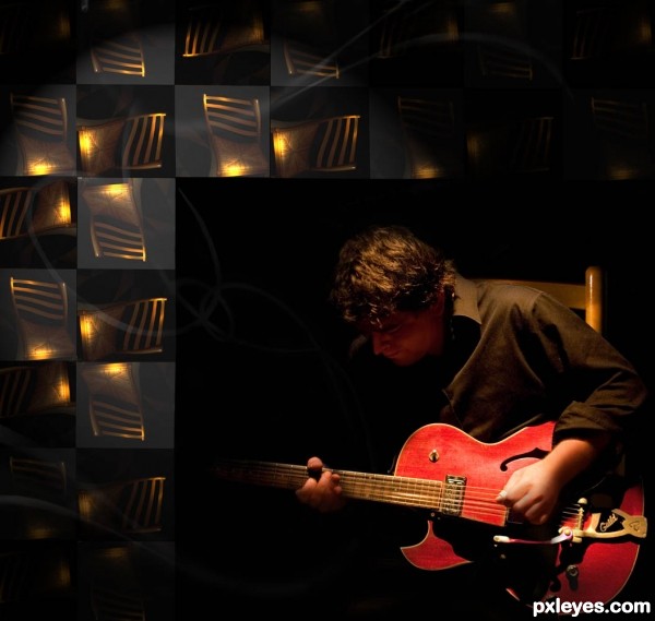
Thanks to Charlie Llewellin at flickr.com for the guitar player source; (5 years and 3056 days ago)
- 1: source1

Wishing you all a very merry Christmas. Completely created from the sourcefile given. Please look in HIGHRES for all the details. (5 years and 3057 days ago)
And a very merry christmas to you too!
Nice work. The star looks like a real decoration you could buy in a store.
thank you very much  my mom used to have a wooden christmas star when i was a child I saw it many christmasses hanging.. I have no clue what happened to it.. the star was 3d and there was a lamp inside.
Nice work here....love the star and the doves. GL author.
Thank you very much George 
Really stylish Christmas card, love the old gold glow 
Thnx Cornelia ) That was what got me started with the star I wanted to use these nice light effects
Howdie stranger!
If you want to rate this picture or participate in this contest, just:
LOGIN HERE or REGISTER FOR FREE
(5 years and 3061 days ago)
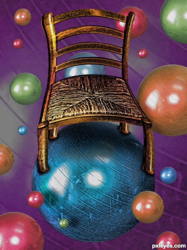
Good work on the chair. It seems that the chair is on its way to get some weight loss..... because I can not think of some one sitting on the chair and lossing balance. Any way..... Good luck author.
Gorgeous 
Howdie stranger!
If you want to rate this picture or participate in this contest, just:
LOGIN HERE or REGISTER FOR FREE
(5 years and 3283 days ago)
so clever.. lol.. GL
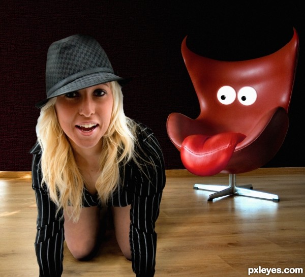
I think her expression should evoke a bit more 'surprise' and 'fear'. Funny nonetheless!
OMG!!! lol 
What Olga said LOLOLOLOLOLOOL
There is a problem with the cut of the air, try to fix that a little bit. I had the same idea but you were faster than me...  Godd work and good luck author !
lolu ... if you mean the cut of the chair , i will try to refine the edge ... thanks
lol, I can't even imagine the chairs expression if she was sitting in it, lol.
hahahahahahahahahahaha....great...damn this is too good...well done author
Howdie stranger!
If you want to rate this picture or participate in this contest, just:
LOGIN HERE or REGISTER FOR FREE
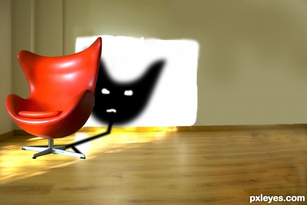
Hope you'l like this. Feels like i could have improvised on it. Only the source image was used along with the stamp dodge and durn tools.... (5 years and 3285 days ago)
NICE 1 HA BRAINS HA LOL 
this is a good idea , you didn't had to erase the shadow of the trees, just place the darker chair shadow over them . the shadow needs more work . good luck 
yaaa thanxxxx..........
@gornats: thanx for pointing that out.. i my self felt somethin was wrong but couldnt figure out wat..... felt i should have added a lil lesser amount of Gaussian blur..... anyways thanx again cheers \m/
hahaha funny GL
The shadow is too dark...
Hey wats a GL??????
Good Luck
Ohhhhh k k thanx.....
Howdie stranger!
If you want to rate this picture or participate in this contest, just:
LOGIN HERE or REGISTER FOR FREE
Distorted chairs are just distracting IMO. The simple man in the chair would suffice.
This would have been much better without the floating chairs. As CMYK says, the man in the chair would have been ok. Good luck any way!
I like your concept with the rotated chair image. A suggestion if you want to take it a step further would be to then make this into a folded curtain.
Howdie stranger!
If you want to rate this picture or participate in this contest, just:
LOGIN HERE or REGISTER FOR FREE