Photoshop Pictures: Chair (page 4)


results 16 - 20 of 22

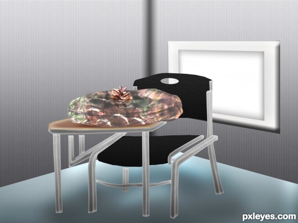
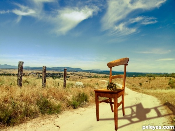
The Lost Helmet - created by Toothpick134


The Lost Helmet
Favs: 0SBS: n/aHi-resRank: 13/15Score: 50.5% (0)14856 views

HI everybody, this is my first competition entry and I hope you like my work.

Basicly for this image I got a nice countryside backround. Found a chair and cut it out. Onto the chair I put the competition image, firstly though, I cut it out and puppet wrapped it so it looks like a helmet. Then I added a camo texture to the helmet and played around with the different blend modes. Lasty I put everuthing together by adding some extra shadows, and then I added a nice Brown and Orange gradiend and blended that to look nice.
Take care! (5 years and 3454 days ago)

3 Sources:

avatar phubar
phubar says:

Welcome to the competition. Just a thought for your entry... The shadow on the chair doesn't match the high noon image it is placed on. It also looks like you distorted the image of the chair (if you hold down shift while resizing the aspect ratio will remain constant thus avoiding the distortion).
Also a high res copy would be nice so that we can see what you did with the turtle shell.
Cheers and good luck.

avatar wazowski
wazowski says:

Have to admit, the shadow is fascinating . It's not correct, but on the other hand...who cares . A high resolution version would be nice though (if you want that, then go to topnavigation My stuff - My contests, there you see your entry and then you can check the option High Resolution, something like that...). Good luck!

avatar itsdesign
itsdesign says:

good luck

Howdie stranger!
If you want to rate this picture or participate in this contest, just:

LOGIN HERE or REGISTER FOR FREE


Classroom`s Chair (updated) - created by kevinice95


Classroom`s Chair (updated)
Favs: 0SBS: 12Hi-resRank: 8/15Score: 49.3% (0)4955 views

Just one drawing of myself and some creativity. Only source used. (5 years and 3460 days ago)

avatar erikuri
erikuri says:

Hmm... perspective, specially of the table, is a bit odd...

avatar Chalty669
Chalty669 says:

I think the wall is what's throwing the perspective off. Maybe try to make two walls and have one on the left to match the perspective of the table and chairs.

avatar DYNOSSAURUS

I agree with ERIKURI and chlty669. The perspective isn't good.

avatar Lamantine
Lamantine says:

nice idea, you should add some shadows though and as they said, try to fix the perspective

avatar cabldawg71

agree chair and table are floating, good luck

avatar Chalty669
Chalty669 says:

Perspective defiantly looks better with the walls to break things up. Now I would suggest to take a soft black brush with a low opacity and paint some shadows on the lower corner of the wall and under the table. What you need to do is think about where the light source is coming from and then make shadows based off of that same light source. If you look at the object on the wall, it seems like the light is coming from straight above. So things need to get darker the further they are from that light source, which includes the wall and everything else. These are just suggestion, it looks like you've already put a lot of work into this. Good luck.

avatar hereisanoop

still need to work on the perspective... look at the chair, some one's gonna slip from that.... and watch the shadows ...... good luck..

avatar itsdesign
itsdesign says:

good luck

avatar jaescoe21
jaescoe21 says:

I know you are getting some comments about the perspective and you are probably getting mad and want people to stop talking hahah. I know how you feel though. For the perspective of the chair, try to use the distort or perspective transform tools. All you need to do is make the top/back part of the chair a little lower I guess. I'm not sure how else to put it. like bring it down. Overall its a great idea. gl

avatar erathion
erathion says:

This work is a good try,i like the idea to create difficult scene without external sources author.Keep going with things like this and u will be better every next time...Good luck to u

Howdie stranger!
If you want to rate this picture or participate in this contest, just:

LOGIN HERE or REGISTER FOR FREE


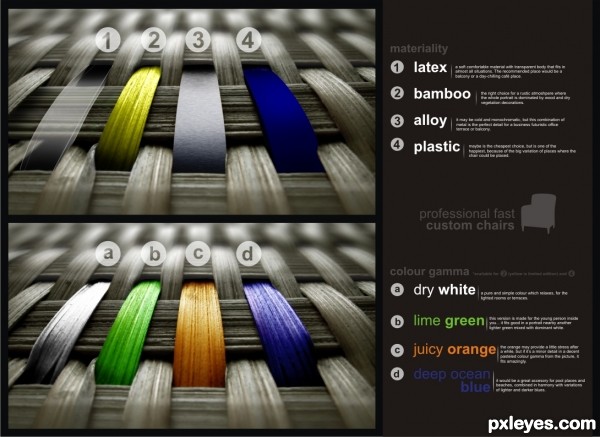
professional fast custom chair - created by dandesign05


professional fast custom chair
Favs: 3SBS: 4Hi-resRank: 7/15Score: 56.1% (0)7593 views

i'll let the presentation to speak for me (5 years and 3478 days ago)

avatar ponti55
ponti55 says:

Very inventive.. good job.

avatar k5683
k5683 says:

great job! When I saw it on the right hand sidebar, I thought it was one of the Ads.

author says:

he he, i like to see things like this, constructive and see-through, so i can understand the object better in its beauty

author says:

done

avatar Darla
Darla says:

good work

avatar DanLundberg

Very creative. The text layout is really cool and contemporary. I note that material 2 is presented in a color other than a, b, c, or d, however. [To spruce up the English a bit -- Paragraph #1: "comfortable" with an M and "situations" plural. #2: "atmosphere" with exchanged H and P. #4: replace "cause" {slangy} with "because" and delete the comma in front of it, plus "pe" should be "be." #a: "witch" should be "which." #d: "armony" should be "harmony."]

author says:

yeah, thanks alot. i'll be more careful next time at spelling and composing...

avatar kakarot
kakarot says:

Very creative Looks real good Nicely done =)

avatar Drivenslush

wonderful execution

author says:

thank you

avatar erikuri
erikuri says:

Dan is right! Why only the next time? You can edit this creative work and improve it better! GL...

author says:

done

avatar derdevil
derdevil says:

glad to see that someone is still using CorelDraw,and also very creative job

author says:

well, i got like 11 years of experience and working with corel, and i think it's the easiest and most usefull vectorial system for anybody. Ofcourse, without Photoshop, i would be dead )... i just use them in parallel to get the max of my ideeas "rendering" results.

avatar 04mehul
04mehul says:

Very nice entry with good idea.Good luck.

avatar swordfish
swordfish says:

nice idea.. .. and a great job.... all the best author...

avatar hereisanoop

good idea.... and good luck

avatar dollmommy
dollmommy says:

Very original thinking, well done....GL

avatar itsdesign
itsdesign says:

great idea

avatar CorneliaMladenova

Really professional

avatar jaskier
jaskier says:

Good idea.

avatar pearlie
pearlie says:

this is very nice work, fantastic use of source.

Howdie stranger!
If you want to rate this picture or participate in this contest, just:

LOGIN HERE or REGISTER FOR FREE


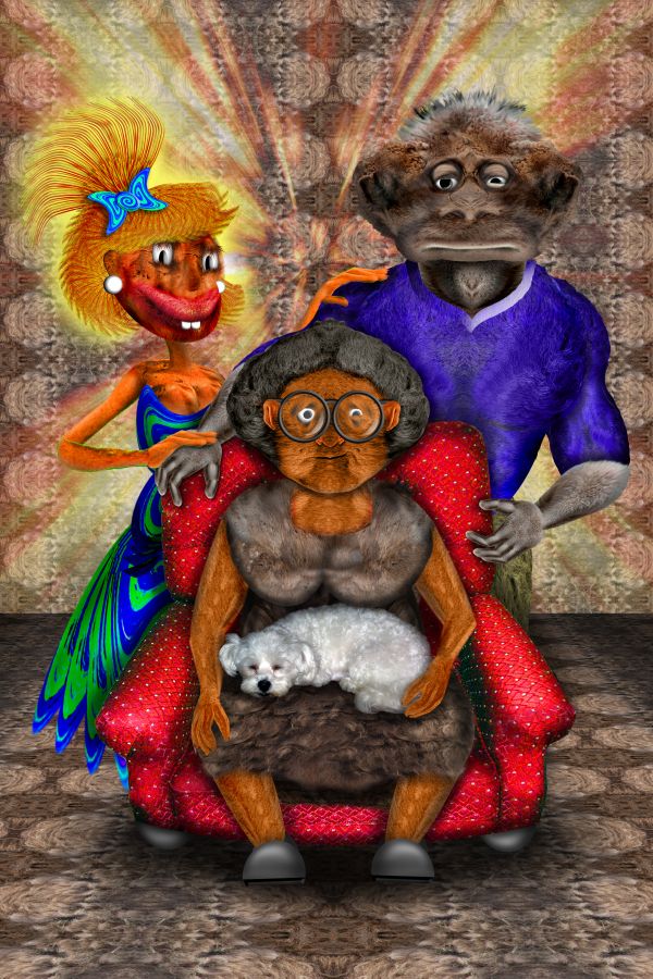
Grandma's New Red Chair - created by Drivenslush


Grandmas New Red Chair
Favs: 2SBS: 35Hi-resRank: 5/15Score: 59.5% (24)13284 views

source and my pics (5 years and 3582 days ago)

avatar Maja12
Maja12 says:

Brilliant!

avatar Graphopoly

lol. funny. Scary looking family though

avatar lchappell
lchappell says:

avatar shaiju1974

nice work!!

avatar chakra1985

very nice job

avatar ponti55
ponti55 says:

Incredibley clever use of various sources... great job!

Howdie stranger!
If you want to rate this picture or participate in this contest, just:

LOGIN HERE or REGISTER FOR FREE


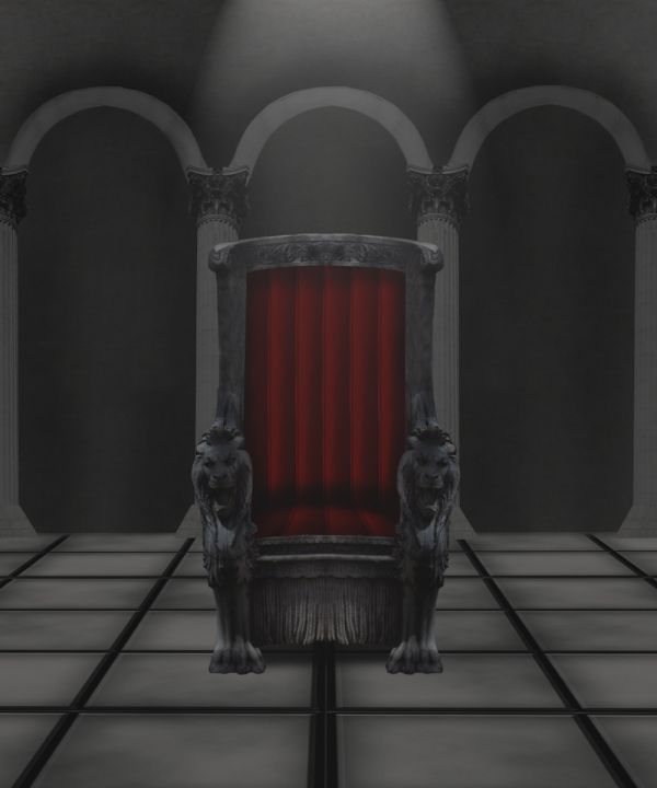
The king's chair - created by jaescoe21


The kings chair
Favs: 0SBS: 5Hi-resRank: 5/15Score: 56.2% (24)13063 views

(5 years and 3595 days ago)

3 Sources:

avatar CMYK46
CMYK46 says:

Lighting effect would produce highlights on the throne (lion heads & seat especially) and the floor...likewise corresponding shadows. The rest is good work...

avatar jawshoewhah
jawshoewhah [banned] says:

That is probably why it doesn't quite look right. Lighting effects would give it more depth.

avatar chakra1985

very nice

avatar k5683
k5683 says:

neat

Howdie stranger!
If you want to rate this picture or participate in this contest, just:

LOGIN HERE or REGISTER FOR FREE