(5 years and 3164 days ago)
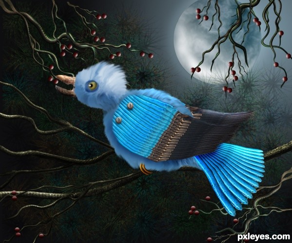
I am participating in this second chance contest with my entry "Bird". The changes made to the original entry, are added in my SBS, please take the time to see the difference. Thank you. (5 years and 3197 days ago)
Definately an improvement ... liked the first one but this guy has a whole other personality! And I prefer the new background. The whole image is not as weird or dark and IMO I like it better that way.
Thank you Arca, I too, like this one better.
I think you should give a little texture tot he moon, it looks too plain, great job overall.
Thank you Akassa, I added the texture to the moon and it looks better!!! Wise suggestion! 
Much better now, good luck 
Beautiful blue creature and the background is amazing! 
Howdie stranger!
If you want to rate this picture or participate in this contest, just:
LOGIN HERE or REGISTER FOR FREE
**Revised Version**
Thanks to Cagdelphi-Tree roots
http://www.sxc.hu/photo/262946
Thanks to dspruitt- Hand
http://www.sxc.hu/photo/1330848 (5 years and 3255 days ago)
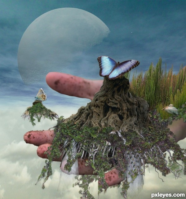
Intriguing image, but I'm not sure that having the floating island be secondary in the background demonstrates a full commitment to the theme. Overall, the image seems a tad flat. More shadows/contrast would add more drama. I just don't know what I should be focusing on (the title suggests the hand, although probably that's really just an allusion to what the hand is holding--but the image itself should provide some guidance).
How is a hand being in my image, causing it to not be on theme? Please explain this to me when there are others in this contest where an island isn't even in the image!!!! Have we all forgotten Surreal interpretation??
Surreal or no, the theme is "Floating Island," not "hand holding stuff." Do you know what the word "island" means?
From Mirriam-Webster (http://www.merriam-webster.com/ ):
Definition of ISLAND
1
: a tract of land surrounded by water and smaller than a continent
In this contest, instead of being surrounded by water, the ISLAND is floating, be it in air, space, or ether (the heavens).
A hand is not an island.
No "forgetting" surreal, so much as not buying a poor excuse for it.
Nice idea..but slightly of theme..good luck
Mossy don't try to insult me by providing a link to the dictionary! My "vision" on this was a hand reaching out of the sky, scooping the island up....Sorry you can't see past your own definition of things 
I like the butterfly steeling part of the island the best, good luck author 
i personally saw for myself the hand was meant to be scooping up the island. i thought it was a wonderful expression .. and in art expression of ones imagination is key to good work.. i support this image and its originality. . some people should look beyond their own tastes sometimes.
The interpretation is wide open. For a butterfly...it is floating. Unsteady ground. This doesn't seem limited to islands as we know it. 
Good luck to your entry author!
This island is not floating !
Thanks for all the comments.....I am so glad everyone is so stirred up over a "floating island"!
I have seen the nasty side of people this week over an image...Kinda sad really....Especially since this is for fun..........Best of Luck to all of you 
Howdie stranger!
If you want to rate this picture or participate in this contest, just:
LOGIN HERE or REGISTER FOR FREE
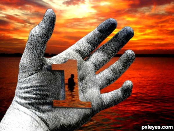
Sometimes you only get one chance at something so don't let it slip out of your hands...
Thanks for the stock images goes to y-it's-mom from flickr.com & Rob Dan from sxc.hu (5 years and 3581 days ago)
Give the interior of the hand some dimension & this could be interesting...
gl
Howdie stranger!
If you want to rate this picture or participate in this contest, just:
LOGIN HERE or REGISTER FOR FREE
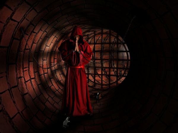
Thanks to ''mjranum'' for source 1
Thanks to ''unholy'' for source 2 (5 years and 3671 days ago)
It's sinister and awesome at the same time!... Just one thing: if the grey rat is under the man's shadow, it needs to be a little darker; in hi res it's possible to see the contrast. 
Thx any way erikuri!!!!!
nice... looks to me like some scene of a game.. where my task is to come n meet this guy to proceed further...
Awesome, I love this! Amazingly ominous entry! 
nice mood and everything, but this is supposed to be a PHOTOSHOP contest, not a 3D contest. Hello, does anyone else realize this?
This is mostly 3D software and someone else's work from DA. As Pearlie said, this is supposed to be a Photoshop contest...it's bad enough that Poser is allowed.
always found a someone ''smart'' to comment....and if it was right .. should be ok!!!... ))))))......what bothers you more CMYK... we know how to use the programs like Poser or we don't have a talent?...btw....you have?
you know something? a high level doesn't say that you have a talent!!!
you are too "smart" and too pedestrian for this century to retain you as a person.........can you ignore me?..pls!
Author, I gave my honest assessment of the work before knowing who made it. My comment was strictly on the work, and not a personal attack. I will not presume to speak for Pearlie, but she obviously agrees with me judging from her comment. Maybe you should stop relying on 3D software that does things for you, and pre-posed & pre-lit & pre-costumed DA pics, and get some talent yourself.
like it
Nice work....
CMYK ! you are boring...realy!!!....your opinion doesn't interest me .... maybe is time to leave us...!!!... )))))
)))))
"What to do with wisdom, when stupidity reigns"
agree with Author 
Okay I'm not taking anyone's side (still think the picture is awesome) but I can see CMYK's point. Maybe there should be some kind of guideline implemented as to what programs are allowed, so that arguments like this don't arise.
CMYK and Pearlie have a point. Traditional drawings are not allowed in digital drawing contests and vice/versa and I don't think any of those are allowed in the 3D contests. It makes sense.
GL
Howdie stranger!
If you want to rate this picture or participate in this contest, just:
LOGIN HERE or REGISTER FOR FREE
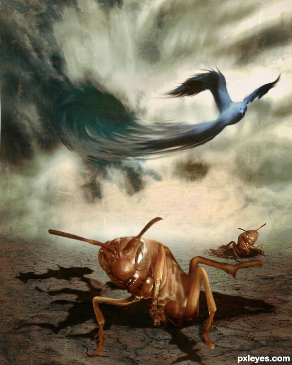
The bottom part looks like a science fiction movie or a Discovery channel program about burrowing wasps. Nice effect.
The top part doesn't really blend well, the colors are too cool in tone for the warmer wasp images, and the swirly, smudgy bird tail looks out of place and distracts from the overall "monster" mood.
Interesting image, puzzling title.
this image will work, provided the style of both the top and bottom is the same
like fantasy world
Unique, love it
Congrats!!
thanks spaceranger
Howdie stranger!
If you want to rate this picture or participate in this contest, just:
LOGIN HERE or REGISTER FOR FREE